Insights & Branding for Healthcare Technology
Soulify provides the healthcare community with an all-in-one platform that addresses the needs of all the
stakeholders, and improves overall efficiency, thus impacting the Safety of not just individuals but also the
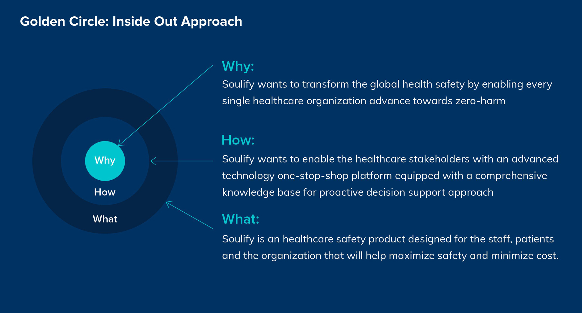
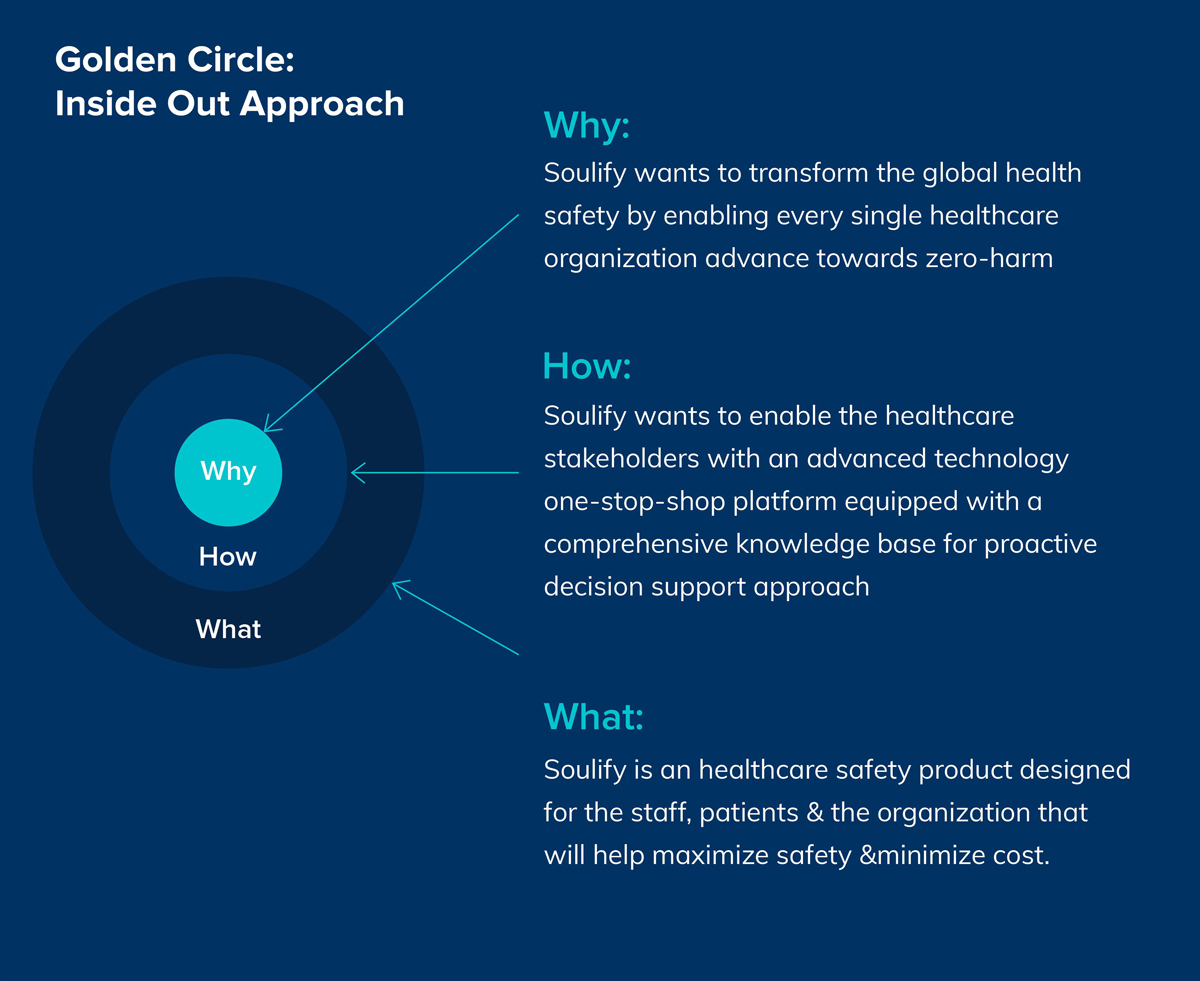
economy. Soulify is a healthcare safety product designed for the staff, patients and the organization that
will help maximize safety and minimize cost.
Challenge
The challenge was to create a brand identity and brand assets for the product from scratch. This included coining the name as well as transitioning that name into a brand identity and further into brand assets through an insights-based approach.
Objective
To advance the global health safety towards zero-harm by empowering the stakeholders with proactive decision-making through a single-platform solution for staff, patients and organization.Brand Concept
During our insights study we came to know
that most of the customers see Ecoville-IRIS as their second investment. Hence, we are using Invest as a theme to make the audience aware about the project. This will also have a good recall factor as the sales collateral (Hoarding, Posters etc.) will start from Invest word and then the message will be followed by.
Brand Concept
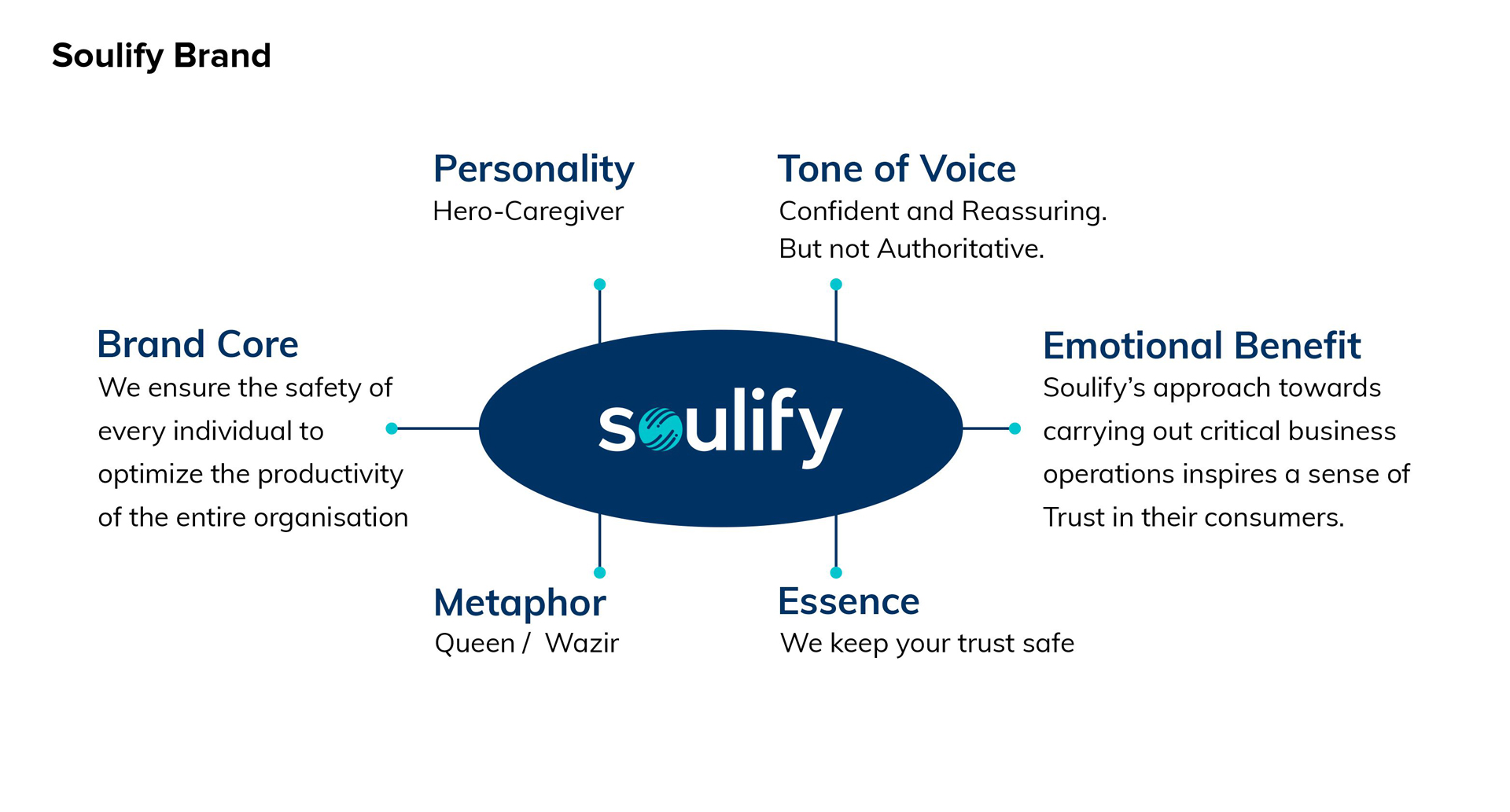
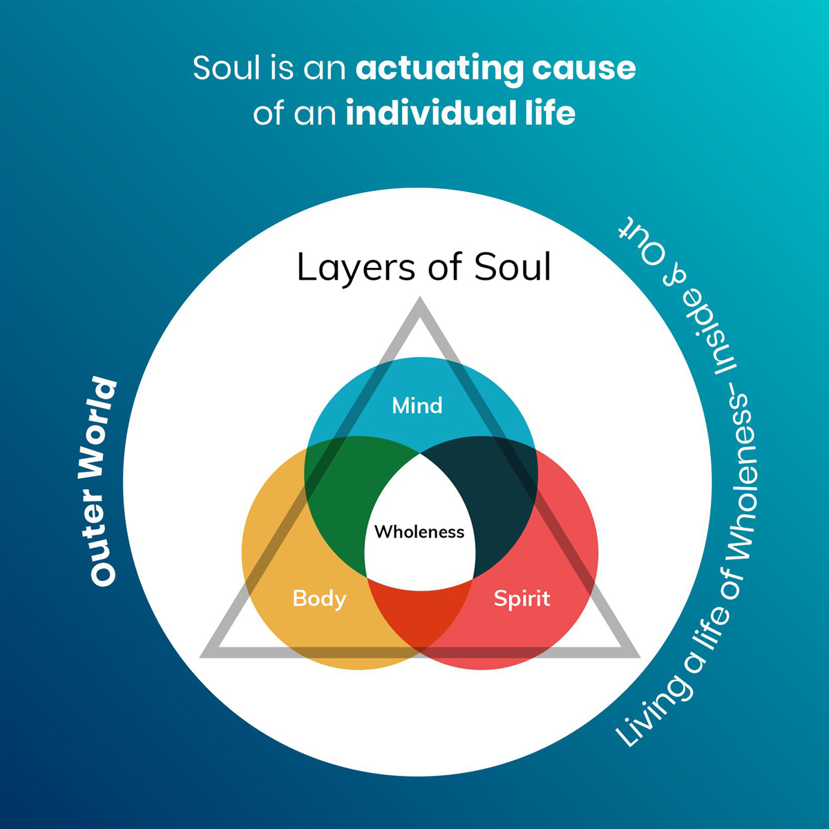
The foundation of our approach is to evolve as awakened and holistic human beings who are conscious of their soul within, and aware of the world outside.
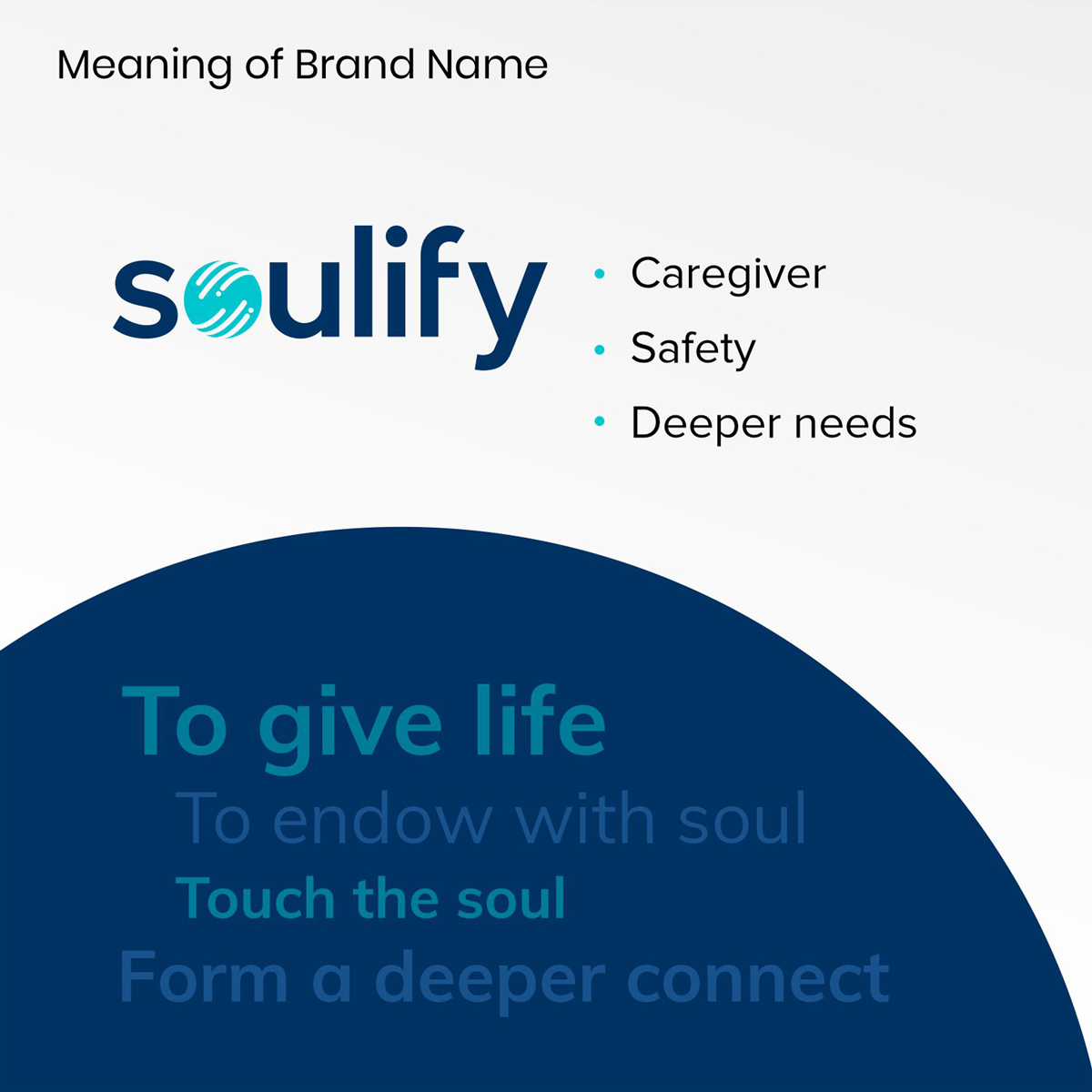
Name Ideation

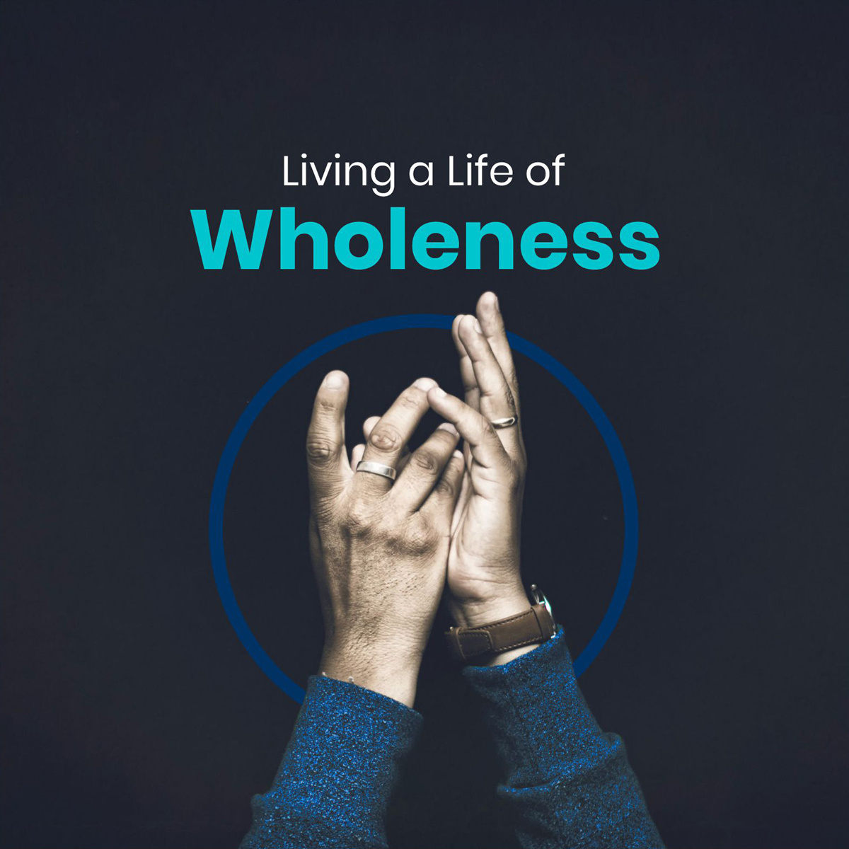
Concept: Living a life of wholeness.
The Soul integrates your mind, body & spirit into a single whole person.

Brand Concept

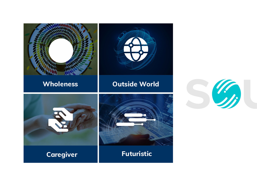
The foundation of our approach is to evolve as awakened and holistic human beings
who are conscious of their soul within, and aware of the world outside.
Brand Identity Design
Soulify is a Healthcare and Technology brand. As per our concept healthcare and tech circle, using the sharp edges and technology globe for creating the identity. The colours are inspired by the moodboard which was created for Soulify. We have selected Proxima Nova font family, which helps inject energy and enthusiasm into the entire Soulify’s communications.
Brand Identity Design
Soulify is a Healthcare and Technology brand. As per our concept, healthcare and tech are to be represented using circle, sharp edges and technology globe for creating the identity. The colors are inspired by the mood board which was created for Soulify. We selected Proxima Nova font family, which helps inject energy and enthusiasm into the entire Soulify’s communications.
Brand Composition
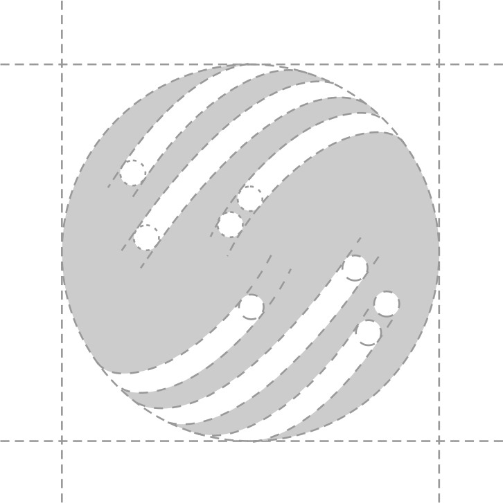
Composition system is elegant in its sheer simplicity of use. By defining the grid based on the logo, the system stays flexible and beyond easy to apply. We’ve looked at different frame variants, how it works in different layouts.
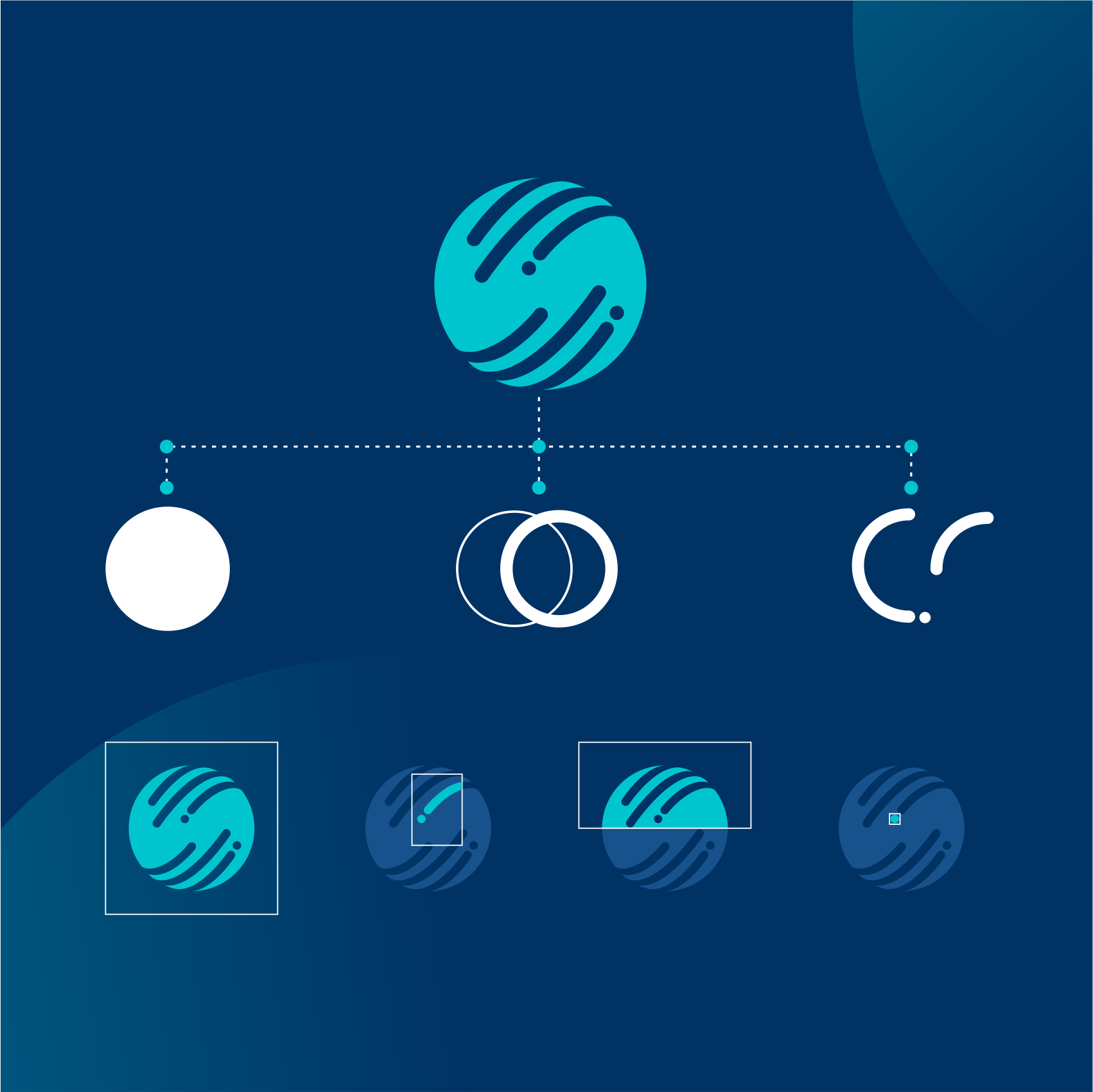
Merchandise Design
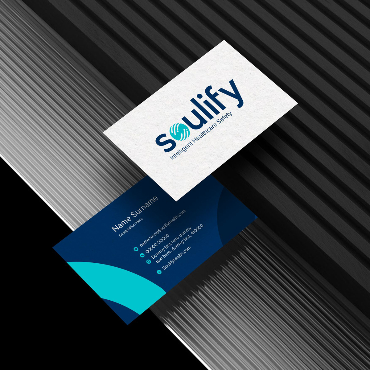
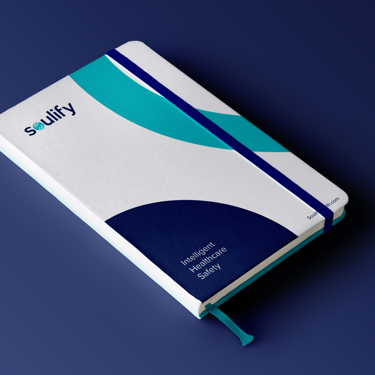
Stationery design usually consists of paper, office supplies, letterheads, writing equipment, and other similar items. The goal is to reflect the Soulify brand through different touch-points.
Our visual content should stick to the same color theme and all print & digital materials should be consistent with that. Consistency helps customers to easily and immediately recognize our brand.
Iconography
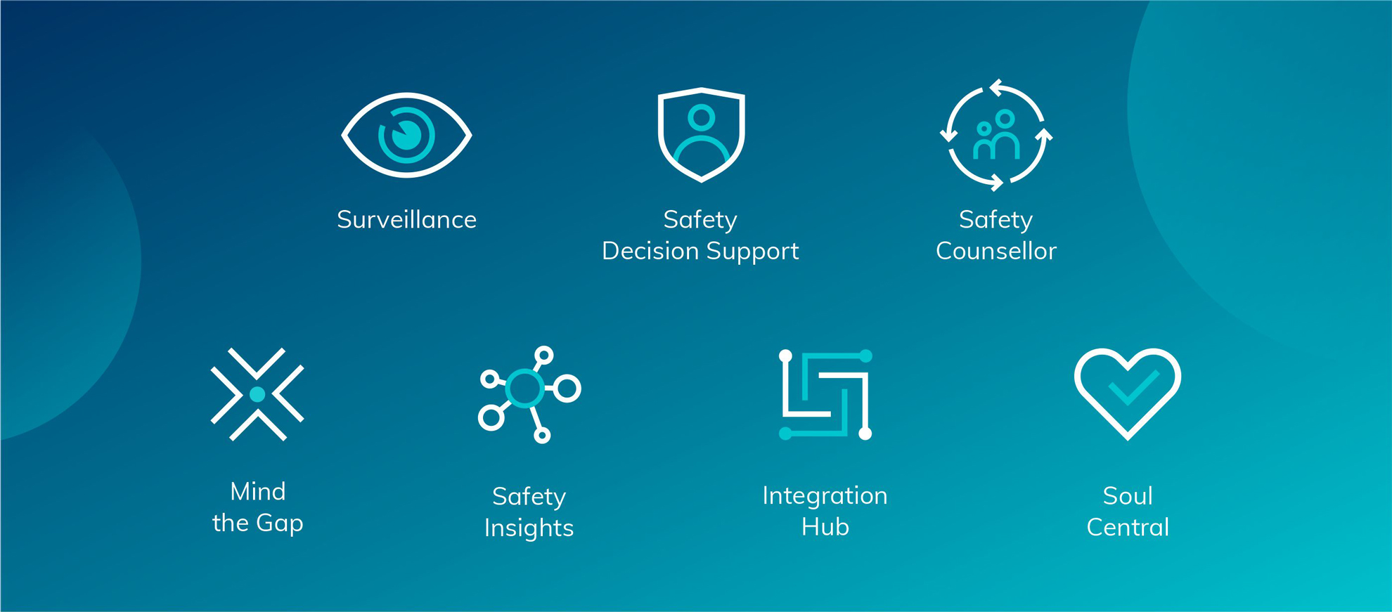
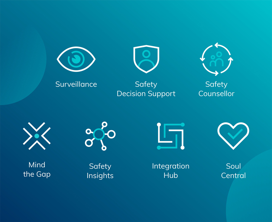
Iconography refers to all of the symbols that will appear on website and across marketing paraphernalia. It is symbolic and meaningful; and it works in different sizes and vectors. We have used outline circle & without outline circle to design the iconography of the 7 toolkits. The iconography is web and print friendly.
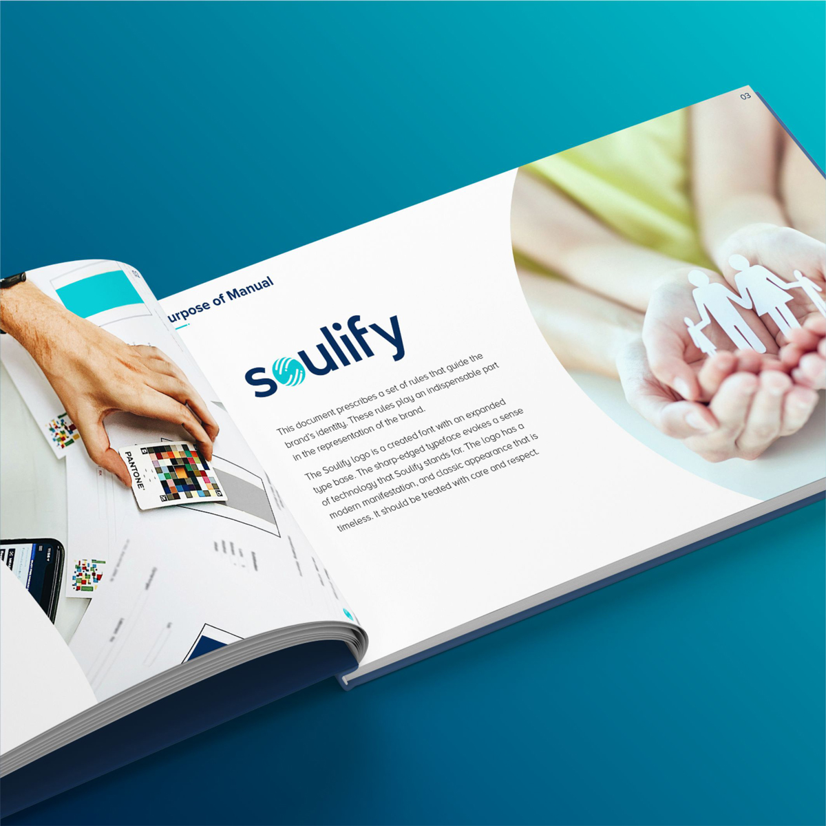
Brand Manual
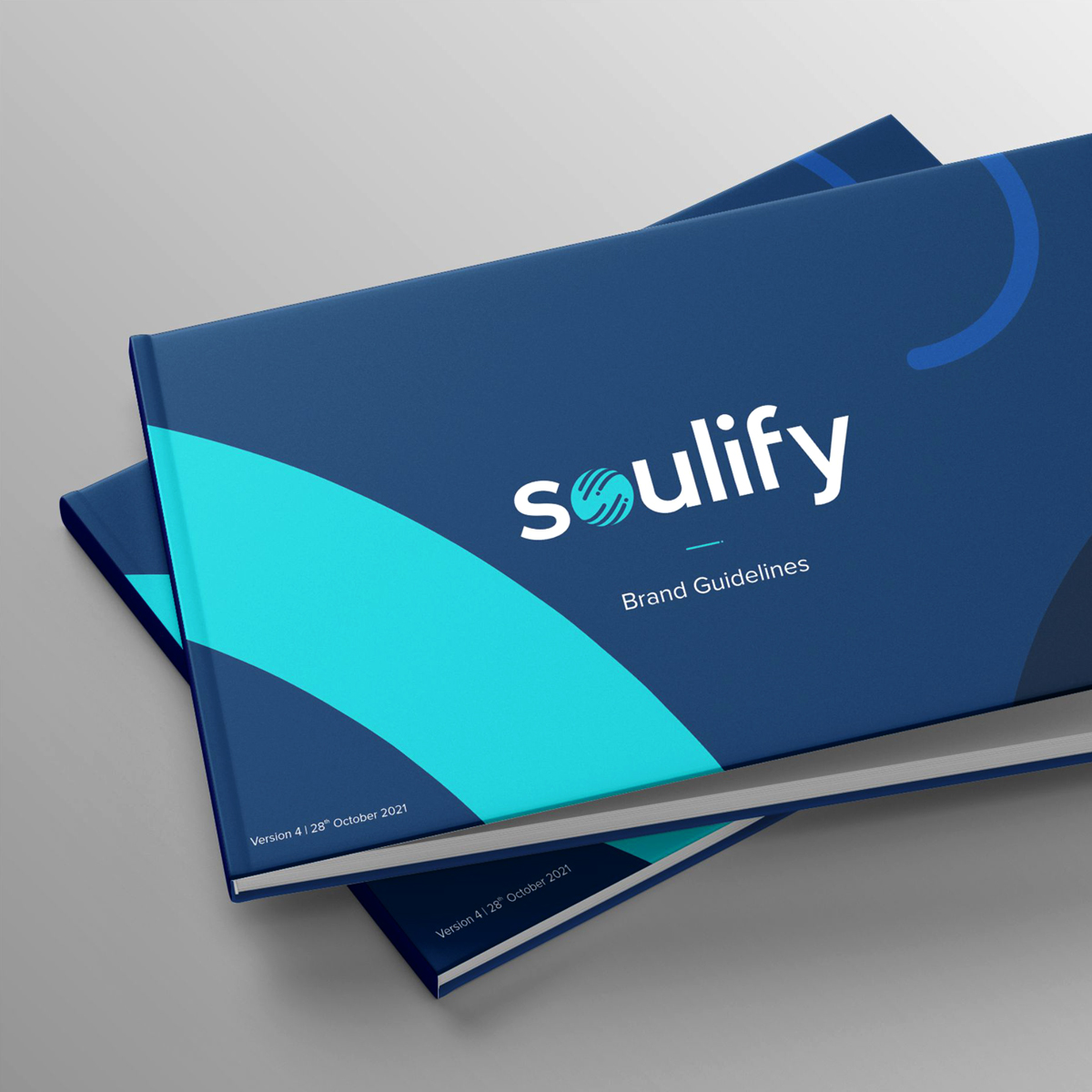
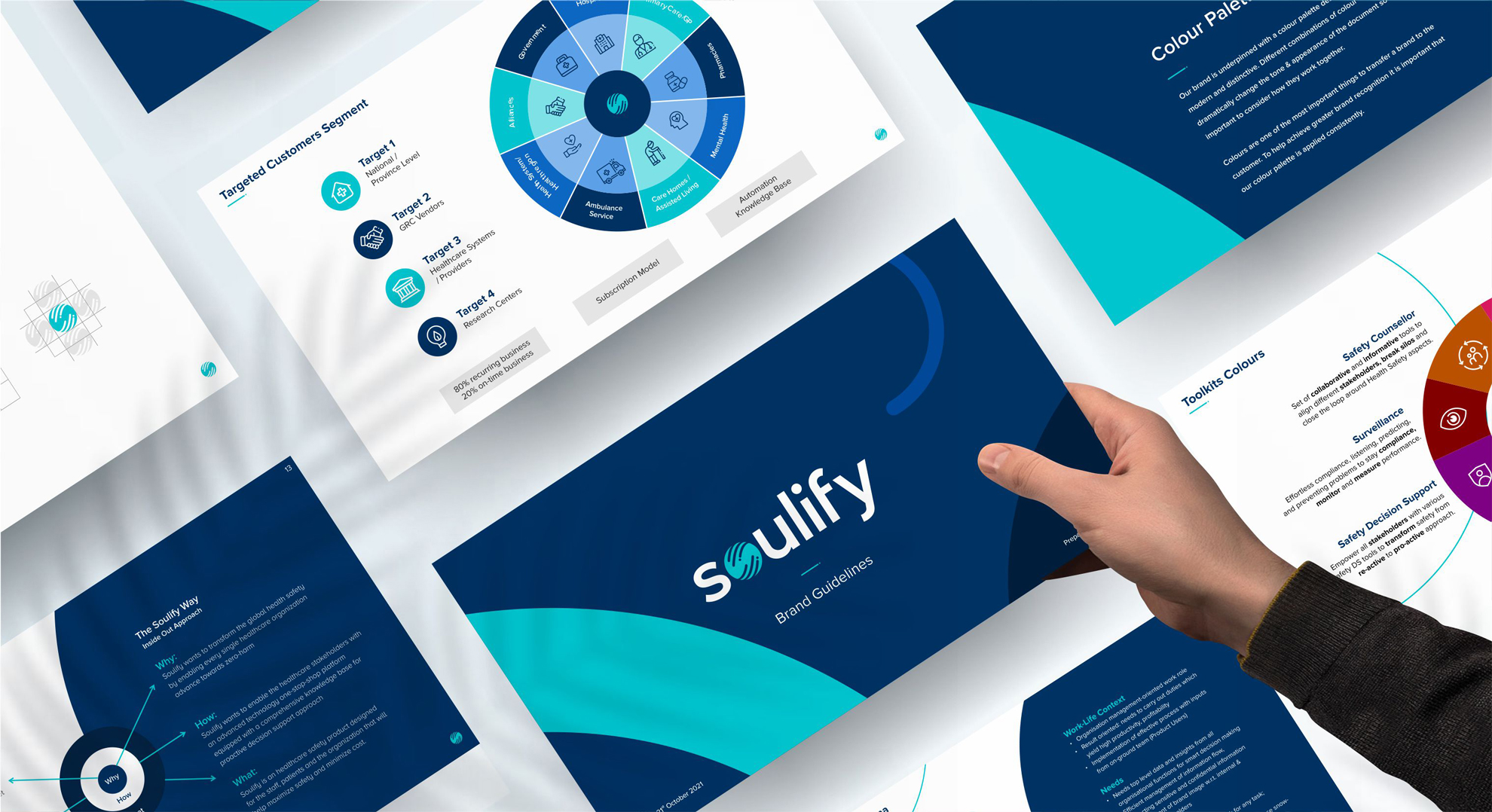
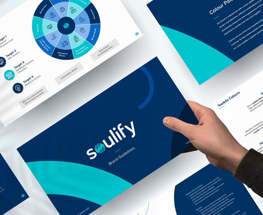
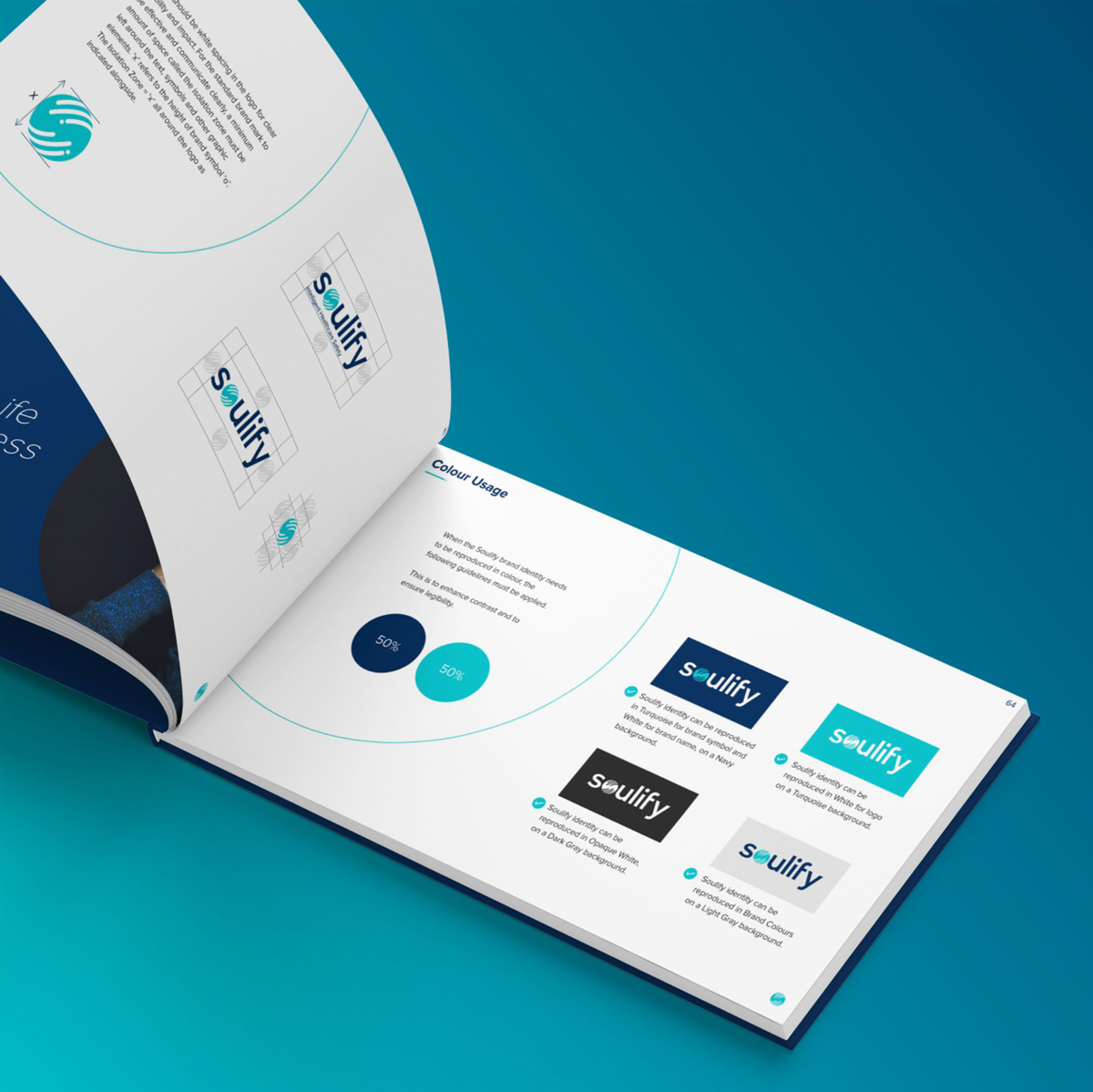
Contained in the manual are the rules, tools and resources to build a consistent Soulify brand in everyday activities. The guidelines in the document ensure the accurate representation of our brand.
Complying with these standards ensures our communication reflect a consistent & cohesive identity across all channels and touchpoints.
