Rebranding & Packaging Design for a Bakery Brand
A party or a wedding, a relationship management initiative or seasonal corporate gifting, nothing beats a gorgeous serving of Celebration’s smooth well-tempered chocolate or an attractive plateful of multi-tier creamy cakes or a scrumptious treat of layered confectioneries.
Challenge
Chocolate Biclate, with more than 50 outlets in Pune and PCMC, didn’t have a clear brand message. The consumers were also not aware of the brand and its offerings.
Objective
To increase the consumer footfall at Chocolate Biclate outlets and represent the brand as an innovator & thought leader in chocolate oriented products.
Brand Communication
Brand Communication
After interacting with their team, visiting their outlets, and communicating with current and potential customers, we created an insights study. Which helped us to identify the positioning statement and overall communication strategy for the brand. Post the insights study we derived brand attributes, personality, philosophy, and brand pillars. The current brand philosophy is ‘Chocolate as a core ingredient’ and the brand pillars are: operational efficiency, taste, and service excellence. Before finalizing the concept for rebranding we did a small research on Chocolate history. There we came to know that chocolate was invented by The Mayans.
Chocolate is the Celebration
Factor for Mayans
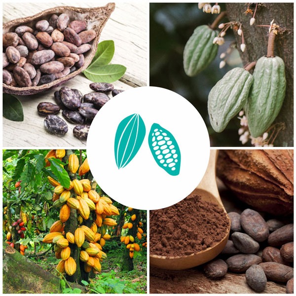
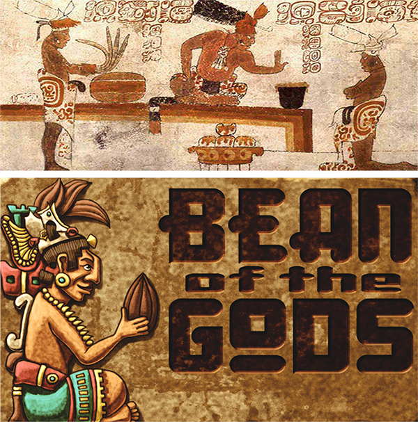
The Mayans (Maya) were the first to discover cocoa as early as 900 AD. Compared to today’s chocolates the Mayan chocolate was very different and healthy to consume. They used to harvest the beans inside the cocoa pods and made them in liquid form to enjoy their Mayan treat. Their overall artifacts and paintings were mostly based on the Mayan people gathering, preparing or drinking cocoa. It can be seen that cocoa played an important role in their religious and social lives. We connected the Ancient Mayan history to Chocolate Biclate, to represent them as a brand with expertise in making chocolate oriented products.
Thought Process
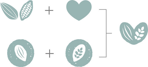
It is said that nobody knows chocolates better than the ancient Mayans. Hence, while designing the brand identity we considered Mayan pottery, food, calendar, civilization, writing, cocoa pod, chocolate pattern and cacao & maize in Maya tradition.
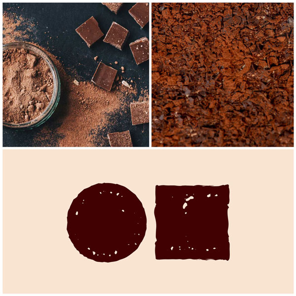

We took inspiration from raw chocolate texture to create typeface. We have created a typeface which is simple, robust, and hearty, similar to the brand. The rounded edges make the logo appear to be soft, relatable, and approachable. The most important part of the typeface is appealing and very recognizable.

We took inspiration from raw chocolate texture for create typeface. We have created the typeface which is simple, robust and hearty, similar to the brand. The rounded edges makes the logo appear to be soft, relatable and approachable. The most important part of typeface is appealing and very recognizable.

Colours
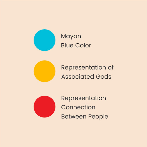
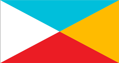
In the case of colour, we have been inspired by the Mayan flag. The Maya flag is divided diagonally into four fields, the one closest to the hoist is white (for people), the field at the fly end is yellow (for the sun), the top field is blue (for the sky) and the bottom field is red (for fire). The flag was fringed in light blue.
Mayan Flag

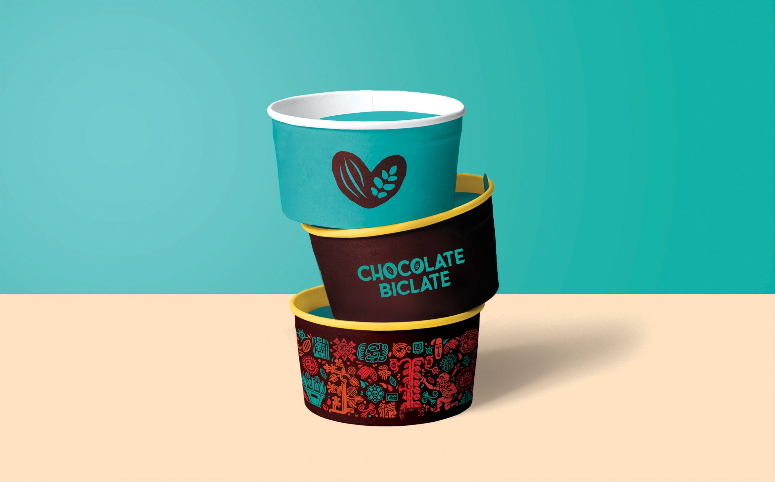
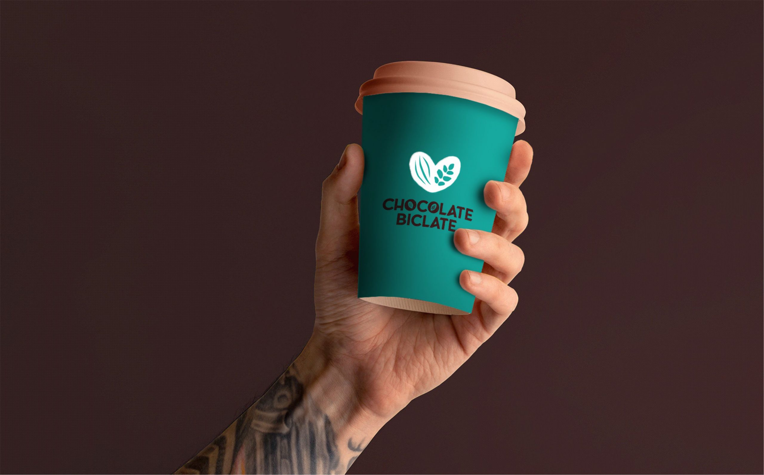
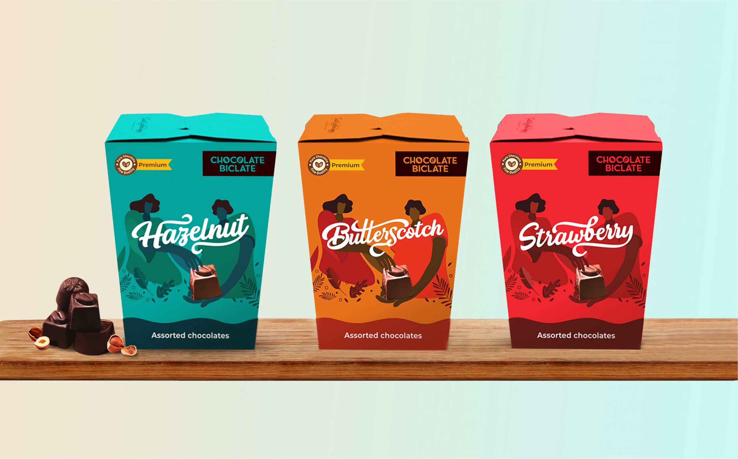
Stationery and Packaging Design
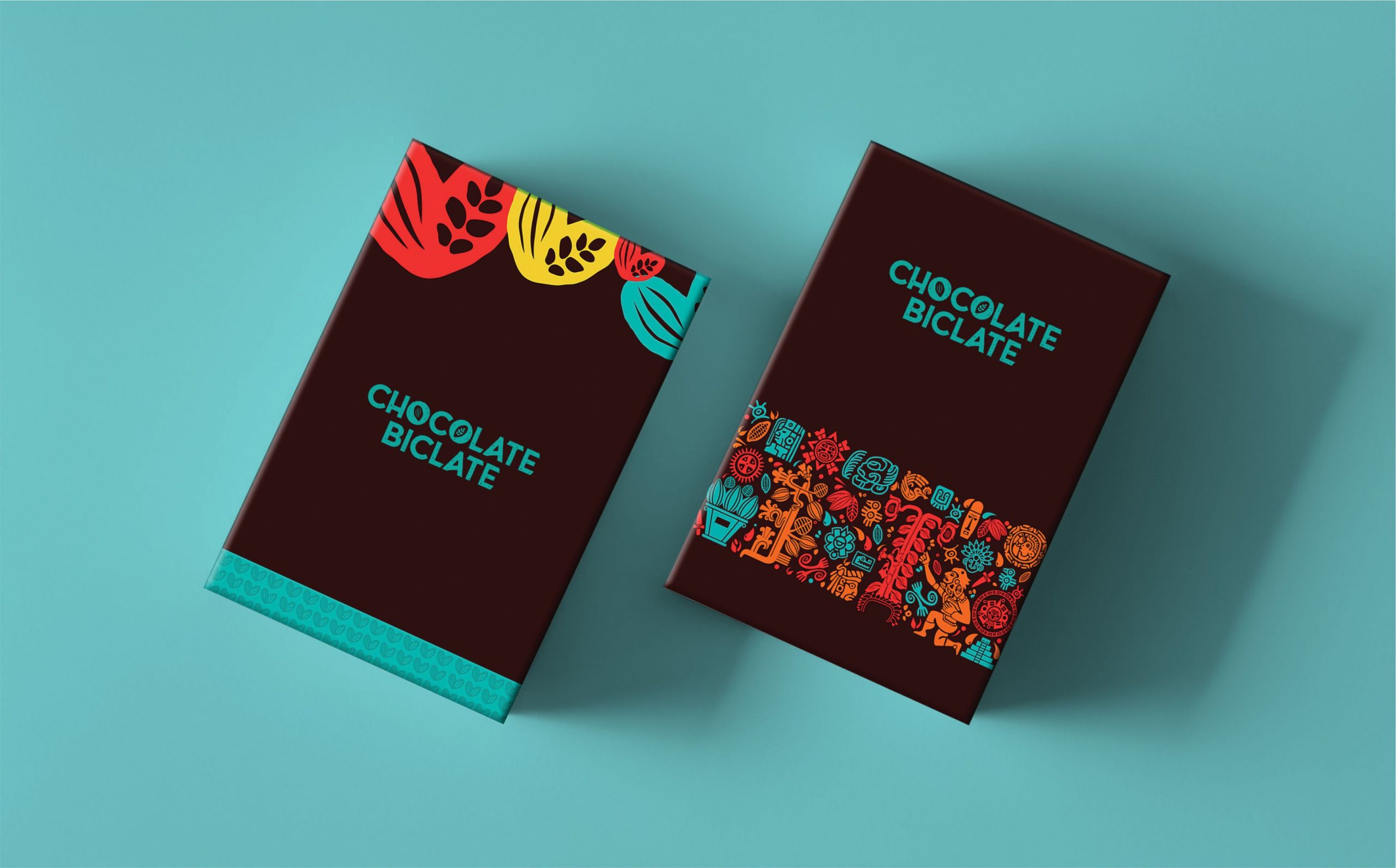
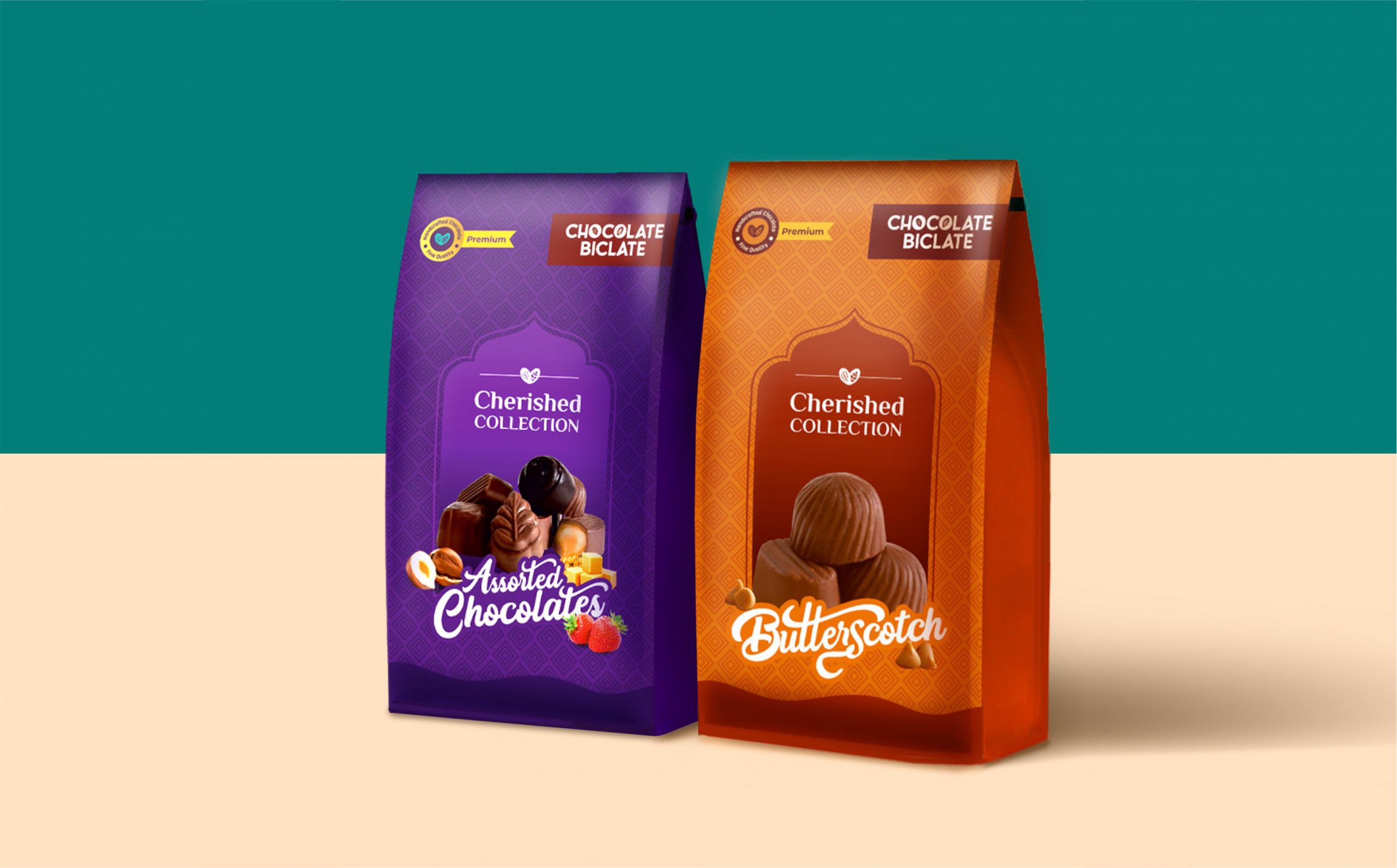
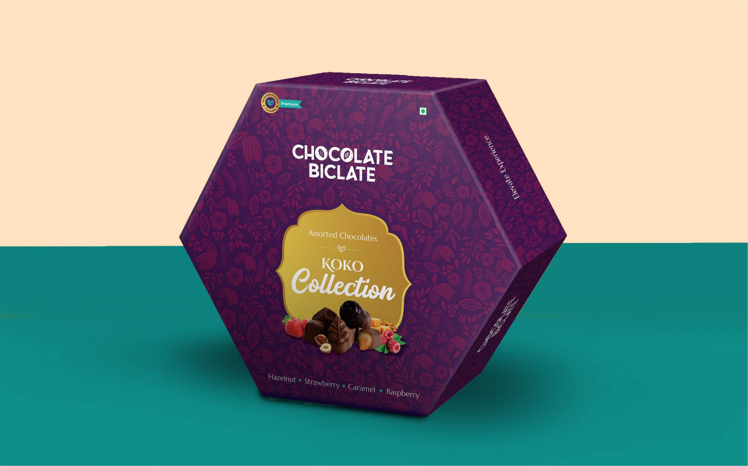
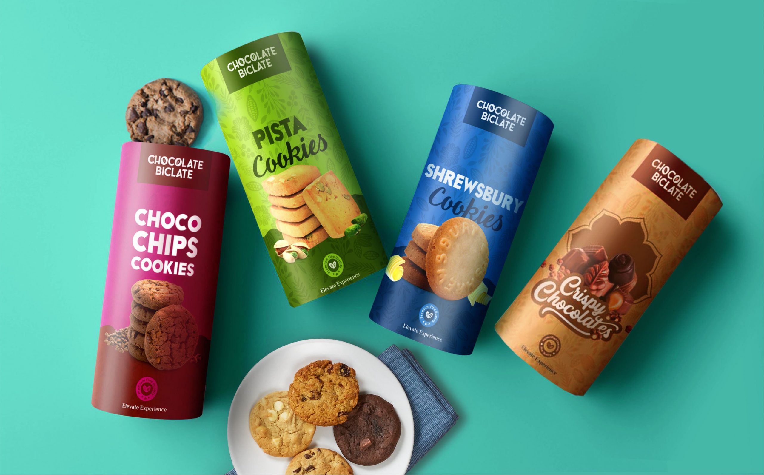
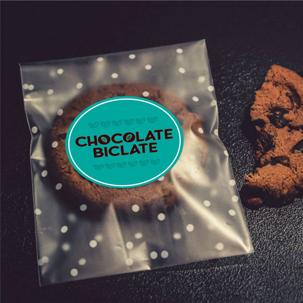
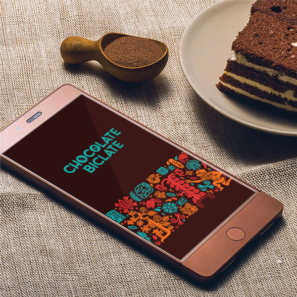
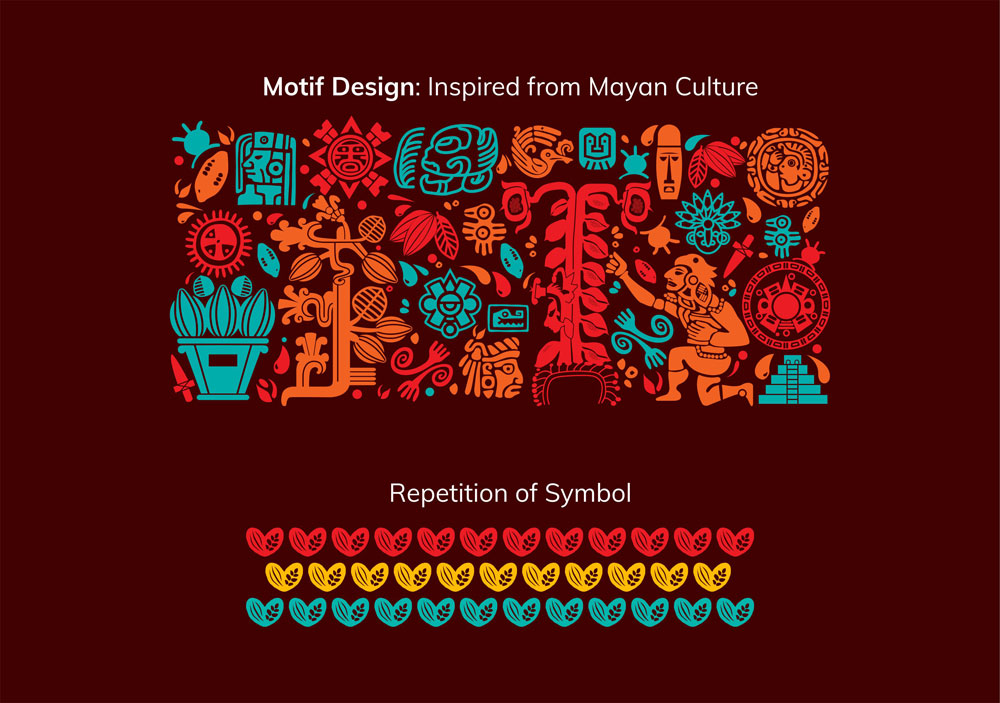
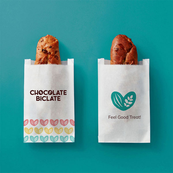
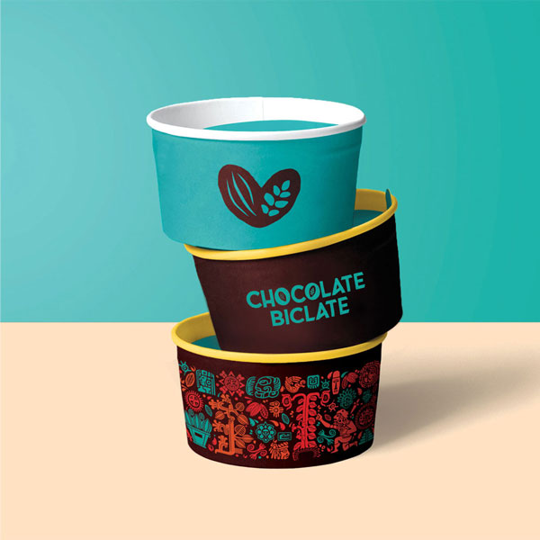
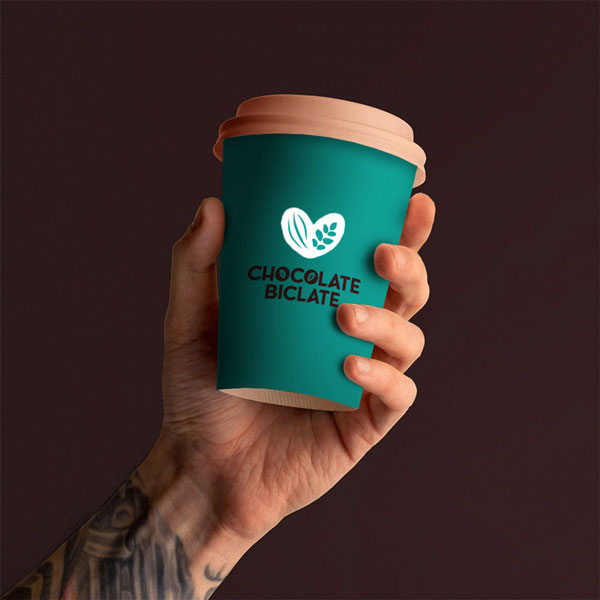
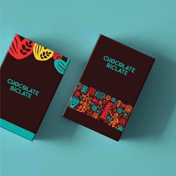
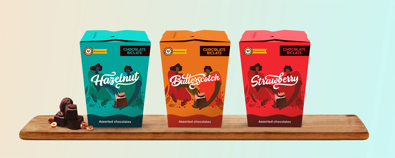
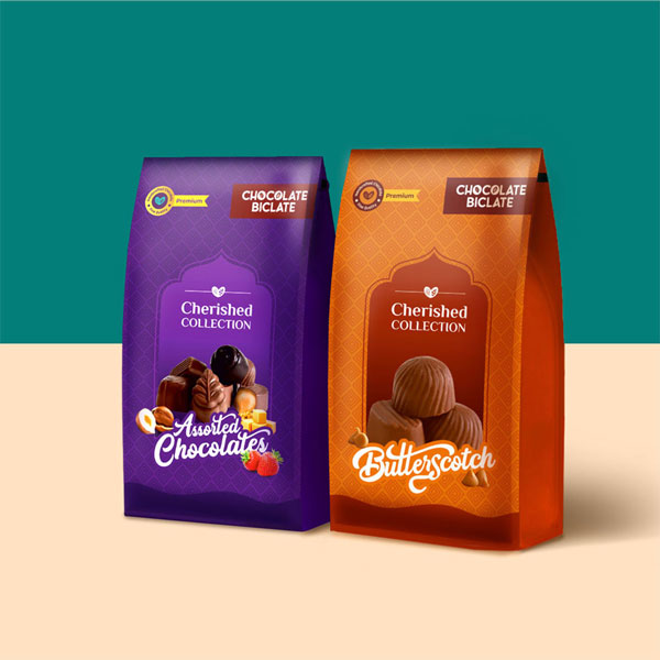
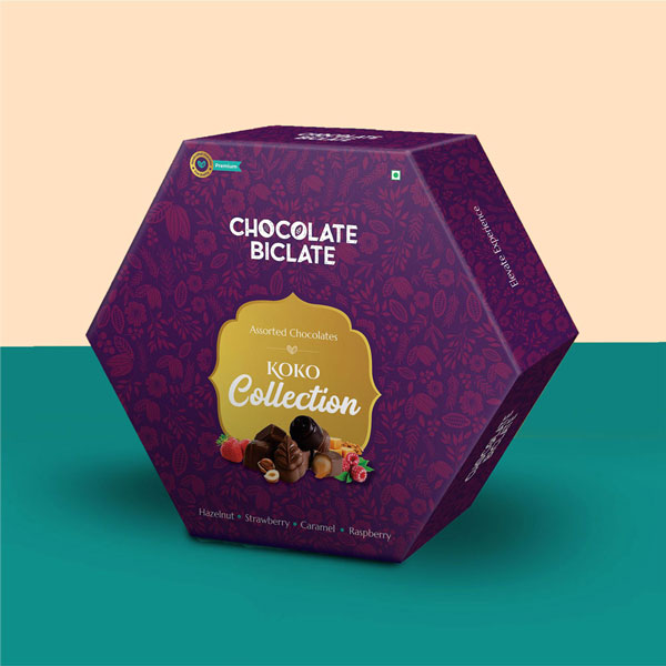
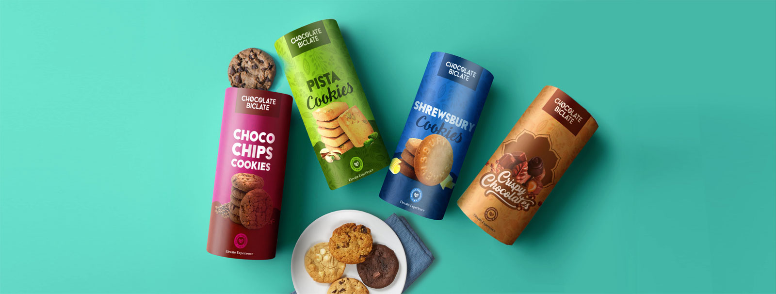
The inspiration for the product packaging was from the illustration style of the Mayan Civilization. Taking inspiration from there we created various design motifs and iconography to incorporate in the design.
Stationery and Packaging Design
