Rebranding for hyperscale-quality infrastructure tech company
Part of the Taurus Group family of brands, Circle B is an official OCP Solution Provider focused on delivering advanced OCP solutions to companies in the European market. Circle B’s managed services activities consist of IT infrastructure deployments including racks, power supplies, servers, storage, and switches, as well as implementing and maintaining software-defined networking capabilities.
Challenge
To create a new and differentiated brand identity in the minds of consumers, investors, prospects, competitors, employees, and the general public and encounter the past perception.Objective
Distinguishing Circle B from the competitors. Presenting a fresh, current image and Connecting with a new customer base with the new re-branding.Brand story
Circle B believes that openly sharing ideas, specifications, and another intellectual property is the key to maximizing innovation and reducing complexity in tech components.
Brand
Communication
After interacting with the Circle B team and researching the competitors we created an insights study. Which helped us to identify the positioning statement and overall communication strategy for the brand. Post the insights study we derived brand attributes, personality, philosophy, and brand pillars. For rebranding, we also did a study on OCP and started to brainstorm on how we can incorporate and interlink the word “Circle” with OCP attributes.

Thought Process
Thought Process

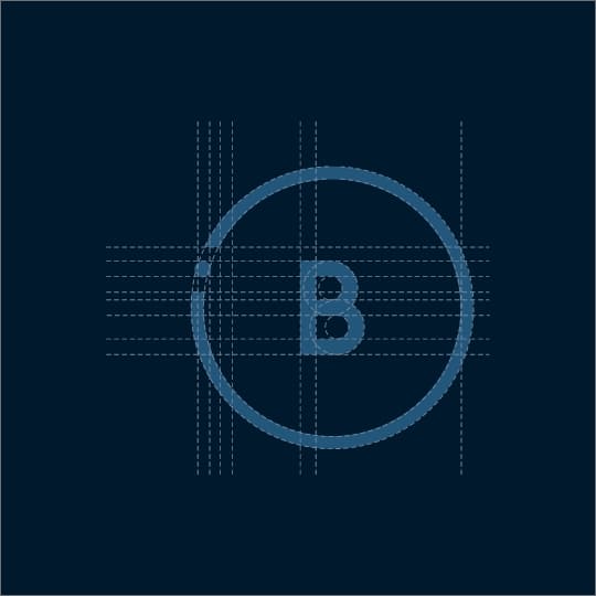
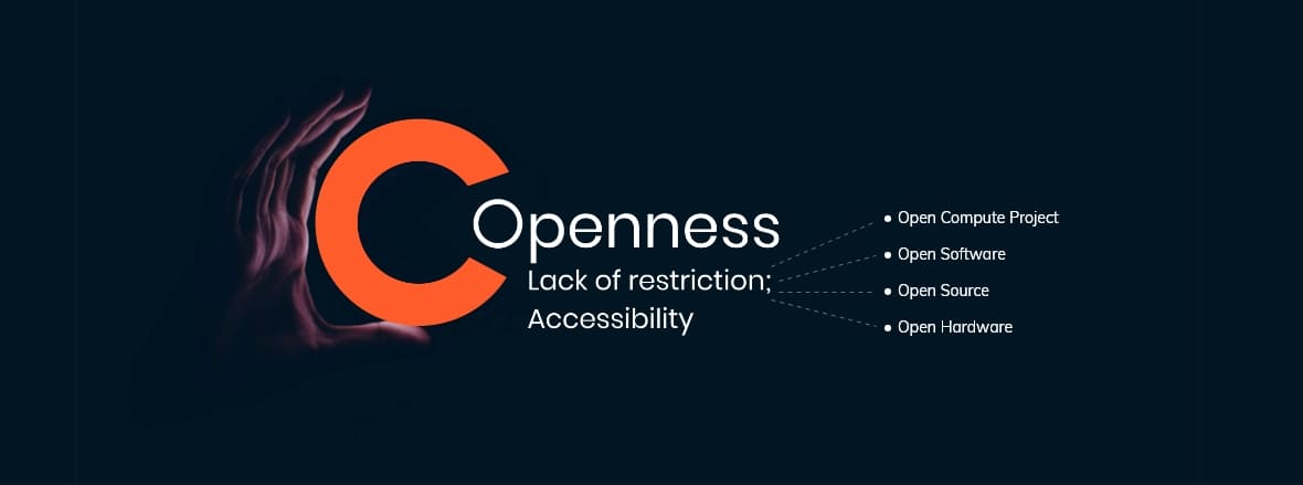
As the brand name itself have the word “Circle” also they cater to OCP which means ‘Open Compute Project’ we came across the concept of “Open”, using the open circle for creating the identity. The circle represents transformation, and collaboration and the open circle represents the open source and sharable approach.

Colours
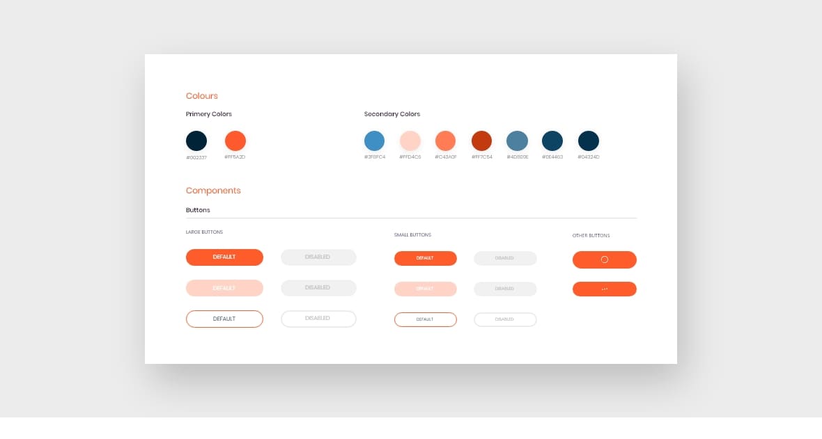
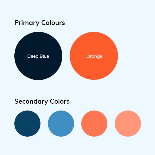
Orange + Blue combination: Make your audience feel excited about your brand while instilling trust with an orange and blue logo. This complementary color duo is a classic yet powerful pairing and is popular in the technology sector.
Composition
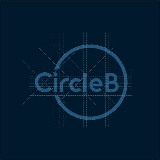
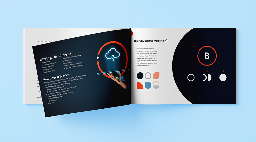
Our composition system is elegant in its sheer simplicity of use. By defining the grid based on the logo, the system stays flexible and beyond easy to apply. We’ve looked at different frame variants, and how type works in different layouts.
Brand Book
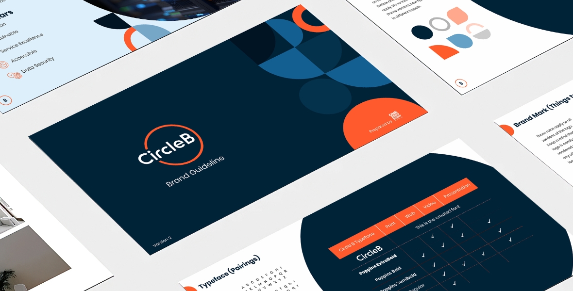
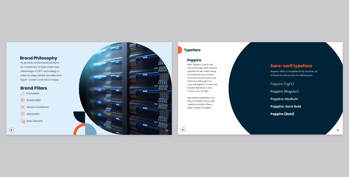
Created a Brand Book which communicates the company’s design standards to the whole group. Having this document to reference for expected standards will make the lives of the designers, writers, and developers much easier and give them a solid framework to use as a starting point for their work. It supports marketing initiatives by ensuring that all messaging is relevant and related to your brand’s goals.
Website
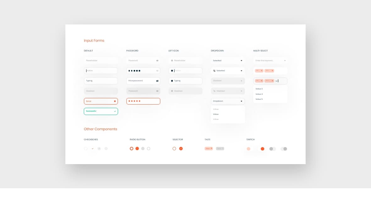
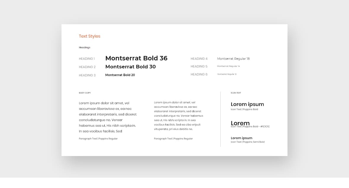
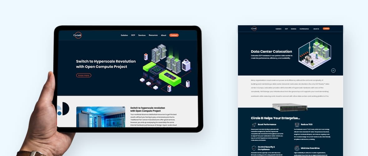
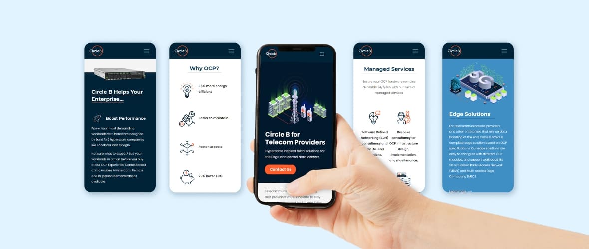
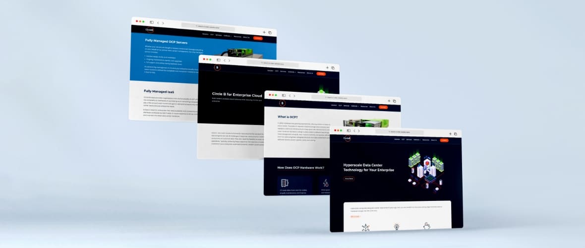
The entire website of Circle B has been revamped, from the concept to its content and design. We created the Design System Language to improve consistency across platforms, build more-intuitive products, and allow designers and engineers to focus on addressing bigger problems. The new website is based on the industry standards and consumer’s expectations.
DSL (Design System Language)
Website UI
Stationery and Merchandise
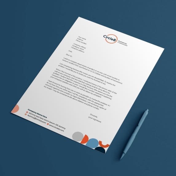
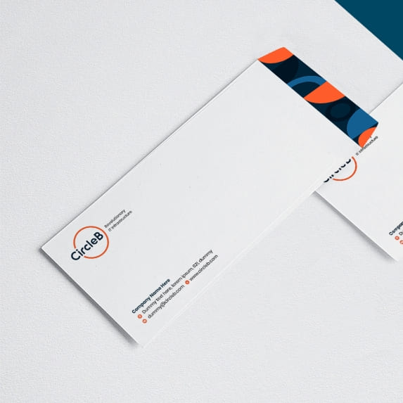
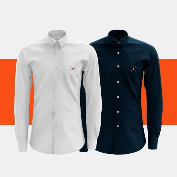
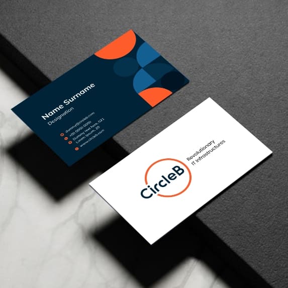
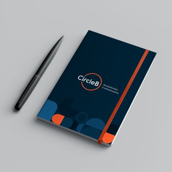
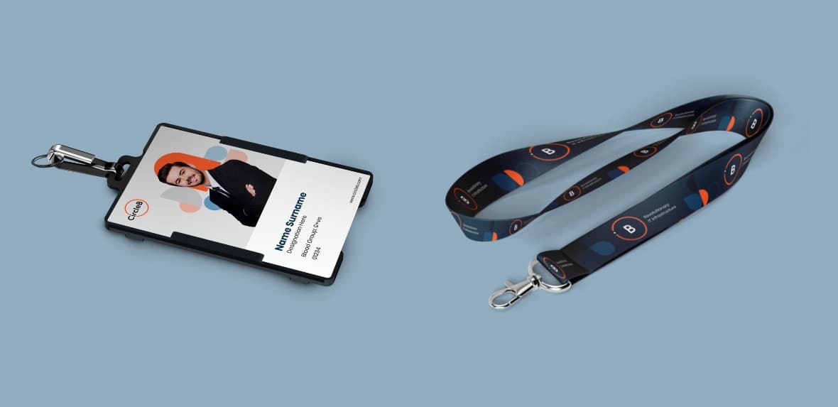
The stationery and merchandise have been updated and re-designed from bags to visiting cards, notepads, t-shirts, coffee mugs, etc. The merchandise builds recognition for the brand. We created these vibrant and professional-looking merchandises that stands out from other brand’s merchandise.
