Importance of Logos for Your Brand’s Identity
Logos are important to any business. It represents your brand, and what you stand in the market industry.
What comes to your mind when you think of the word logo? Your favorite brand’s logo ? or also the brands that are creating their presence everywhere by taking a small space in this huge industry. A logo is the face of your Brand!
Whenever you think of any product or company, the logo comes to your mind.
- Amul is incomplete without the utterly butterly delicious girl to imagine.
- iPhone and iPad are unrecognizable without the half-bitten apple.
- Audi is identified with those 4 circles on cars
- McDonald’ M
- Baskin Robbins’ BR and so on.
If the logo is not present on the product you’re purchasing, you will be a bit hesitant to purchase. Because that’s what the identity of the product has been recognized by.
What is the Real Definition of Logo Design –
A logo is just a symbol of your company. But that symbol must convey your brand message to the users in order to create a long-lasting impression on your audience.
A logo is not just a shape that you create and say it’s our logo! The shape of the logo should represent something about your industry in the minds of people who are looking at it.
Logo reminds people – that is the priority in today’s era.
If you observe, logos don’t take up much space on the website or your app, it is fitted into tiny pixels at the corner of your website, but the people’s mind occupies the actual space of your logo. The logo should be flexible, adaptable, and consistent.
Nowadays we use logos everywhere, on your building, business cards, apps, merchandise, hoardings, etc. That’s the presence of identity we are creating in people’s minds. Because it’s easily seen and remembered if it’s attractive.
The logo should just not be attractive in design for a matter of catching the people’s attention. But it should also convey the message of what value you are adding to people’s lives and how your brand is unique in this vast industry. It should represent the values and culture of your organization.
Famous Brand Logos with their Meanings –
Let’s have a look at a few examples of famous brands and what they mean.
1. Amazon
An online store that started by just selling books online to selling everything! The orange arrow from A – Z, clearly conveys that their store has everything a customer needs. Also, the curve represents the smiles, which assures that their customer will be satisfied after shopping from their site/app.

2. Baskin Robbins
Baskin Robbins is an ice-cream store, if you observe closely, the number ‘31’ is represented in pink color, which conveys they are selling ‘31’ flavors of ice creams in their store. Also, it’s flexible, the pink color can be changed, in their campaigns with their different flavors without making any change in the logo.
3. Vaio
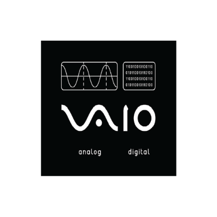
Vaio is a brand of personal computers and consumer electronics, currently developed by a Japanese company. VAIO – stands for Visual Audio Intelligent Organizer, which was first introduced in 1996. The letters V and A represent the analog signals to the last two letters I and O, which reflect a digital binary code.
So the list continues, now you have an idea of how much a logo is important for your brand and why it should relate to the industry you’re in.
Types of Logos Explained With Examples –
There are various types of logos, we will see here the main 3 types of logos that are the base of all the logo creations.
1. Wordmark Logos –
A Wordmark logo is the typographic type of logo, which is represented in simple words, that purely focus on the brand name and its font. Coca-Cola is one of the good examples of wordmark logos.

2. Pictorial Logos –
Pictorial logos is the image or graphics-based logos, where organizations represent the logos in a form of images, that convey their brand message. Twitter is one such example of Pictorial Logos.
3. Combination Mark Logos –
Combination mark logos, as the word represents, it’s a combination of image and name/words that your brand represents. Starbucks is one of the examples of combination mark logos.
3 Things that a Good Logo Needs –
Sagi Haviv (is an Israel – American graphic designer) – a partner and designer at Chermayeff & Geismar & Haviv says – 3 Important Things that a Good Logo Must Have
- Appropriate – logos should be appropriate in their feeling. It doesn’t need to say a whole lot.
- Distinctive & Memorable – It has to be unusual enough to persist in our minds. It should pass the “doodle test.”
- Simple – Logos are displayed across various mediums in many different sizes. It needs to be able to be produced in every pixel size. For this reason, a good logo is one that’s super, super simple.
When you strike the balance of these 3 things, you have a good logo.
So, what makes up a bad logo? If a logo is generic, or if it’s too complicated to be formatted in different pixel sizes, you’ve got yourself a bad logo.
We all know, that logos actually rely on visual language, but visual language will change over time, Websites keep on upgrading according to the times, but logos can be changed frequently. A logo can be modernized without changing its meaning.
Logos should be consistent, flexible, adaptable, and Simple! It should be distinctive with different colors, different gradients, different production lines, anything. But the logo should go on all paths.
7 Reasons Why a Logo is Important to Your Brand
Now you know, how much a logo matters in any organization’s life. So it’s very important to have the perfect logo for your brand.
Let’s see some reasons why we need logos for our brand with One Zero Eight’s case studies.
1. Being the face of the brand
Sure, there are ambassadors and mascots also associated with businesses, but the logo is quite literally the face of the brand and one of the very first things that consumers notice about it. A well-designed logo establishes a connection with consumers instantly, gives them the first impression of your brand, and keeps them coming back for more.
One Zero Eight – iauro Case study ->
For our client iauro, the new logo was created, and we made sure that it represents the face of their brand industry.
The symbol of the new brand identity is ‘IŌ’. ‘I’ stands for input, ‘O’ stands for output and Ō denotes continuous learning and evolution. iauro is the company that builds everything between input & output.


Check out the full case study here, – Iauro
2. It grabs attention
Attention spans are getting shorter by the day, thanks to the clutter that exists in the market. This is true, especially for new consumers. For those consumers, you only have a few seconds to tell them your brand story without actually being there, and telling a good story only happens with a good logo. If you have a logo that is able to communicate your brand values and convince them of the potential you have, you’re going places!
One Zero Eight – Babylon Case study ->
Babylon is the largest brewery in Maharashtra and the only brewery in Kothrud, Pune. The logo grabs attention, as the overall theme of the restaurant is based on an Egyptian theme. The main objective was to create a brand identity for Babylon & create the experience of Egypt.
Check out the full case study here, – Bobylon
3. Enhances brand visual identity
Logo and design are the pillars of the entire business narrative, especially for the visual look and feel of it. Colors, tones, and fonts can say more about the brand in seconds than marketers can sometimes say in hours! And this is a very aspect of storytelling that business custodians sometimes choose to ignore. The logo and design are what customers remember for much longer after the initial brand interaction and purchase, so choose wisely and tell your story perfectly!
One Zero Eight – BECIS Case study ->
BECIS provides distributed energy solutions by partnering with one of the world’s highly recognized commercial and industrial customers. Diagonal lines convey a feeling of movement. Objects in a diagonal position are Powerful because they are neither vertical nor horizontal, they are already in motion. Upward-directed edges represent Speed, Energy, Growth, Power, Development, Moving Forward, etc.
Check out the full case study here, – BECIS
4. Aids brand recall and loyalty
One thing that customers value most is consistency. And that’s something that a good logo promises for sure. Markets keep upturning and priorities keep changing but brands stay true to themselves, and so do their logos. The familiarity that this consistency brings, equates to trust and brand credibility and aids massive customer loyalty in the long run. Popular brands like Nike, Coca-Cola HUL, and Nestle are testament to this fact. The more consumers interact with you, the more they will look for you, and logos are the easiest way to remember!
One Zero Eight – The Bid Capital Case study ->
This design is typography based. A smart and aesthetical twist has been given to the identity to make it eye-catching. The overall identity of The Bid Capital Café and Bar was conceived to be designed in synchronization with its vibrancy and class, energy and spirit, fun and fancy.

Check out the full case study here, – The Deccan Bid Capital
5. Steers ahead of the competition
In times like today where accessibility and customer convenience make and break marketing strategies, the clutter in the business landscape has increased. There is a solid chance that there are a lot of competitors hankering for consumer brand recall and loyalty along with you, and the best way to steer clear of competition is through unique product and service offerings. A unique logo is the first step in this direction!
One Zero Eight – GEMS Case study ->
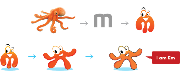
The founder of Gems wanted to create a special place for children to learn, enjoy and have fun. She realized that an eye-catching, bright, and playful brand identity and visual communication are needed to accomplish her goal. Gems Preschool represents Creativity, Growth, Active, Explore, Intelligent, Experimental, Beginning, Fun & Learning. These Attributes Resembles with an Oceanic Animal Octopus – An Intelligent and Creative Animal.
Check out the full case study here, – G.E.M.S
6. Memorable
The logos are memorable, and not so easily forgotten. One can forget your brand name for a moment, they can mispronounce your brand name, but the logo will be fitted in their mind.
One Zero Eight – Kalinga Case study ->
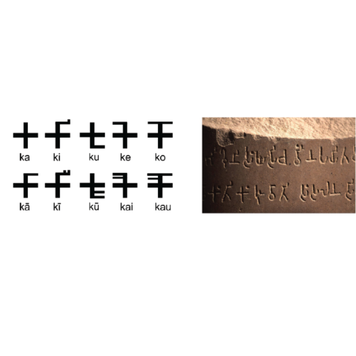
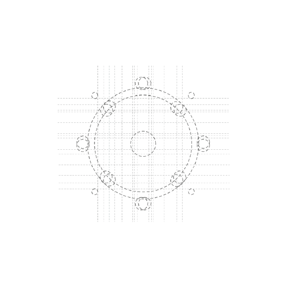
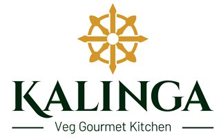
To Create a Premium Identity for Kalinga Restaurant Keeping Kalinga’s History and Cuisines into Consideration. We approached the Kalinga identity with the aim of creating a Historic, Premium, and memorable symbol that was familiar and immediately recognizable. Devnagri Logo has been created as per the English font to maintain consistency and font family.

Check out the full case study here, – Kalinga
7. Your Customer Needs it.
Well, we all know how people are particular about brands when purchasing some products because they need proof of your brand. Your logo is the center of attention in the market. It’s visible everywhere, your business cards, banners, brochures, apps, advertisements, etc
One Zero Eight – Eteva Case study ->
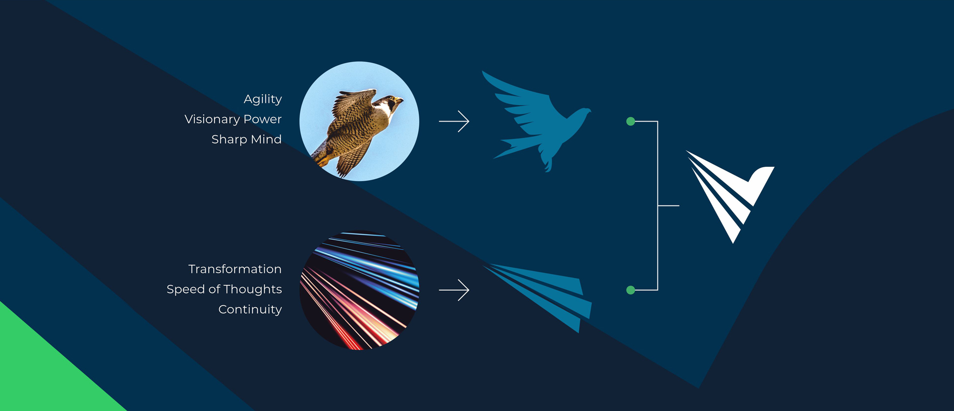
Eteva has helped countless businesses step into the future with its latest solution architecture technologies. The objective was to visually communicate the unique identity of the brand and what it represents. We derived the brand communication based on their innate brand attributes of being an agile, tech expert, visionary with a solution-oriented mindset. A brand that can be trusted by customers for their digital enablement and digital transformation requirements.
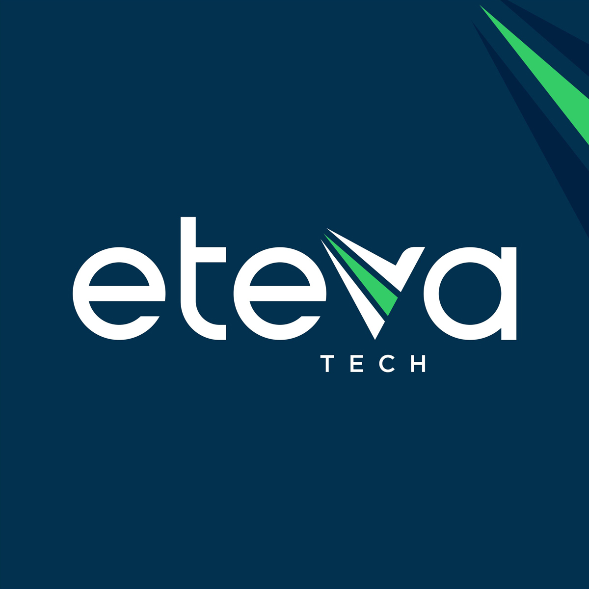
Check out the full case study here, – Eteva Tech
How to Decide the Right Logo for Your Brand?
- Understand why you need a logo?
- Define your brand industry
- Who is your target audience?
- What message do you want to convey to the people?
- Work on the type of design styles?
- Check out your competition.
- Select the right color palettes and typography for your logo.
- And most importantly, always have expert guidance for your logo design.
The point of a logo is to stick to the minds of people. A logo is not what you like and what you don’t. It’s about what works! The logo is as important as the sales pitch you do to your customers. It’s the face of your brand, so make sure you have the best logo that represents your business industry and your values.
Check out some beautiful case studies, where we have built new logos for our clients: case-study
So if you don’t have a logo or you are looking to upgrade your brand logo, head out to our experts, and will connect with you soon!