Charyā Ayurveda
A digital platform which is an ecosystem in itself offering Ayurvedic products, Doctors and appointments along with guidance and counselling.
OUR ROLE
User Interface Design
User Experience Design
Wireframaes
Prototyping
CLIENT

ABOUT CLIENT
Charya is all about leading a healthy lifestyle with as per age old Ayurvedic scriptures which not only helps in curing the most pressing health issue but also assists in preventing any disorder that can occur in future.
They are India’s first comprehensive digital ecosystem for Ayurveda in order to spread its philosophy and create awareness about it to become a guiding beacon for every individual in their daily lives. Charya Ayurveda emphasizes the importance of a holistic approach to health and wellness, including diet, lifestyle, and mindfulness practices. Charya Ayurveda aims to promote Ayurveda as a way of life and a path to optimal health and well-being.
CHALLENGES
Ayurveda is a complex system of medicine that involves a lot of terminology and concepts that may be unfamiliar to users. The UX UI team will need to find ways to present this information in a clear and concise manner that is easy for users to understand.
Ayurveda is not a widely understood concept in some parts of the world. The UX UI team will need to create a design that educates and raises awareness about Ayurveda, its benefits, and how it can be integrated into daily lifestyle.
WHAT WE DID?
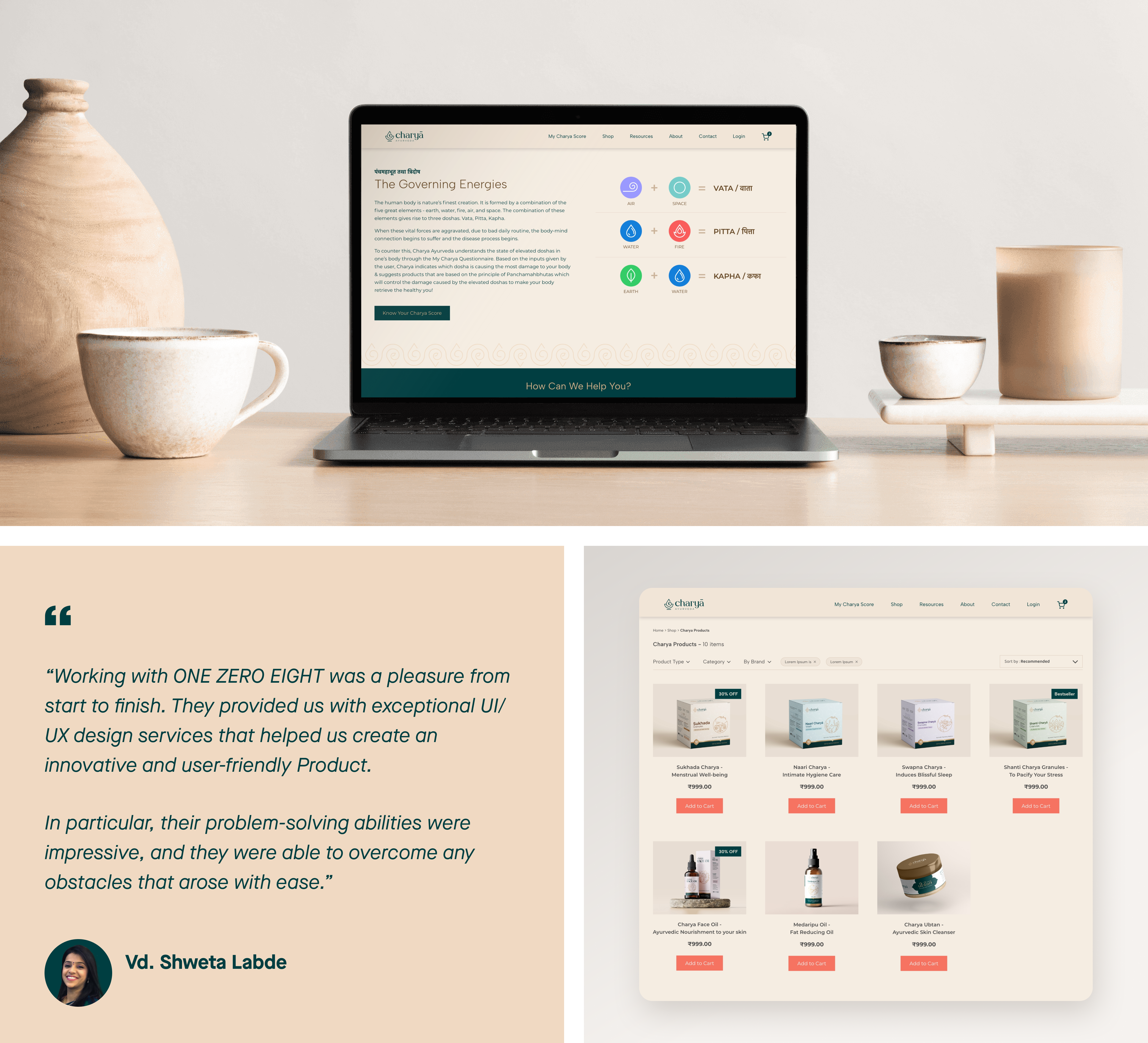
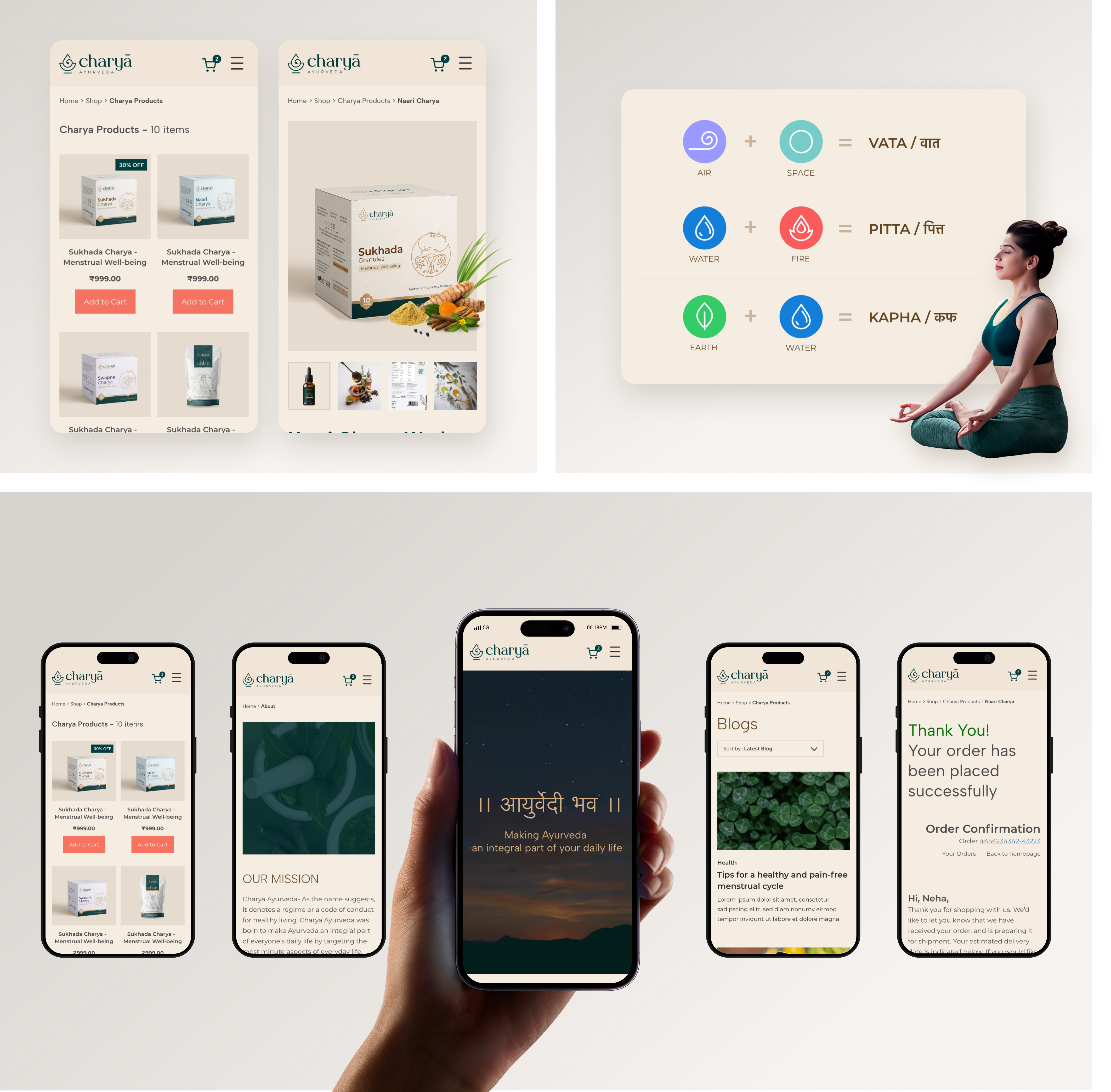
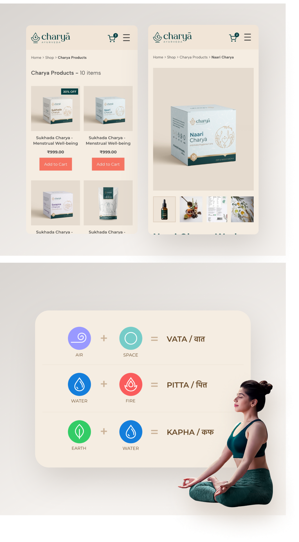
We have focused on using visual aids, such as diagrams and infographics, to help users understand complex concepts. We have also made an effort to use simple language and avoid technical jargon wherever possible.
By using a conversational tone and providing clear explanations, we hope to help users understand Ayurveda’s principles and benefits.
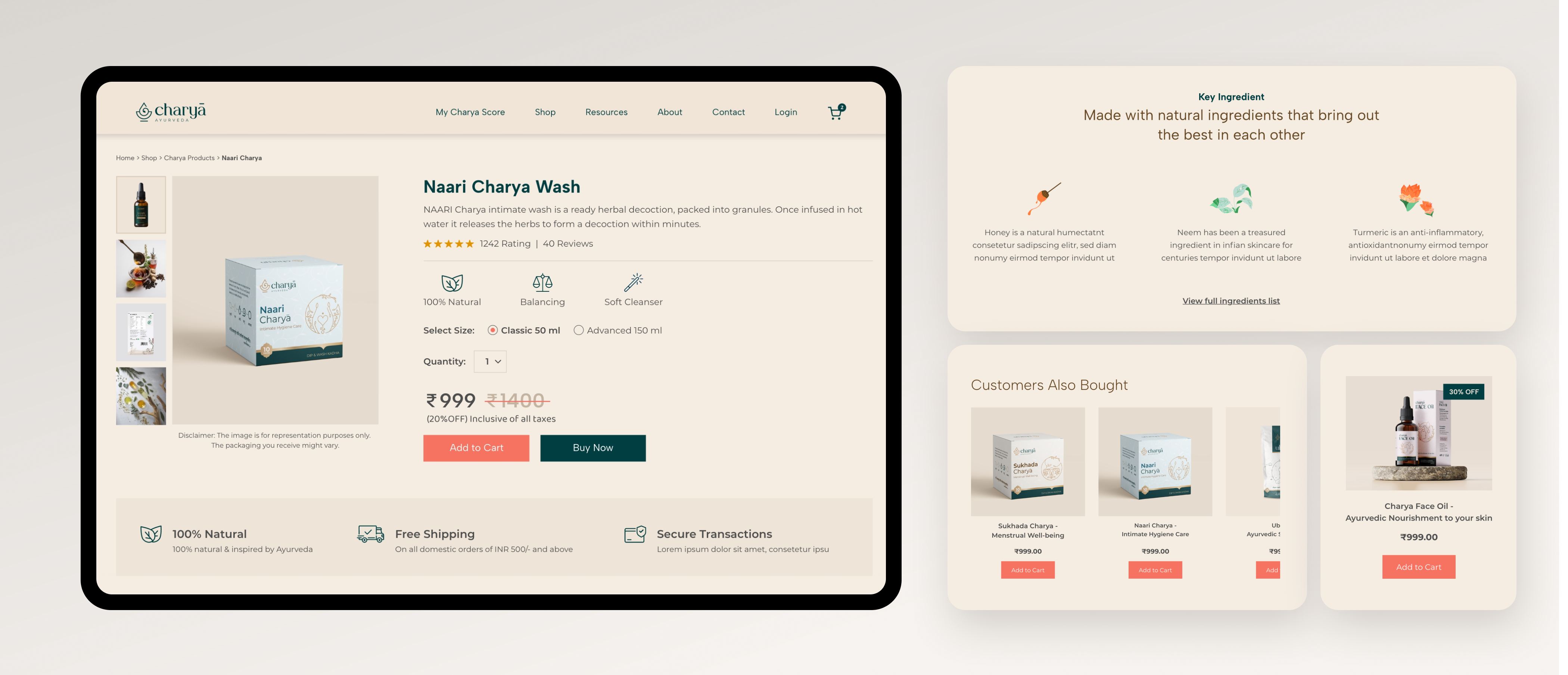
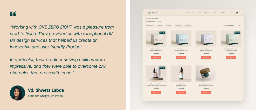
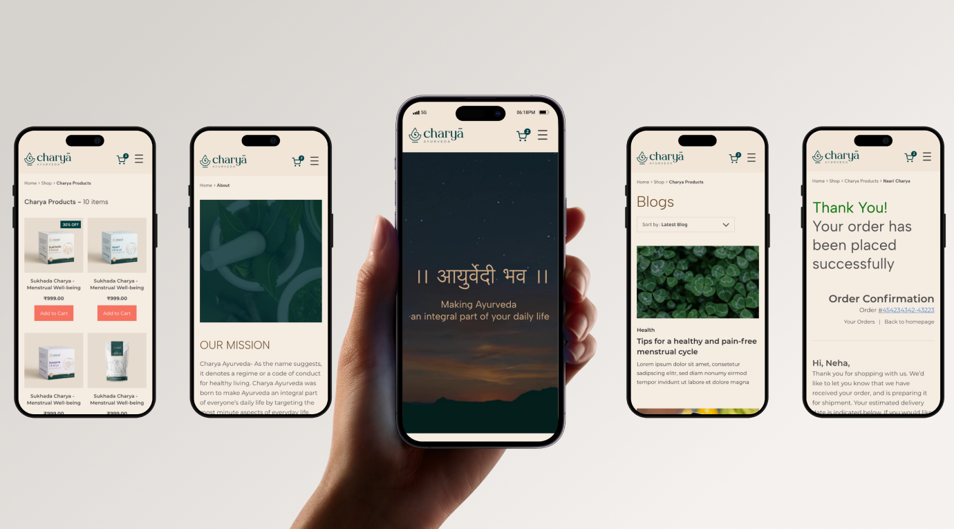
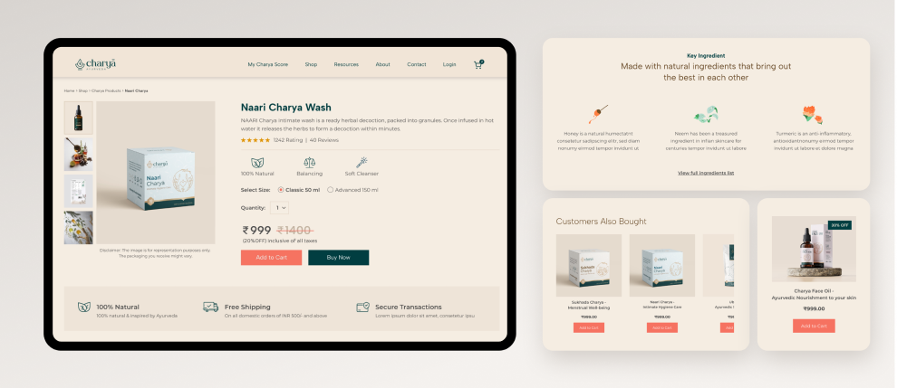
We have also focused on creating an intuitive and user-friendly interface that enables users to easily navigate the website and find the information they need. By using clear and consistent navigation menus, search functionality, and sorting options, we hope to help users find the products and information they need quickly and easily.
EXPERIENCE MAP

PROJECT BRIEF
“To design an eCommerce website that showcases both the products and the holistic principles of Ayurveda.”
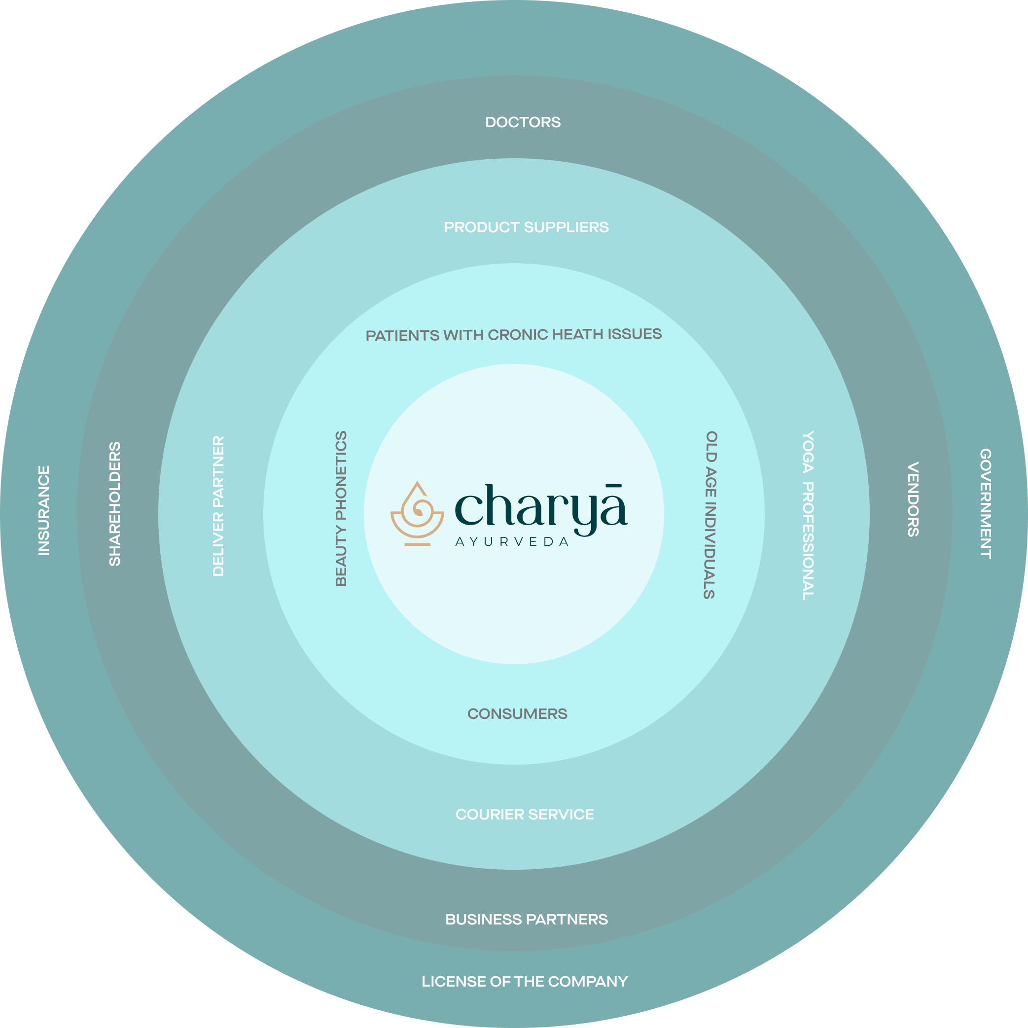
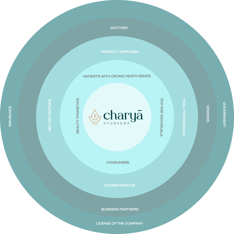
STAKEHOLDER MAPPING
USER PERSONA
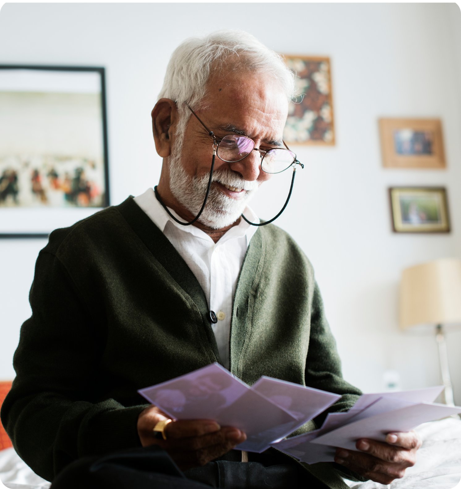
Age: 60-80
Gender: Male/ Female
About:
User persona represents typical myths and problems face by users while using ayurveda products.
Due to old age facing major back and knee pain issues even after doing yoga daily with medical supervision.
Emotion graph:

- Need product which can help heal body pain.
- needs guidance regrading daily diet, which food and supplements to consume to reduce pain.
- Need guidance and effective product to reduce weight loss.
- In search of products to improve skin and overall health.
- Has a concern weather the Aryurvedic products used by have 100% natural ingredients.
- They are tedious to use and takes long time to show visible results.
- Doesn’t have a clear route on how to use the products.
- started doing yoga everyday but due to body pain facing difficulty in performing all asanas.
USER JOURNEY
of seeking information about the brand
INFORMATION ARCHITECTURE
Low Fidelity Wireframes


Charyā Ayurveda
A digital platform which is an ecosystem in itself offering Ayurvedic products, Doctors and appointments along with guidance and counselling.
OUR ROLE
User Interface Design
User Experience Design
Design System Language
Wireframaes
Prototyping
About Client
Charya is all about leading a healthy lifestyle with as per age old Ayurvedic scriptures which not only helps in curing the most pressing health issue but also assists in preventing any disorder that can occur in future.
They are India’s first comprehensive digital ecosystem for Ayurveda in order to spread its philosophy and create awareness about it to become a guiding beacon for every individual in their daily lives. Charya Ayurveda emphasizes the importance of a holistic approach to health and wellness, including diet, lifestyle, and mindfulness practices. Charya Ayurveda aims to promote Ayurveda as a way of life and a path to optimal health and well-being.
Challenges
Ayurveda is a complex system of medicine that involves a lot of terminology and concepts that may be unfamiliar to users. The UX UI team will need to find ways to present this information in a clear and concise manner that is easy for users to understand.
Ayurveda is not a widely understood concept in some parts of the world. The UX UI team will need to create a design that educates and raises awareness about Ayurveda, its benefits, and how it can be integrated into daily lifestyle.
What We Did?
We have focused on using visual aids, such as diagrams and infographics, to help users understand complex concepts. We have also made an effort to use simple language and avoid technical jargon wherever possible.
By using a conversational tone and providing clear explanations, we hope to help users understand Ayurveda’s principles and benefits.
We have also focused on creating an intuitive and user-friendly interface that enables users to easily navigate the website and find the information they need. By using clear and consistent navigation menus, search functionality, and sorting options, we hope to help users find the products and information they need quickly and easily.
Experience Map
Project Brief
Stakeholder Mapping
User Persona
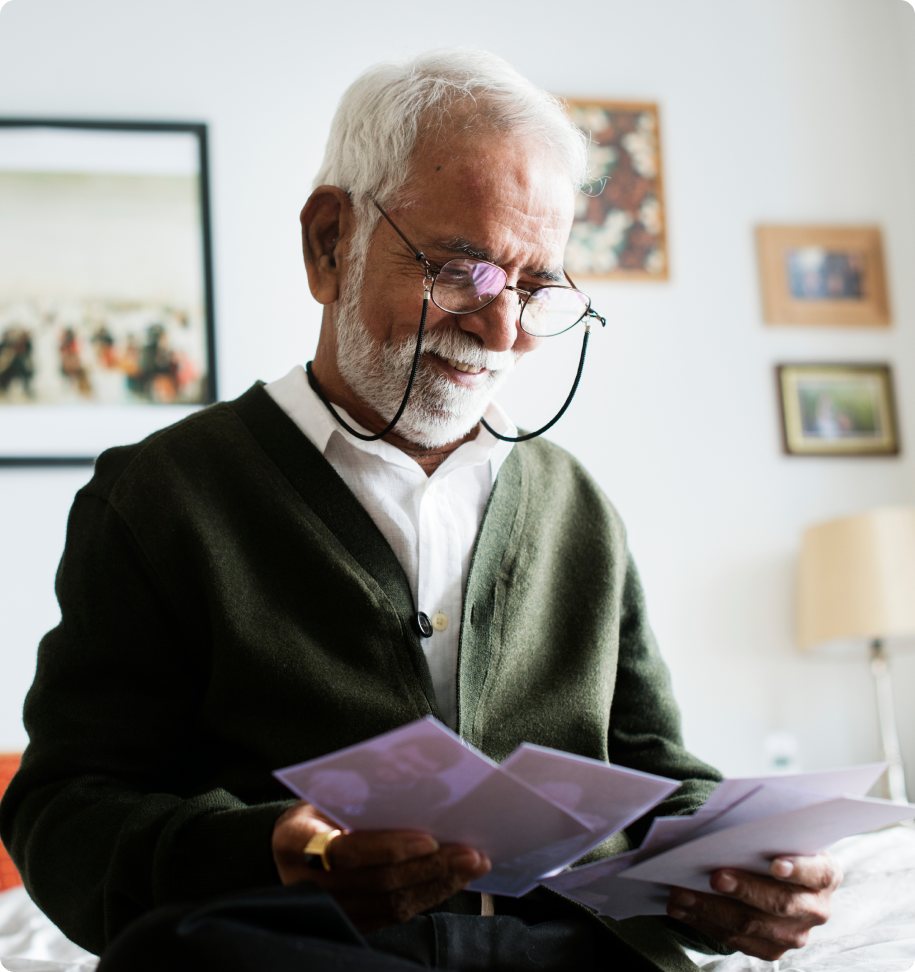
Age: 25-45
Gender: Male/ Female
About:
User persona represents typical myths and problems face by users while using ayurveda products.
Due to old age facing major back and knee pain issues even after doing yoga daily with medical supervision.
Goals & Needs:
- Need product which can help heal body pain.
- Needs guidance regrading daily diet, which food and supplements to consume to reduce pain.
- Need guidance and effective product to reduce weight loss.
- In search of products to improve skin and overall health.
Pain Points:
- Has a concern weather the Aryurvedic products used by have 100% natural ingredients.
- They are tedious to use and takes long time to show visible results.
- Doesn’t have a clear route on how to use the products.
- started doing yoga everyday but due to body pain facing difficulty in performing all asanas.
Emotion graph:

User Journey
of seeking information about the brand
Information Architecture
low fidelity wireframes

OTHER PROJECTS
