CREDAI Pune Coffee Table Book: Capturing the City in Print. Pune's Story, in One Volume

CREDAI Pune Coffee Table Book: Capturing the City in Print. Pune's Story, in One Volume

Services

Marketing | Creative Design

Sector

Publishing & Media

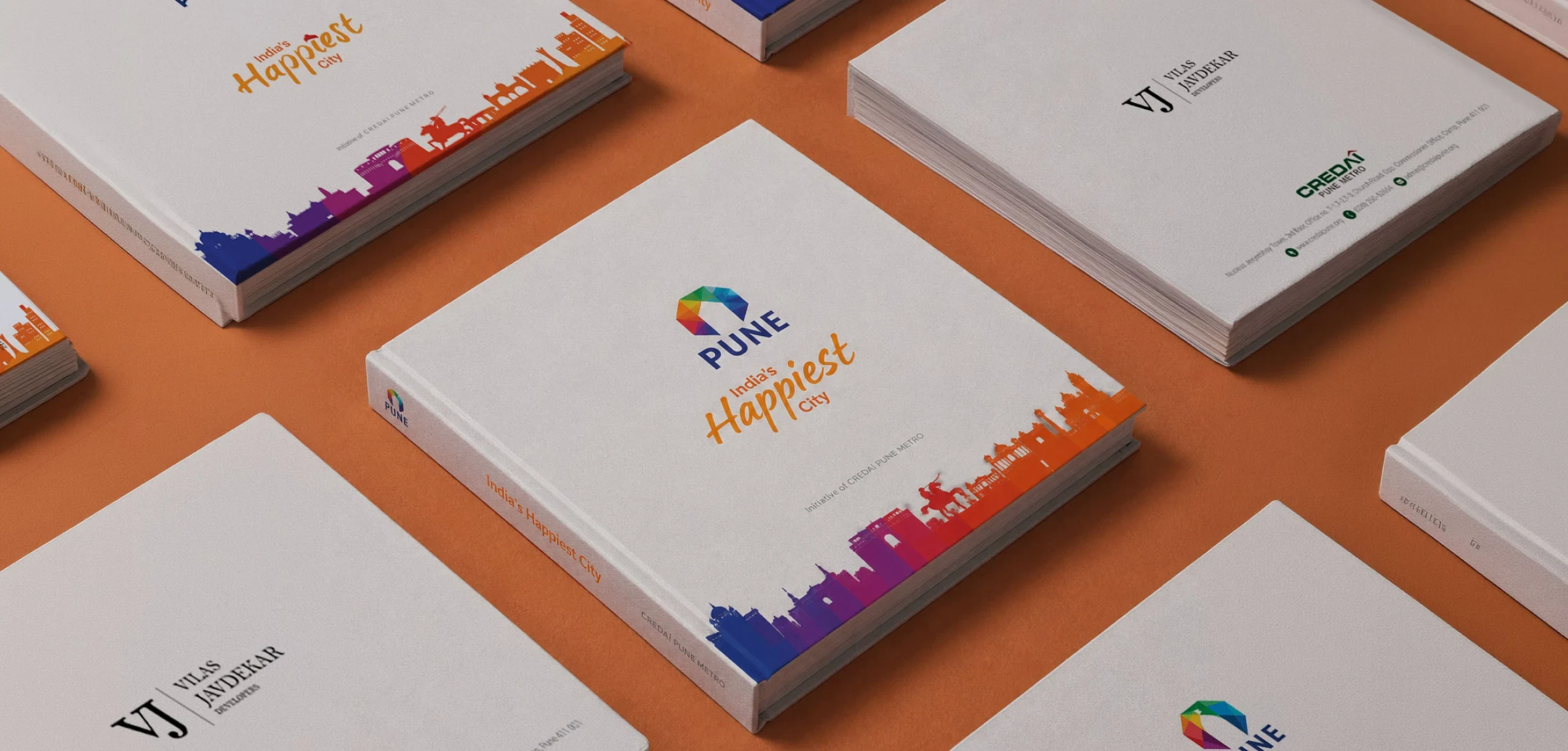
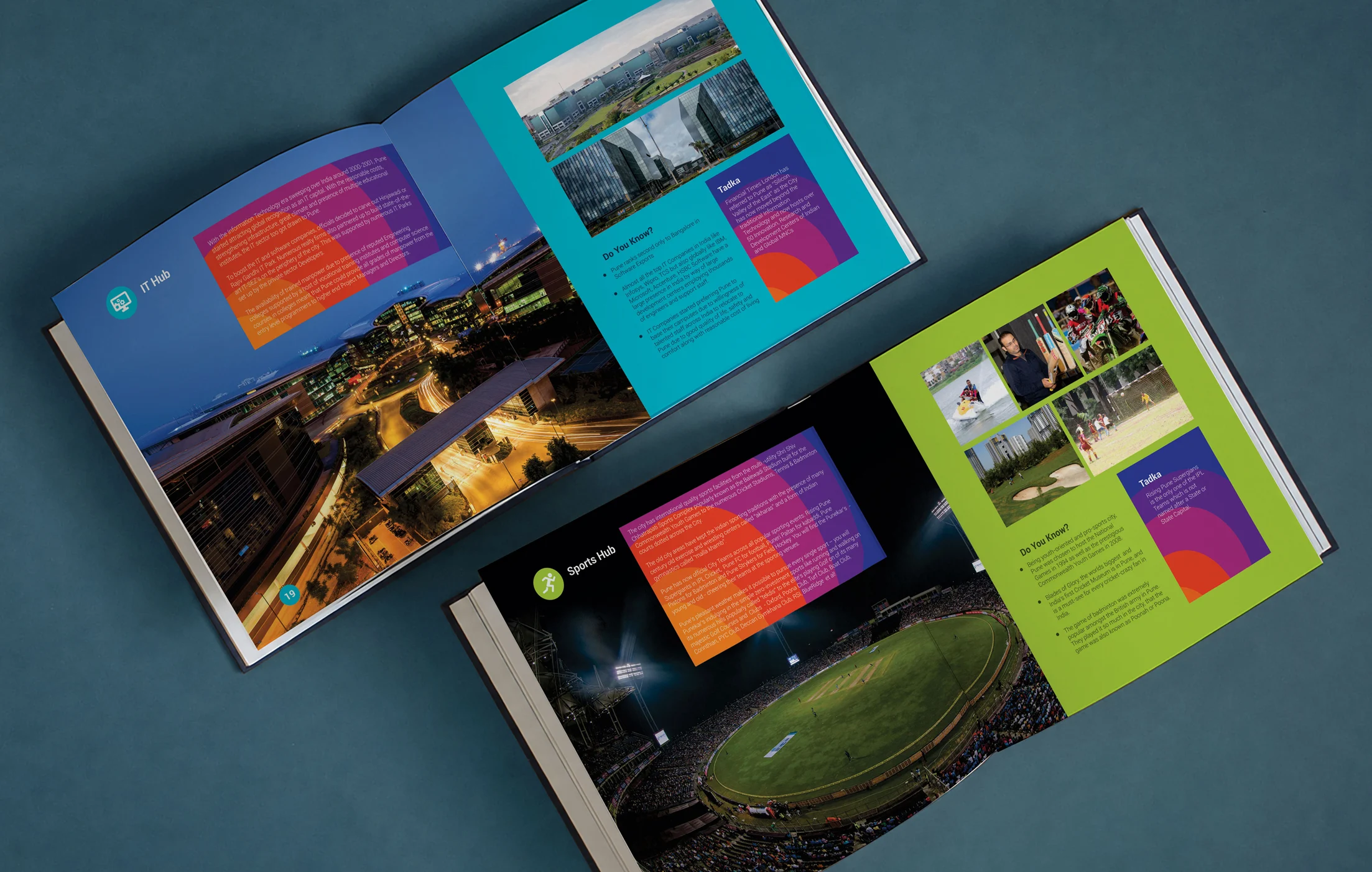
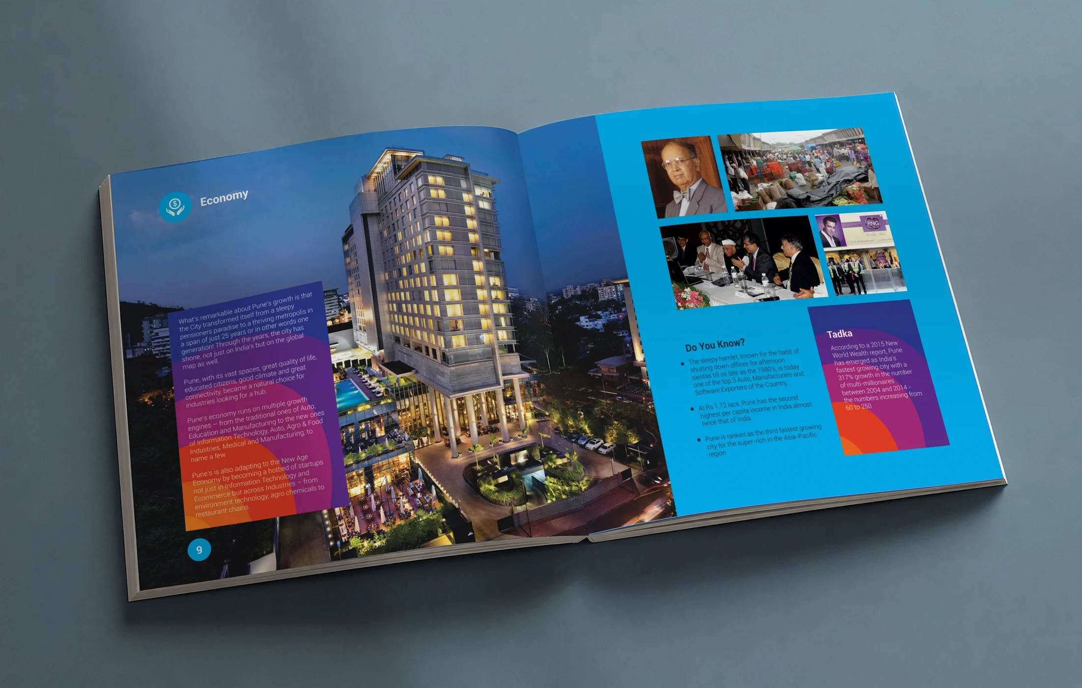
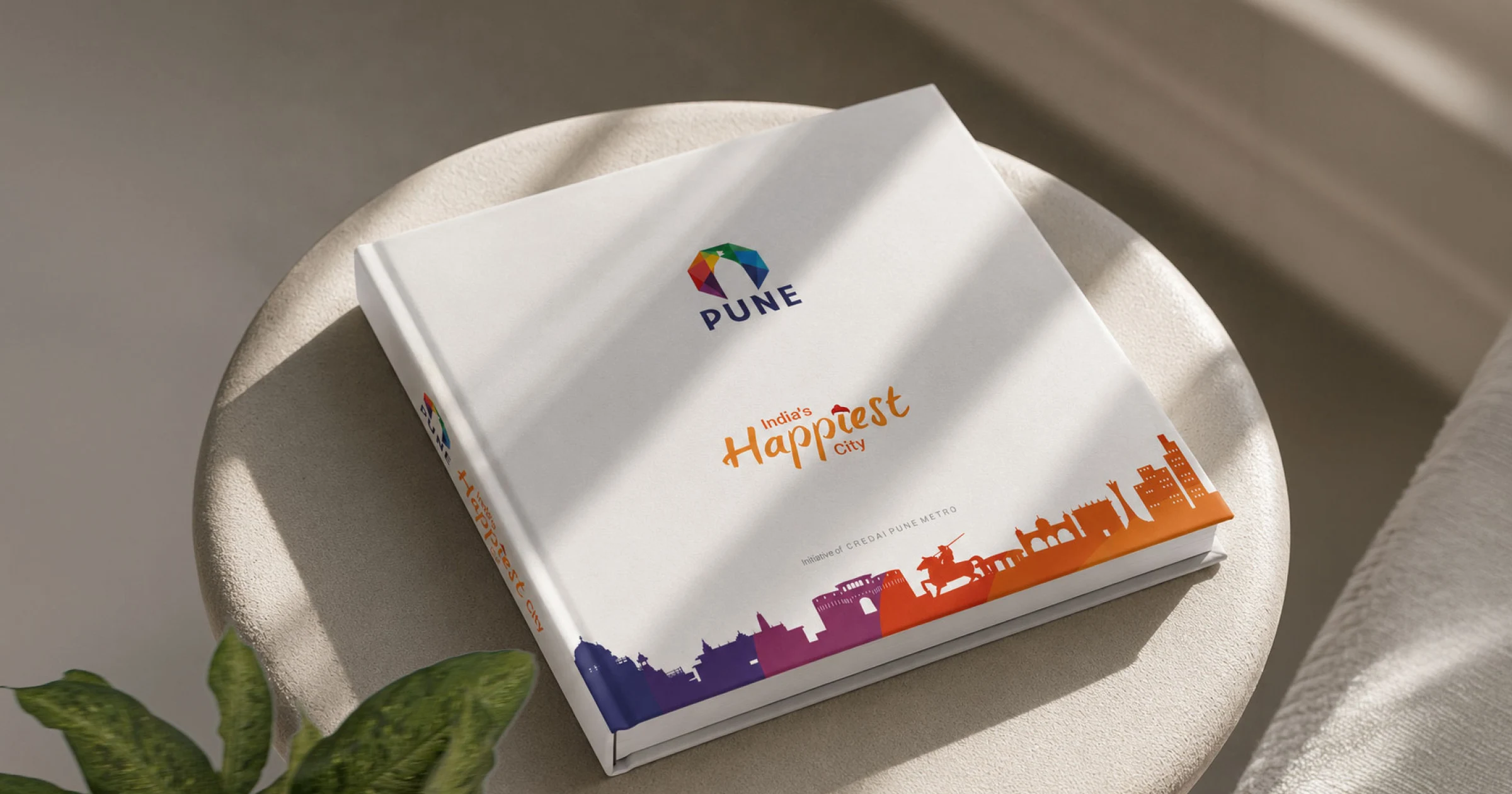
The CREDAI Pune Coffee Table Book is a premium hardbound publication that captures the city's culture, heritage, architecture, and evolving urban identity. Commissioned by CREDAI Pune, it gathers the city's stories, photography, and local insight into a single collectible volume a tactile tribute designed to be displayed, gifted, and returned to by residents, visitors, and businesses alike.

02 - THE CHALLENGE

01 - THE CHALLENGE

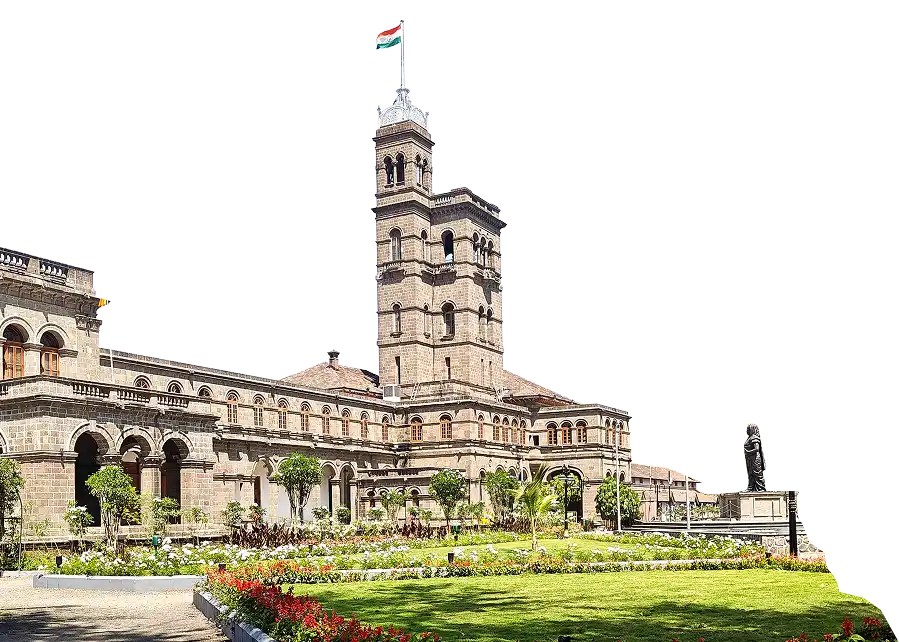
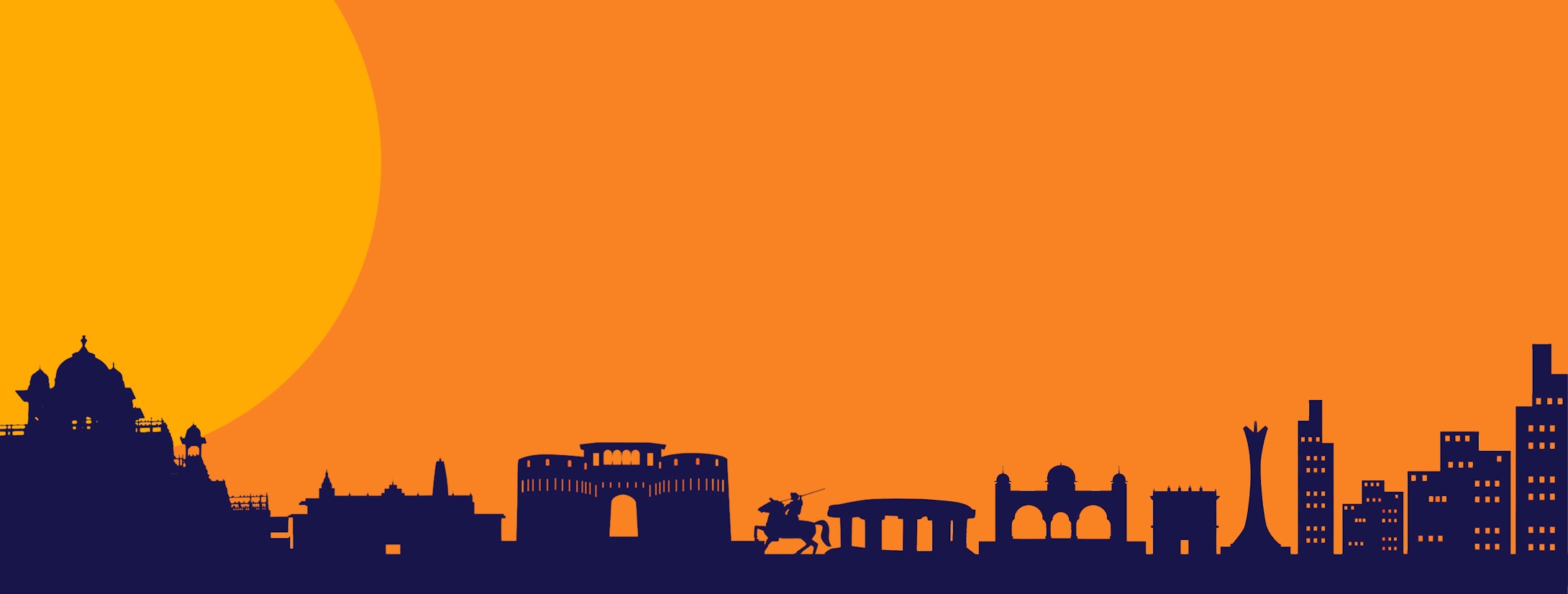
Pune is a city of layers centuries of heritage, colonial-era architecture, and a fast-rising contemporary identity, often coexisting on the same street. The task was to weave all of it into one cohesive narrative, and give it a design language premium enough to belong on a coffee table, not a bookshelf.

02 - THE OBJECTIVES

02 - THE OBJECTIVES

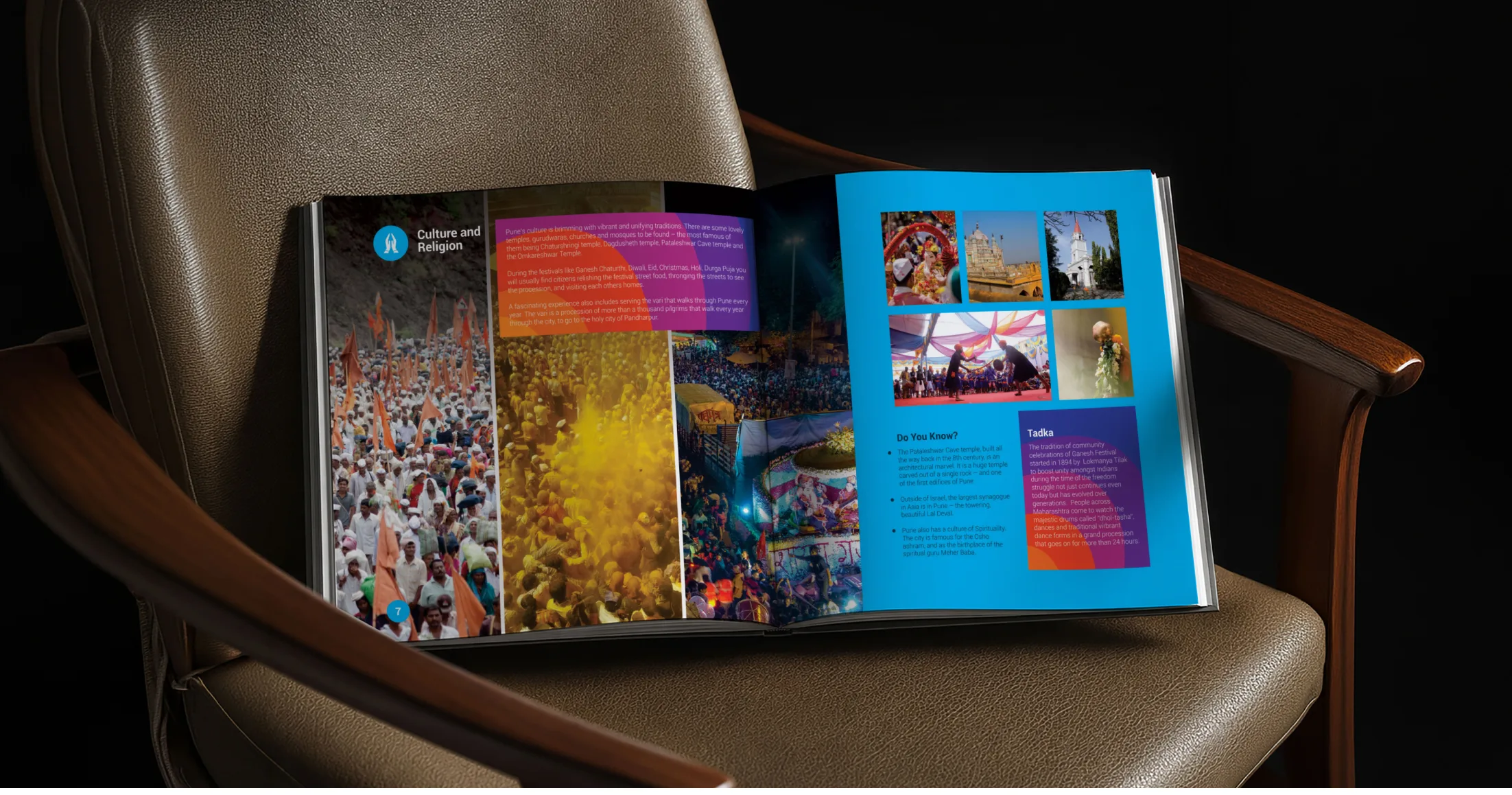
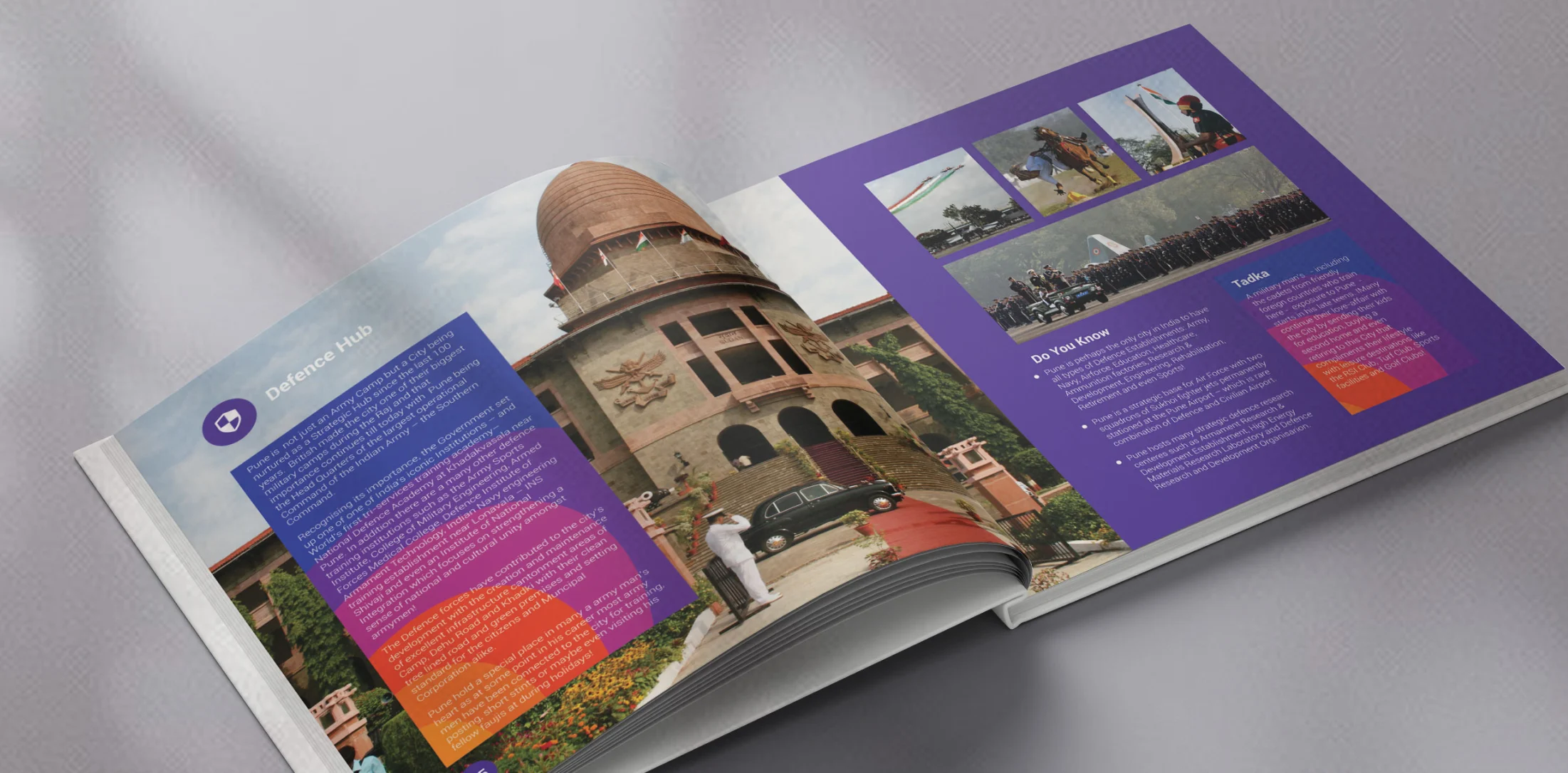
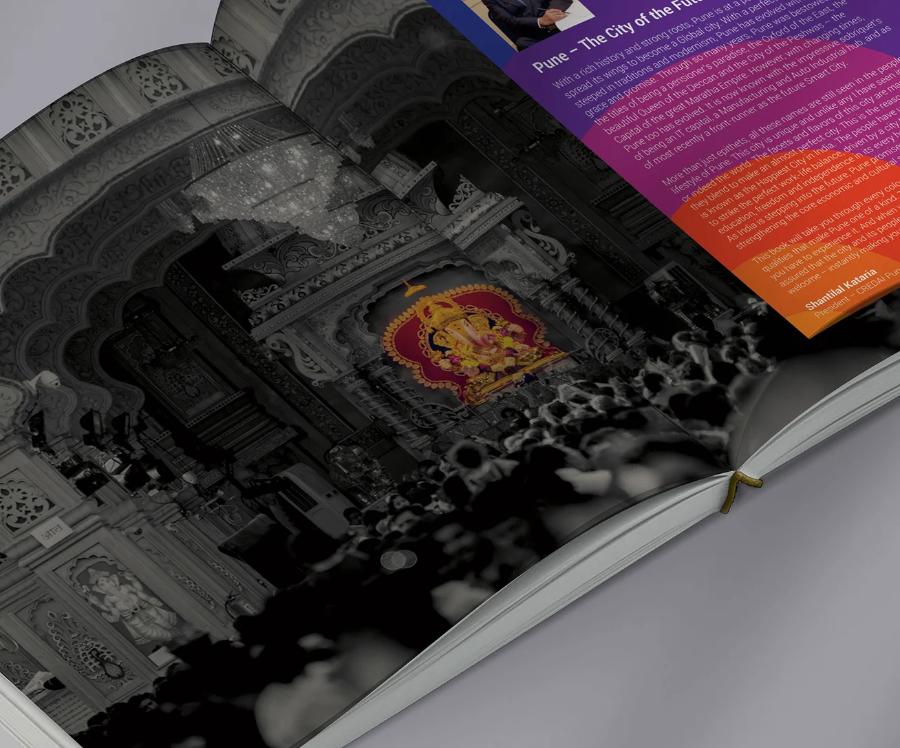
The book had to read less like a corporate publication and more like a keepsake. Every spread needed to balance editorial storytelling with visual richness, pacing photography, text, and white space so the reader moves through Pune the way one wanders the city itself: unhurried, and always finding something new.
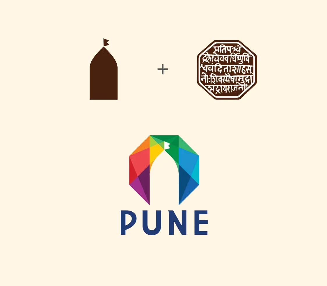
03 - THE LOGO

The logo was built from two specific sources - not as decoration, but as structural argument.

The Wada Form
Inspired by the traditional Pune Wada - its arched portals and inward structure - the mark draws from the city’s earliest architectural identity and sense of community.

The Rajmudra Structure
Referencing Shivaji Maharaj’s Rajmudra, the form adopts the logic of a seal - contained, authoritative, and enduring - bringing institutional weight to the identity.

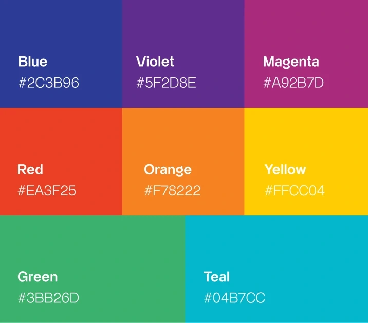
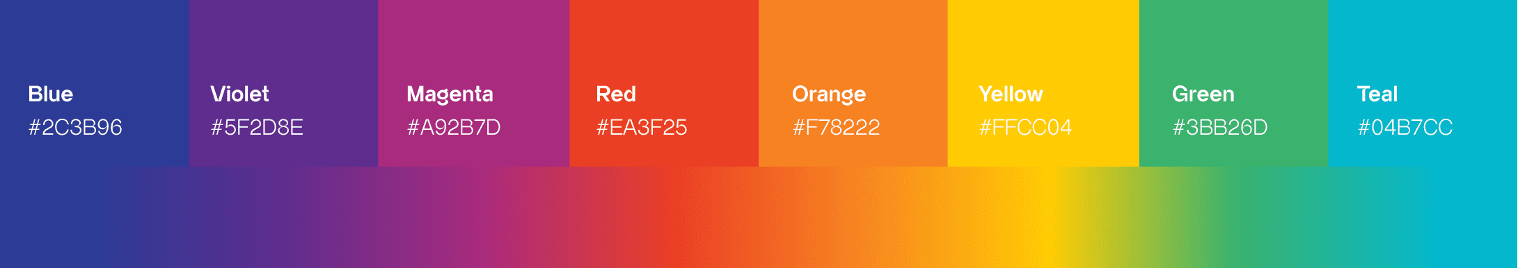
04 - THE PATTERN & COLOUR

The Pattern

The pattern traces Pune’s skyline as a continuous silhouette - moving from Wadas, temples, and historic gateways to modern civic structures and towers. At its centre stands the equestrian figure of Shivaji Maharaj, acting as the bridge between heritage and progress.

Rendered in the same indigo-to-saffron gradient as the logo, the pattern becomes a secondary identity system - used across the book to create a visual language that feels distinctly Punekar without repeating the mark itself.

The Colour

The chapter colour system inside the book draws from this same palette - assigning specific colours to specific subjects based on their emotional register. History takes indigo and orange. Culture takes magenta and violet. The civic hubs shift into teal and cobalt. The spectrum is the city; the city is the palette.

The Pattern

The pattern traces Pune's skyline as a continuous silhouette, moving from wadas, temples, and historic gateways to modern civic structures and towers. At its centre stands the equestrian figure of Bajirao Peshwa, anchoring the city's story as it moves from heritage to modern skyline.

Rendered in the same indigo-to-saffron gradient as the logo, the pattern becomes a second identity system, used across the book to create a visual language that feels distinctly Puneri without repeating the mark itself.

The Colour

The chapter colour system inside the book draws from this same palette - assigning specific colours to specific subjects based on their emotional register. History takes indigo and orange. Culture takes magenta and violet. The civic hubs shift into teal and cobalt. The spectrum is the city; the city is the palette.

05 - BRAND COMMUNICATION

The brand communication strategy focused on presenting Pune’s identity through premium storytelling, strong visual narratives, and engaging editorial content. A refined tone, immersive imagery, and structured messaging were used to connect with residents, visitors, businesses, and cultural enthusiasts.

Explore More Work

For Business Enquiry

Govind Kabade

+91 98238 71759

govind@onezeroeight.in

For Career Opportunities

HR

+91 86683 46464

join@onezeroeight.in

Follow us on

© OneZeroEight Brandcomm Ltd.

We Help You Grow

Let’s Get In Touch

For Business Enquiry

Govind Kabade

+91 98238 71759

govind@onezeroeight.in

For Career Opportunities

HR

+91 86683 46464

join@onezeroeight.in

Follow us on

© OneZeroEight Brandcomm Ltd.

We Help You Grow

Let’s Get In Touch

For Business Enquiry

Govind Kabade

+91 98238 71759

govind@onezeroeight.in

For Career Opportunities

HR

+91 86683 46464

join@onezeroeight.in

Follow us on

© OneZeroEight Brandcomm Ltd.

We Help You Grow

Let’s Get In Touch

We Help

You Grow

Follow us on

© OneZeroEight Brandcomm Ltd.

For Business Enquiry

Govind Kabade

+91 98238 71759

govind@onezeroeight.in

For Career Opportunities

HR

+91 86683 46464

join@onezeroeight.in