Decoding Hick’s Law: A Strategic Approach to Smarter UX Design

When users interact with a digital interface, their decision-making ability hinges on the number and presentation of available options. Hick’s Law offers a psychological lens to understand this process, revealing how excessive choices can overwhelm users and disrupt their journey. For OneZeroEight, where impactful design drives meaningful user experiences, applying Hick’s Law strategically is essential to crafting interfaces that simplify decision-making and amplify engagement.

Design is intelligence made visible,” said a renowned designer, and this principle aligns with the laws of UX, which emphasize the importance of simplifying choices and guiding users to make faster decisions.

In this article, we delve into the nuances of Hick’s Law, explore its implications for UX design, and share actionable insights to enhance user satisfaction.

The Core of Hick’s Law

Simplifying Decisions, One Choice at a Time

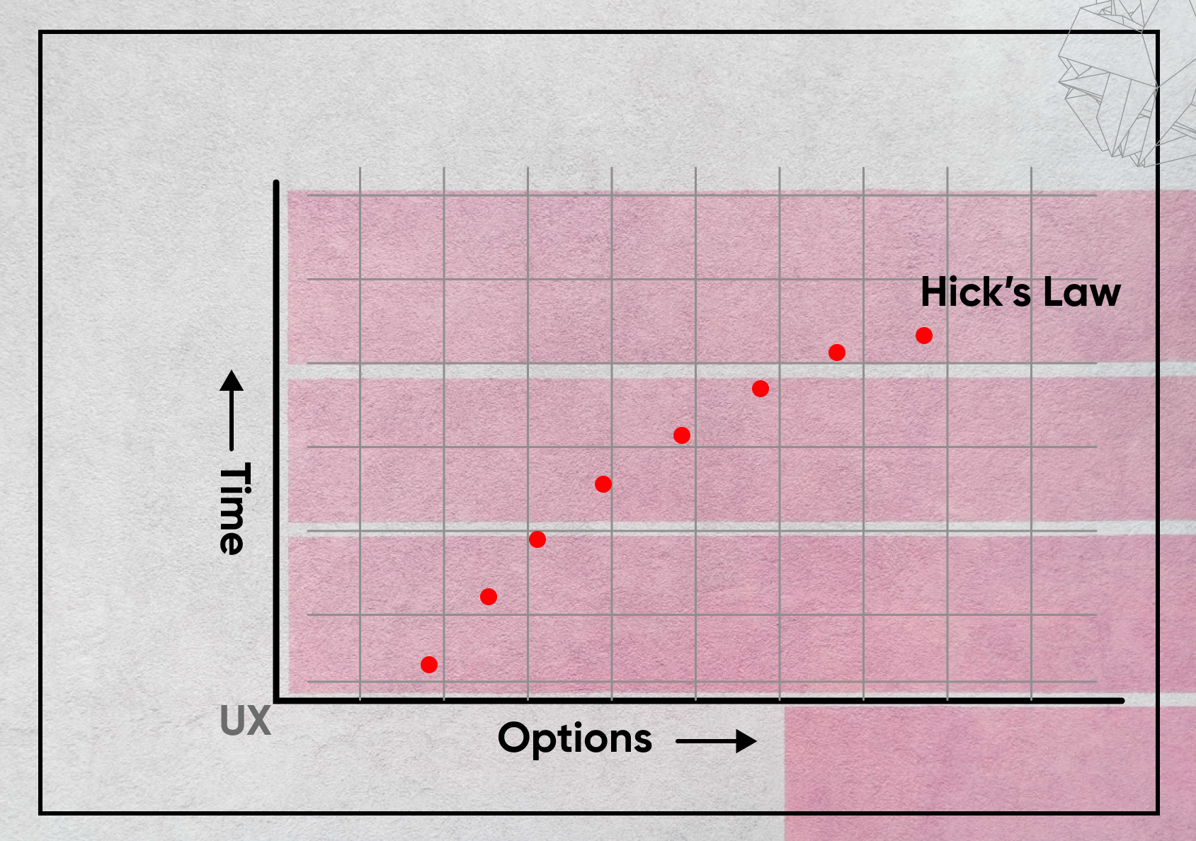
At its essence, Hick’s Law, one of the fundamental laws of UX design, states that the time required to make a decision increases logarithmically as the number of available options grows. This principle, backed by research from William Edmund Hick and Ray Hyman, underscores the cognitive burden that multiple choices impose on users.
Imagine navigating an app with just two options—Home and Personalized Quick Links. The decision is instantaneous. But expand this to 15 navigation choices and the cognitive load skyrockets. Hick’s Law provides designers with a roadmap to minimize this friction, optimizing interfaces for clarity and speed.

From Theory to Practice: Applying Hick’s Law in UX Design

1. Streamline Navigation with Purpose

Cluttered menus and excessive options can overwhelm users, slowing their interactions. A streamlined navigation strategy—leveraging techniques like categorization or collapsible menus often guided by the principles of the Atomic Design System—can help declutter the user interface while keeping key actions accessible.

Example: Instead of a sprawling homepage, organize options into intuitive categories and subcategories. Hamburger menus, though classic, remain effective for this purpose.

2. Create Logical Groupings

Grouping related options not only reduces the cognitive load but also guides users naturally through their journey. For instance, on an e-commerce platform, segmenting products by gender, occasion, or style simplifies decision-making and enhances user satisfaction. A strategy grounded in the laws of UX, prioritizing clarity and ease.

3. Prioritize with Precision

In UX design, hierarchy matters. Highlighting essential actions—such as a prominent “Buy Now” button—while de-emphasizing secondary options ensures users focus on what matters most, speeding up their decisions.
Example: A checkout page should emphasize the “Proceed to Checkout” button while subtly presenting “Continue Shopping” as a secondary option.

4. Embrace Progressive Disclosure

Progressive disclosure aligns perfectly with Hick’s Law by presenting information incrementally. This approach prevents users from feeling overwhelmed, particularly in onboarding flows or multi-step processes, where revealing fields or options gradually can enhance usability.

Overcoming Challenges in Applying Hick’s Law

While Hick’s Law is invaluable, it’s not a one-size-fits-all solution. Factors like user familiarity, interface clarity, and task complexity also influence decision-making. For instance, Human-computer interaction plays a key role in how users adapt to complex interfaces, especially when dealing with multiple choices or intricate navigation. While minimalism works well for simple tasks, more complex scenarios like product customization require users to evaluate several variables.
while minimalism works well for straightforward navigation, complex scenarios—like product customization—may still require users to evaluate multiple variables.

Additionally, modern tools like recommendation engines and personalized search results help users bypass choice overload by curating options tailored to their preferences. For OneZeroEight, blending these innovations with the laws of UX, such as Hick’s Law, ensures we stay at the forefront of user-centric design.  Learn Human-computer interaction!

Example of Hick’s Law

If you remember Google’s homepage back in 1998, it was filled with options—search, email, “I’m Feeling Lucky,” “About Google,” and more. Fast forward to today, and it’s much simpler—just the search bar, “I’m Feeling Lucky,” and language settings. By reducing the choices, Google helps you make decisions faster and with less effort. That’s Hick’s Law at work—fewer choices, quicker decisions!

Conclusion

Hick’s Law is more than just a theory; it’s a practical framework for creating intuitive, efficient, and user-friendly interfaces. By reducing choice overload, prioritizing key actions, and organizing information effectively, we empower users to make decisions quickly and confidently. At OneZeroEight, every design decision reflects our commitment to simplifying complexity and delivering exceptional user experiences.