
Building a Unified Identity
for an Engineering Ecosystem
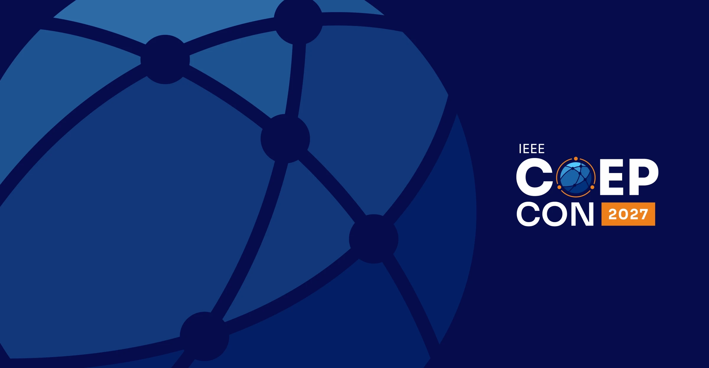
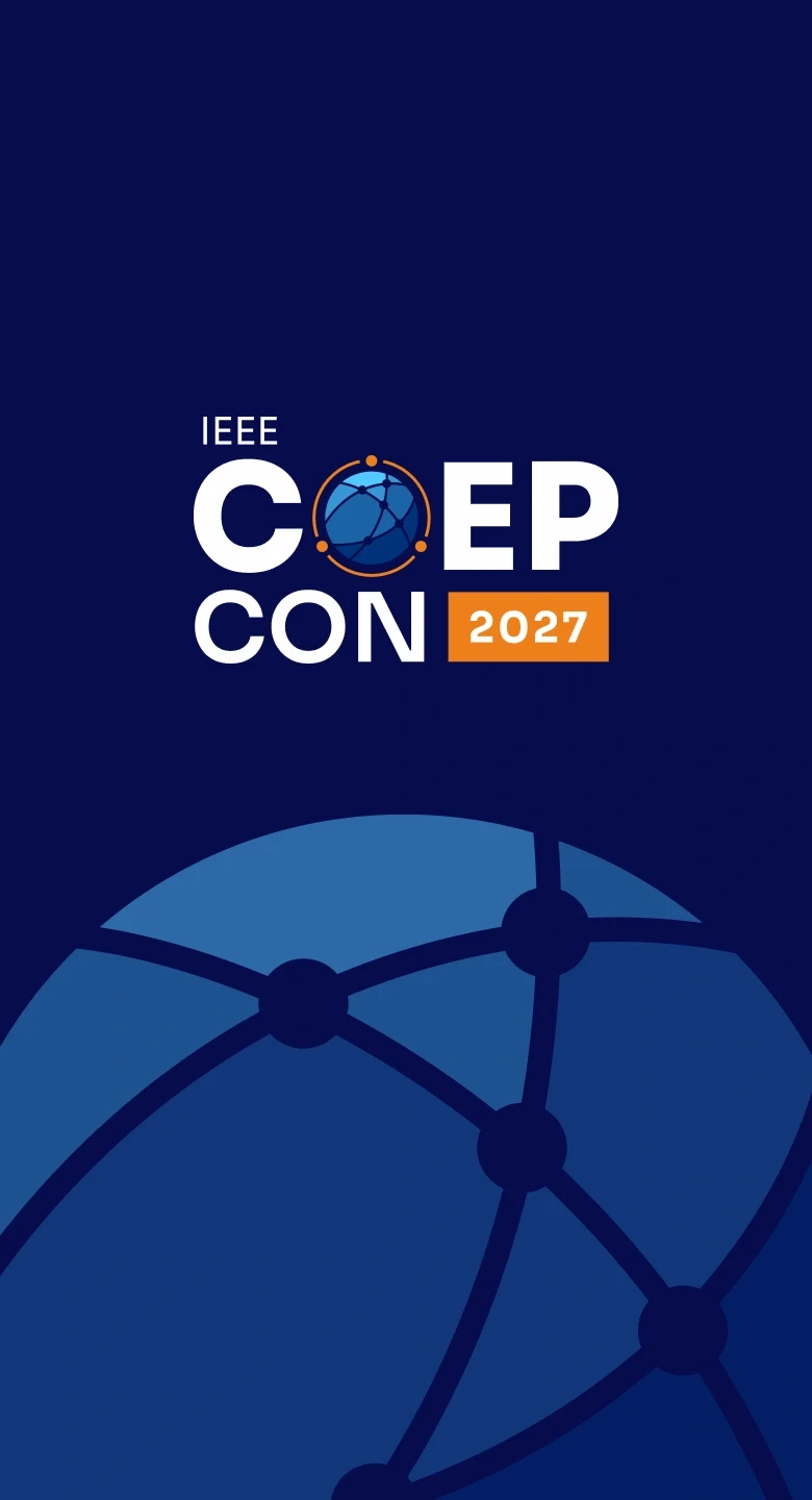
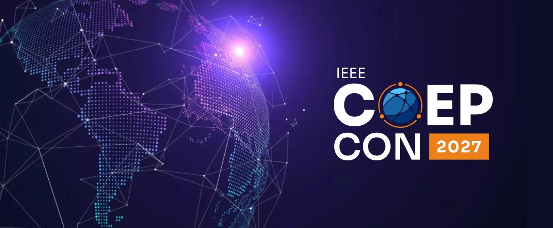
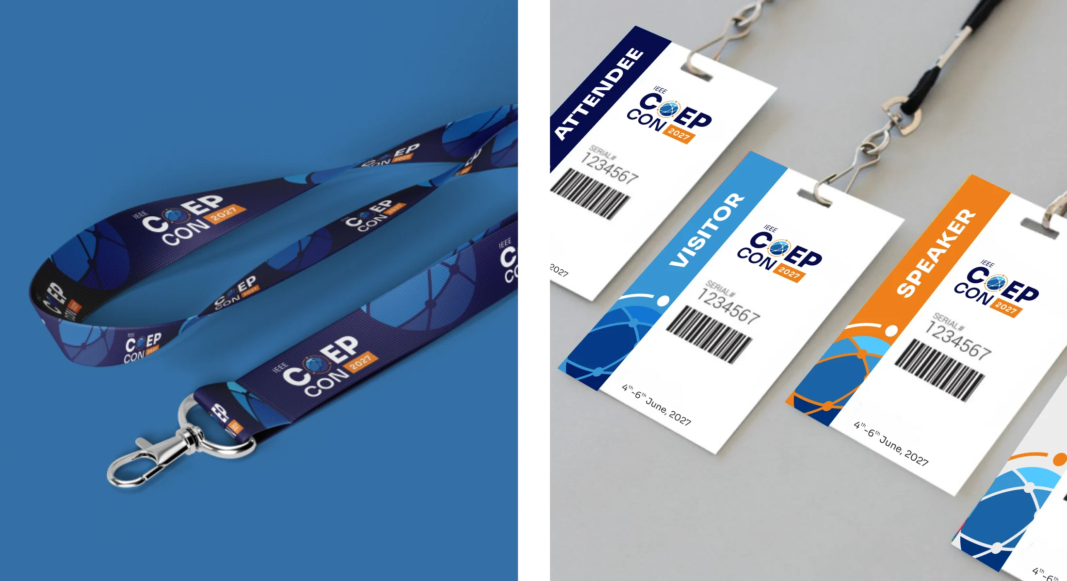
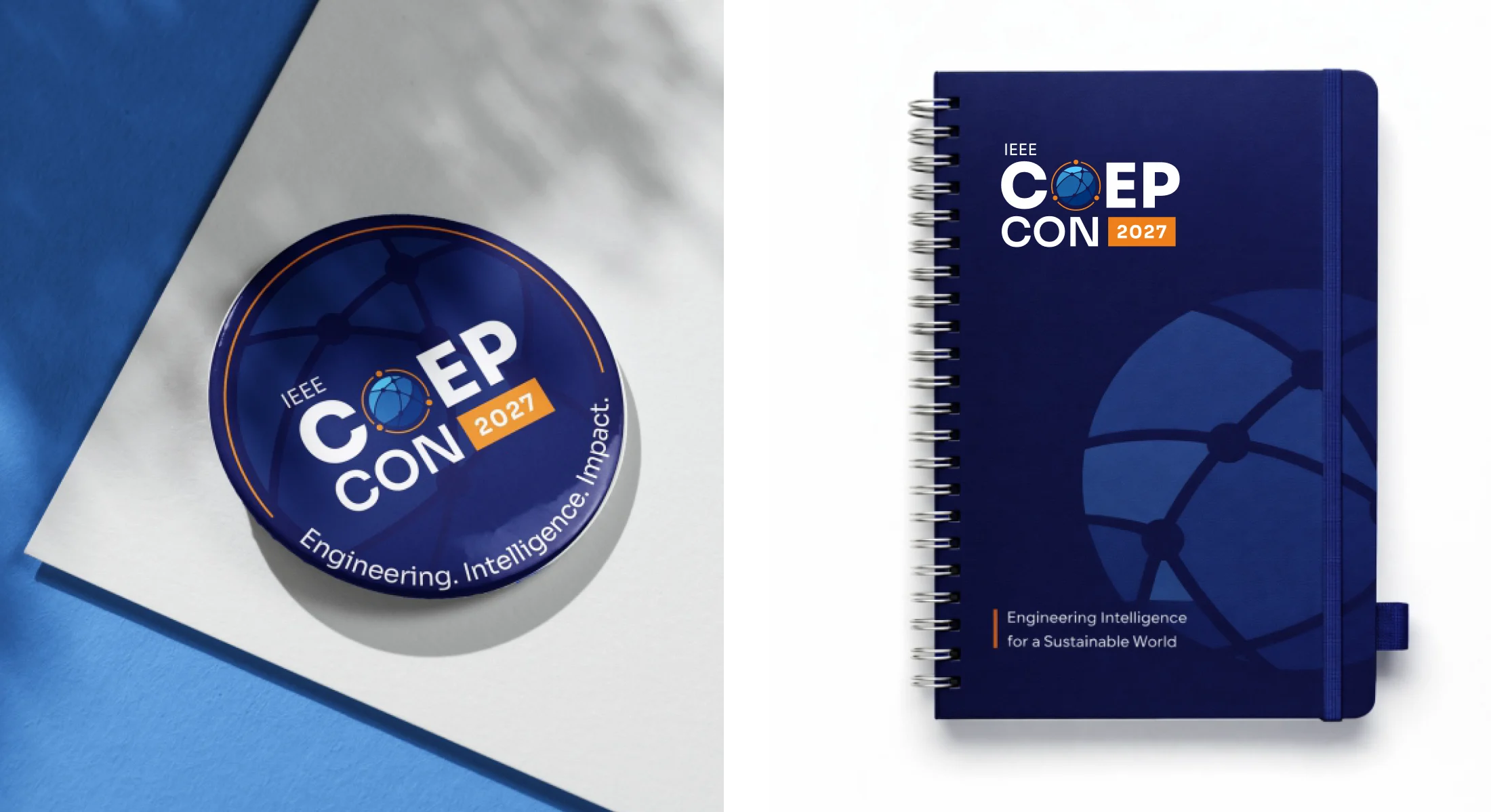
An identity system designed to position COEP CON 2027 as a global engineering platform. From the conference logo and presentation ecosystem to digital experiences and event touchpoints, the project established a unified visual language that later evolved into the ApniLeap Industry-Academia collaboration programme.


02 - THE CHALLENGE
01 - Multiple Audiences
Appeal to researchers, academicians, industry leaders, and innovation partners through a single visual language.
02 - Scalable Across Touchpoints
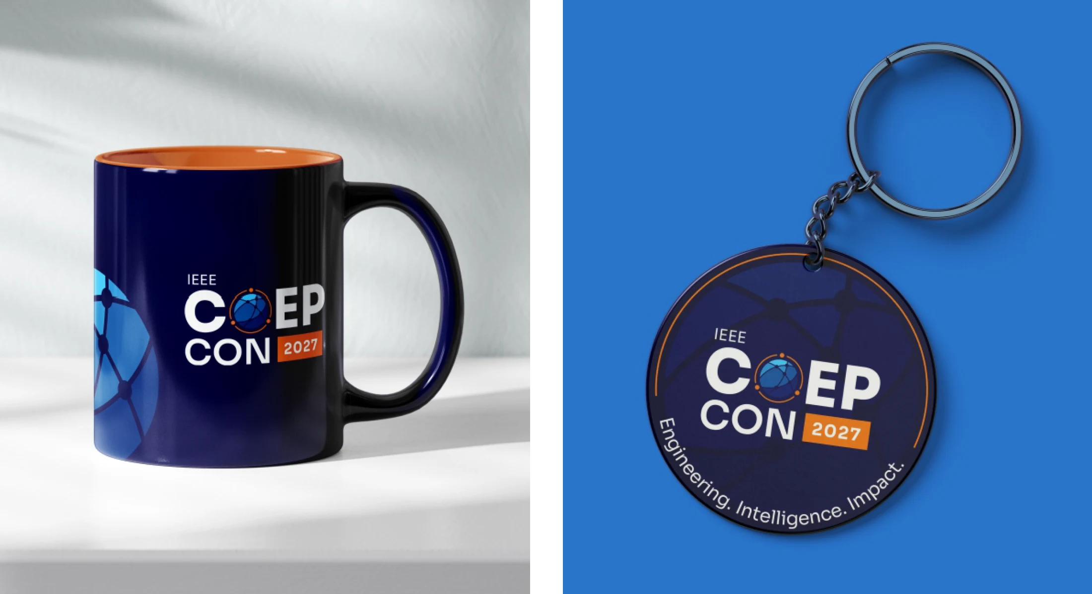
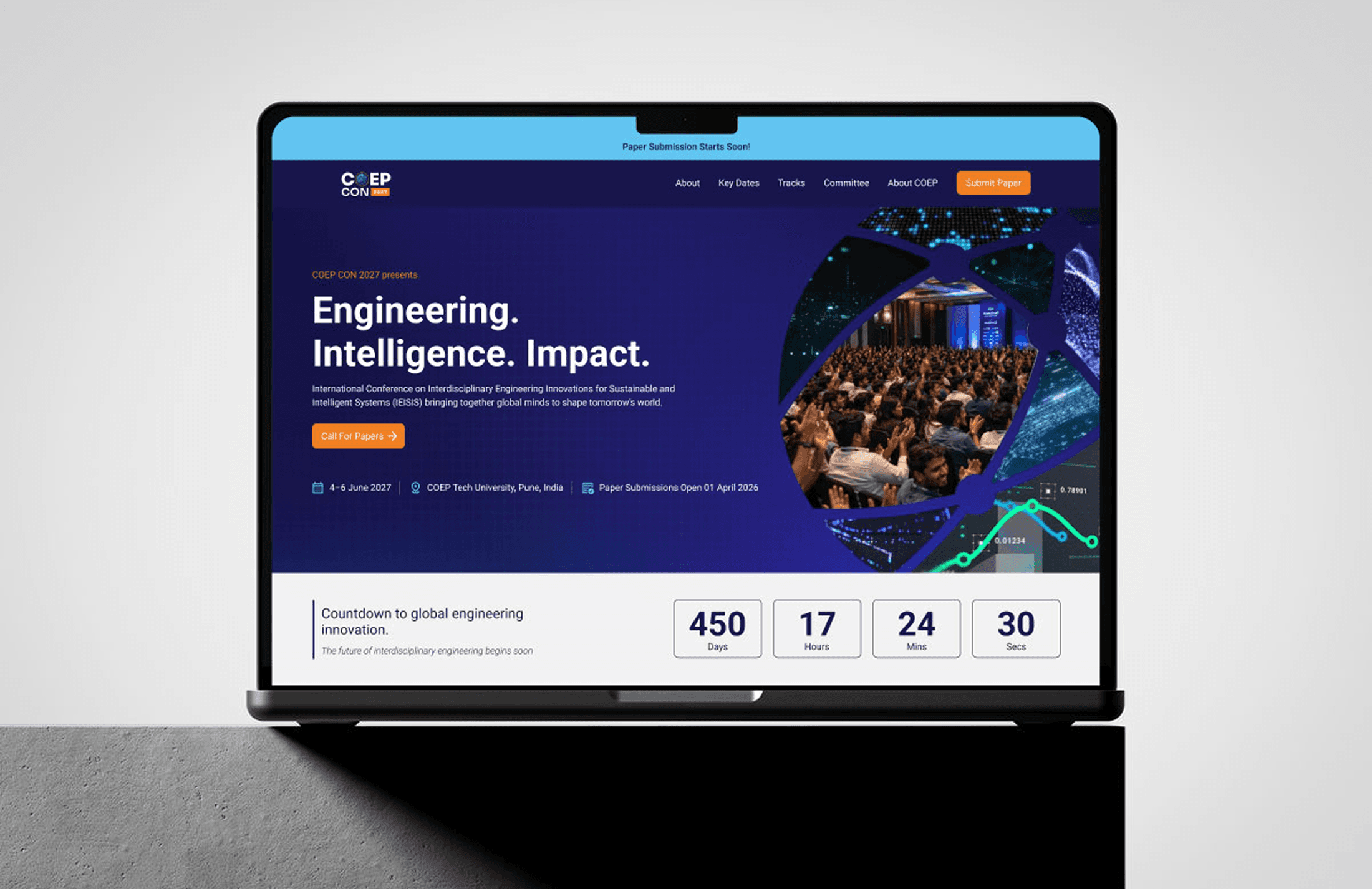
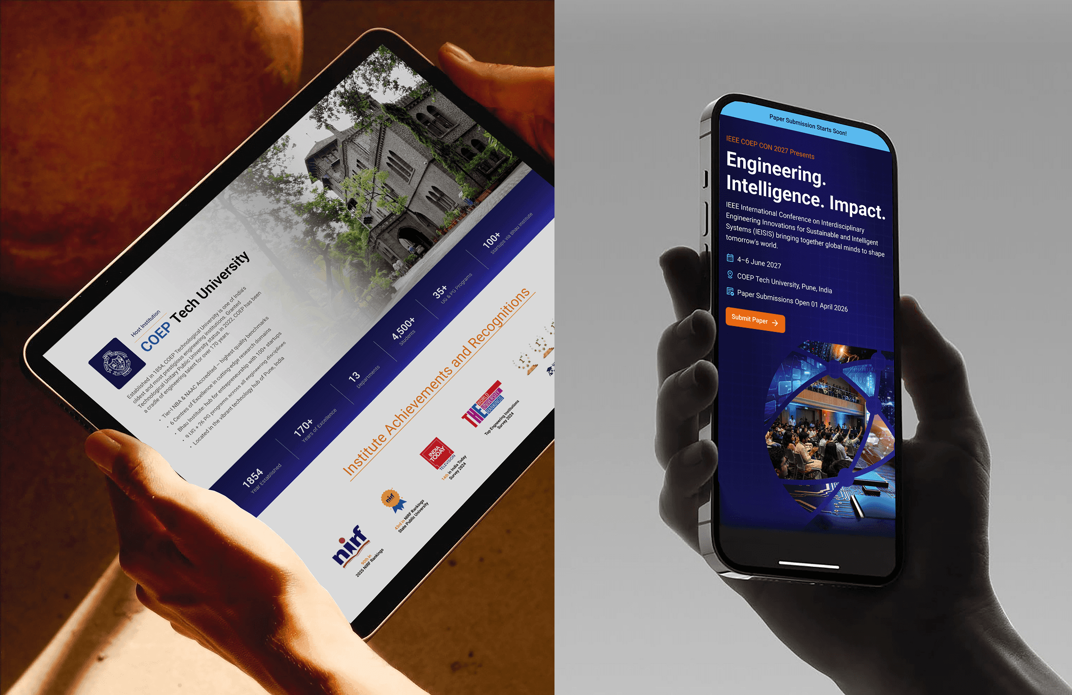
Maintain consistency across the website, presentations, social media, event branding, and merchandise.
03 - Beyond a Conference
Create a foundation that could support future innovation and collaboration initiatives.
"Design a system where engineering precision and India’s product ambition become the same visual language."
Maintain consistency across the website, presentations, social media, event branding, and merchandise.
Create a recurring identity with strong IP potential across future conference editions
Design a website that converts researchers to paper submissions and industry to attendance
Build a presentation system for ApniLeap that works across board-level pitches and college workshops
Extend the design language into a scalable national-scale brand ecosystem
03 - STRATEGIC DIRECTION


05 - COLOUR & TYPOGRAPHY


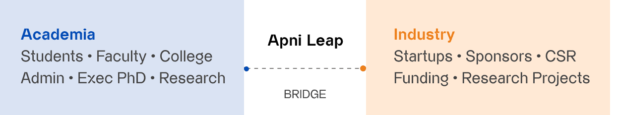
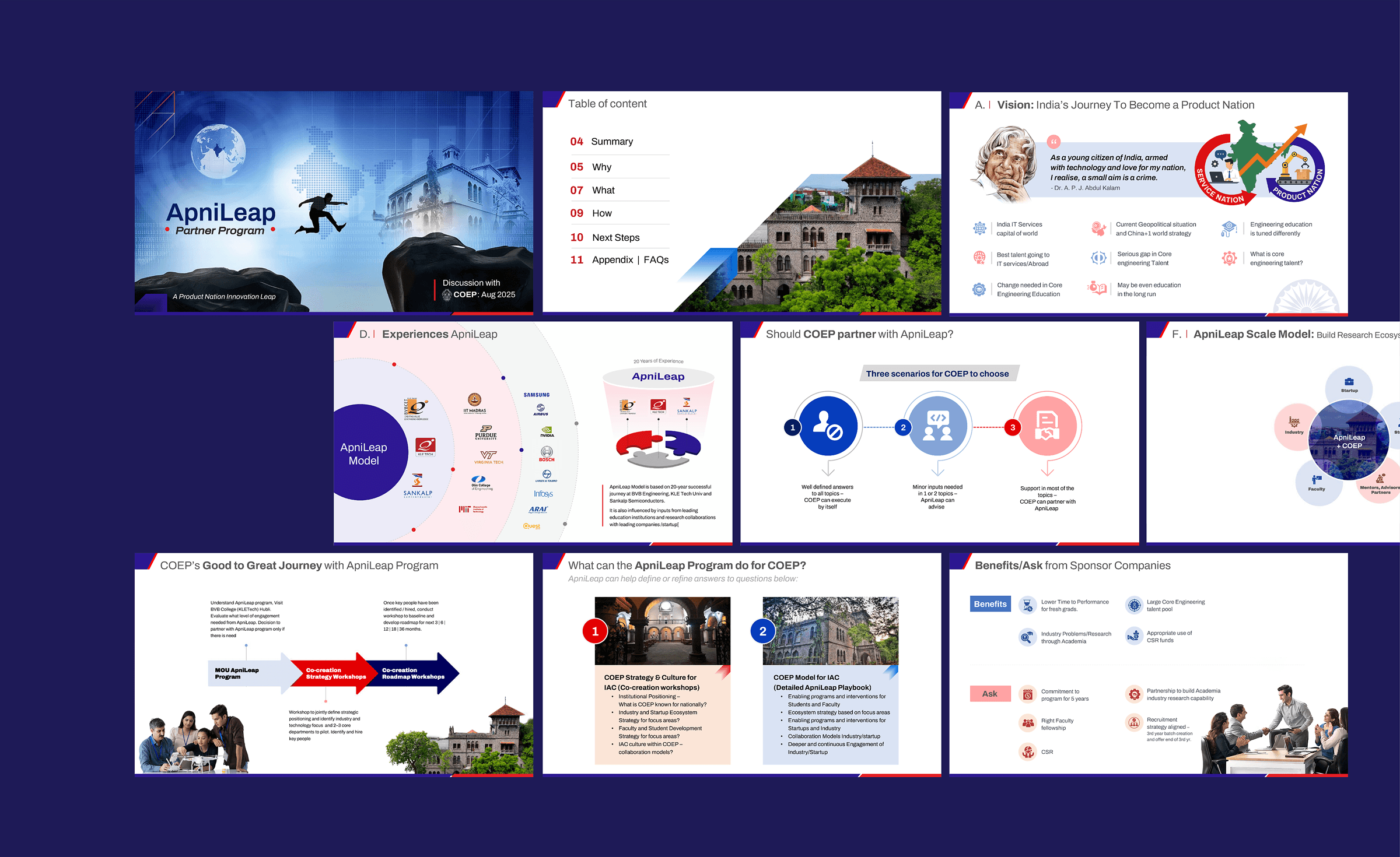
06 - APLNILEAP PARTNER PROGRAM
"Designing for India’s Product Nation ambition."
The ApniLeap Partner Program needed a visual language that could carry a complex 20-year institutional model into board-room pitches and college workshops simultaneously. The COEP CON design system was extended - the same spatial discipline and colour authority, reframed around the bridge metaphor: ApniLeap as the connector between aligned Academia and aligned Industry.

07 - LEGACY CONFERENCE COMMUNICATION
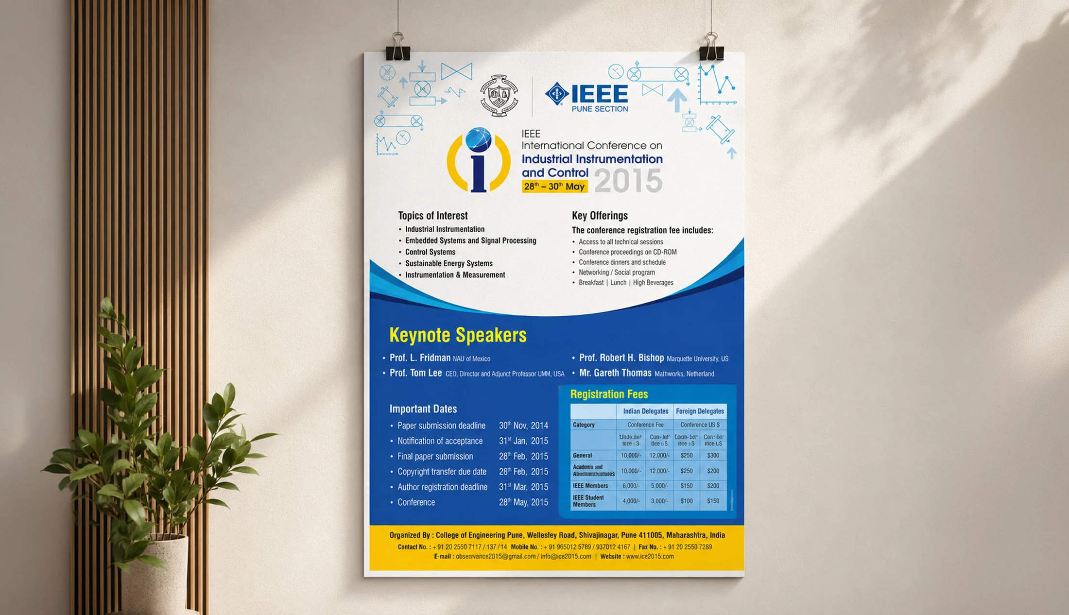
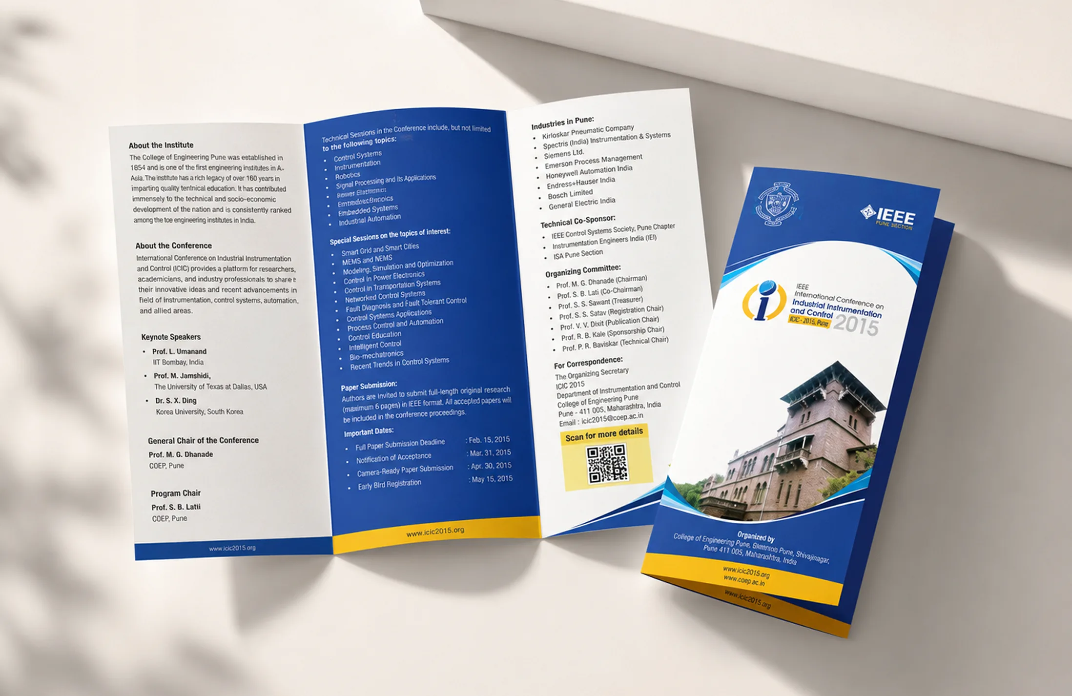
Before the introduction of a broader digital ecosystem, conference communication was primarily driven through information-rich print materials such as posters and brochures. These assets established a strong visual presence while effectively communicating key event details, speakers, themes, and participation information. At the center of this communication was the conference logo, which served as a consistent visual anchor across touchpoints. This evolution highlights the transition from standalone print communication to a scalable identity system spanning websites, presentations, social media, and event experiences.
Collaterals
The identity was extended across the conference poster and tri-fold brochure using a consistent blue-and-yellow palette, technical graphics, and a clear information hierarchy.