

Building the Operating System
of Fundraising.
Building the Operating System of Fundraising.
Building the Operating System of Fundraising.
Services
Services
Brand Identity · Brand Manual
Brand Identity · Brand Manual
Sector
Sector
Fintech/Fundraising
Fintech/Fundraising
Zitics is a fintech platform operating in the corporate fundraising space bringing together seekers, investors, and bankers on a digital platform. The brief was focused: design a logo, build a cohesive identity system, and document it into a brand manual that the team could use consistently across all contexts.
Zitics is a fintech platform operating in the corporate fundraising space bringing together seekers, investors, and bankers on a digital platform. The brief was focused: design a logo, build a cohesive identity system, and document it into a brand manual that the team could use consistently across all contexts.

01 - THE CONTEXT
01 - THE CONTEXT
A Platform That Needed to Look the Part.
The corporate fundraising space runs on trust. When a platform operates at the intersection of high-value capital, sensitive data, and multiple stakeholders - how it presents itself matters enormously. First impressions are formed before a single conversation begins.
Zitics had a clear product vision. What it needed was an identity that matched that ambition one that could hold its own in front of investors, bankers, and enterprise clients, and communicate competence without saying a word.

02 - THE CHALLENGE
Building Trust Through
Visual Language.

The challenge was not to invent a personality for Zitics, but to give the existing one a clearer visual form. The brand needed to feel authoritative, modern, and distinctive - without being cold or loud.
For a fintech brand built on trust, the identity had to feel less like a startup and more like a standard.
02 - THE CHALLENGE
Building Trust Through
Visual Language.
The challenge was not to invent a personality for Zitics, but to give the existing one a clearer visual form. The brand needed to feel authoritative, modern, and distinctive - without being cold or loud.
For a fintech brand built on trust, the identity had to feel less like a startup and more like a standard.

02 - THE CHALLENGE
Building Trust Through Visual Language.
The challenge was not to invent a personality for Zitics, but to give the existing one a clearer visual form. The brand needed to feel authoritative, modern, and distinctive - without being cold or loud.
For a fintech brand built on trust, the identity had to feel less like a startup and more like a standard.
03 - STRATEGIC DIRECTION
03 - STRATEGIC DIRECTION

Positioned at the Intersection of Precision and Progress.
The brand strategy was shaped by three personality traits-
• the conviction of the Hero
• the disruption of the Rebel
• and the structure of the Ruler.
These principles informed every visual decision,
from typography to colour and form.
Built to make fundraising more structured, transparent, and faster, the identity reflects the same sense of clarity and forward movement.

Positioned at the Intersection
of Precision and Progress.
The brand strategy was shaped by three personality traits-
• the conviction of the Hero
• the disruption of the Rebel
• and the structure of the Ruler.
These principles informed every visual decision,
from typography to colour and form.
Built to make fundraising more structured, transparent, and faster, the identity reflects the same sense of clarity and forward movement.
04 - THE CONCEPT
04 - THE CONCEPT
A Mark With Four Layers of Meaning.
The symbol was constructed conceptually before it was drawn. Four ideas were brought together into a single, cohesive mark — the hands of the seeker and investor, the directional thrust of movement, the interlocking arrows of integration, and the Z that anchors the brand name.
The symbol was constructed conceptually before it was drawn. Four ideas were brought together into a single, cohesive mark the hands of the seeker and investor, the directional thrust of movement, the interlocking arrows of integration, and the Z that anchors the brand name.
The symbol was constructed conceptually before it was drawn. Four ideas were brought together into a single, cohesive mark — the hands of the seeker and investor, the directional thrust of movement, the interlocking arrows of integration, and the Z that anchors the brand name.


06 - VISUAL LANGUAGE
06 - VISUAL LANGUAGE


Brand Identity
Design
Brand Identity Design
We have developed a comprehensive range of merchandise for Viridium.AI, including Id cards, visiting cards, Diary, t-shirts, Laptop Stickers, and more, all reflecting the new brand identity.
We have developed a comprehensive range of merchandise for Viridium.AI, including Id cards, visiting cards, Diary, t-shirts, Laptop Stickers, and more, all reflecting the new brand identity.


Explore work

AI & Tech
Turinton AI
End to End Branding of Global AI Tech Company
AI & Tech
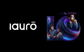
iauro
Built brand communication and digital experience for an enterprise AI transformation company.
AI & Tech
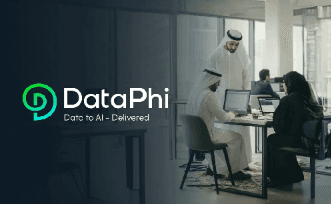
DataPhi
Created brand identity and UX for a data analytics and intelligence platform.
Finance
Vayana Network
Improved usability and clarity for a complex fintech platform.
Explore work
AI & Tech
Turinton AI
End to End Branding of Global AI Tech Company
AI & Tech
iauro
Built brand communication and digital experience for an enterprise AI transformation company.
AI & Tech
DataPhi
Created brand identity and UX for a data analytics and intelligence platform.
Finance
Vayana Network
Improved usability and clarity for a complex fintech platform.
Education
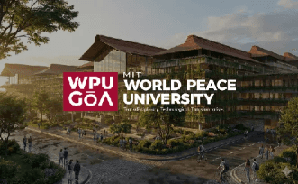
WPU GOA
Built an education brand system and digital experience for a new-age university.
Explore More Work
