
Jeewan Jyoti Brand & Communication Design
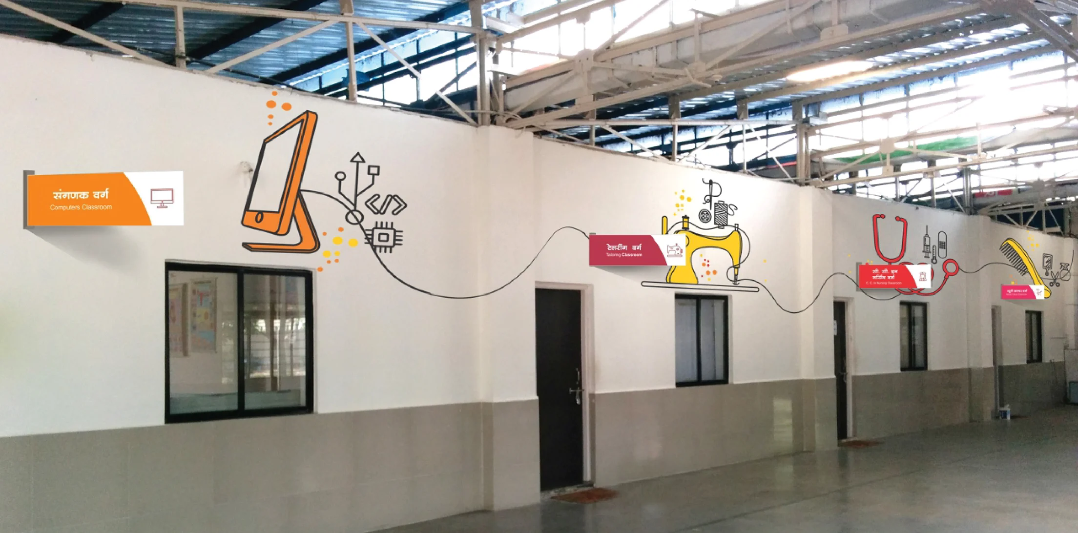
Founded in 2014 by Sterlite Tech in Velhe, Maharashtra, Jeewan Jyoti empowers rural women through vocational training in nursing, tailoring, beauty, and computers - turning an underdeveloped, patriarchal region into a community of confident, self-reliant women.
01 - THE CHALLENGE
Feels human and community-rooted, not corporate
Resonates with the women beneficiaries and local communities it serves
Works across both internal audiences (employees) and external touchpoints (vehicles, print, events)
Balances brand consistency with emotional storytelling

02 - THE OBJECTIVE

To design a cohesive internal branding and communication system for the Jeewan Jyoti initiative that:
Communicates the core belief - every family is empowered when a woman is empowered
Creates pride and cultural alignment among Sterlite Tech employees
Builds a recognisable visual identity for the initiative across all touchpoints
03 - THE INSIGHT


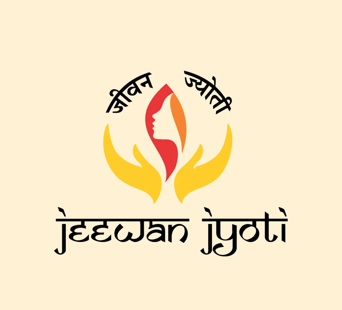
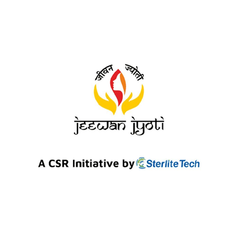
04 - The Symbol
Two uplifted hands cradle a flame within it, the silhouette of a woman's face. Protection, life, and dignity in a single mark.
The Woman's Silhouette
She is not a statistic. She is the entire purpose.
The Flame
Jeewan Jyoti - Light of Life. The spark of empowerment every woman carries.
The Flame
They hold. They support. They never confine.
05 - Colour palette


06 - Vehicle Branding

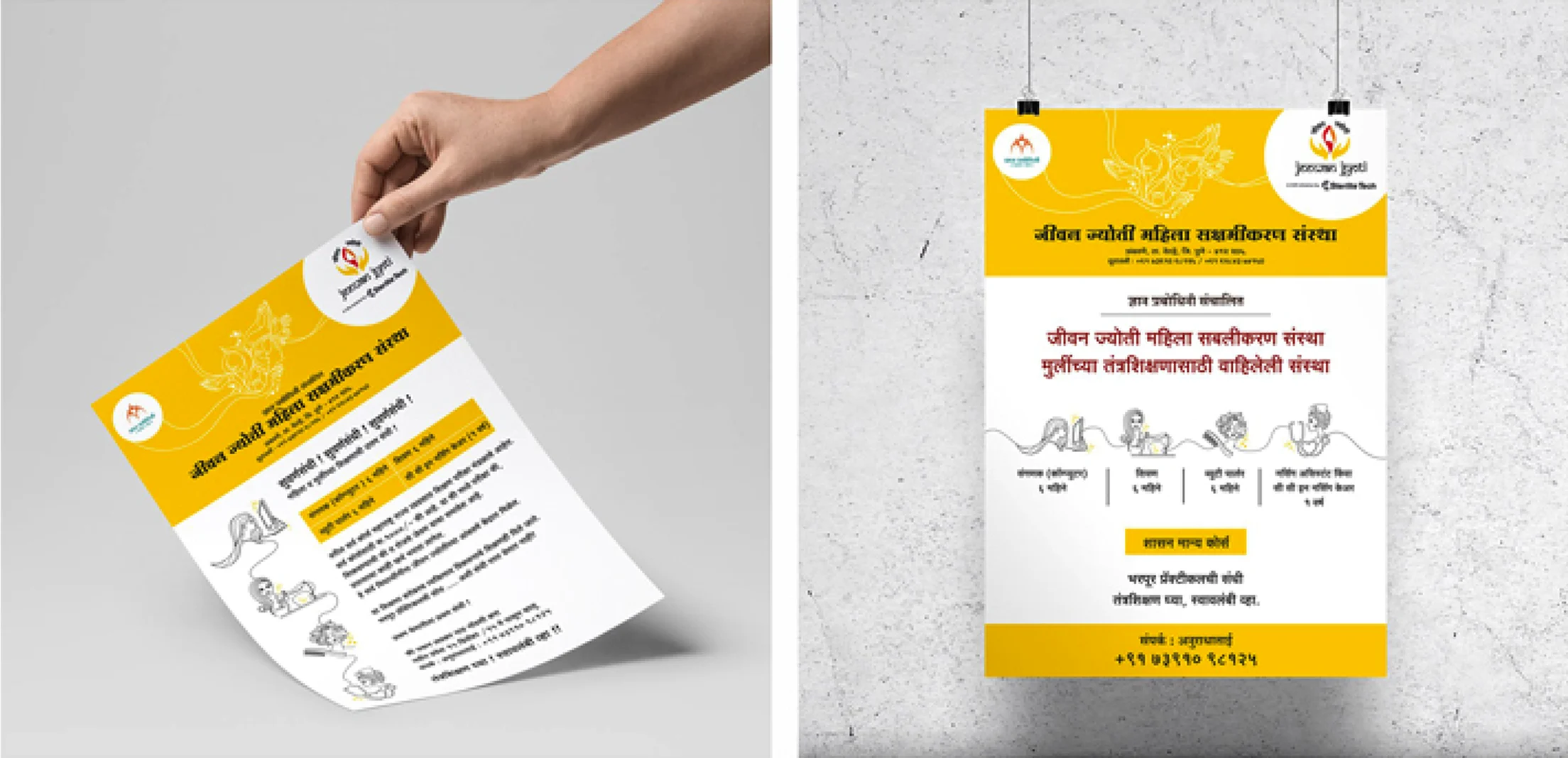
07 - Brand Design- Internal Communication
Making Mission Visible.
Translating Jeewan Jyoti's human values into a cohesive visual system
every colour, illustration, and layout decision made to inspire employees and communicate the initiative's mission with clarity and warmth.