A SIMPLE 2024 GUIDE TO THE PSYCHOLOGY OF USER INTERFACE (UI)
Presently, user interfaces are everywhere around us in the digital world; they can be found in smartphones as well as computers and websites. It makes us wonder why some apps are straightforward while others perplex us. In today’s digital age, user interfaces (UIs) are everywhere, shaping our interactions with technology. From smartphones to websites, well-designed UIs can enhance user experience, while poorly designed ones can lead to frustration and confusion.
What Is Design Psychology?
Design psychology investigates how human behavior and emotions are influenced by design. In UI, designers apply psychological principles to make their interfaces easy to use, intuitive, and engaging. By understanding people’s thinking processes and feelings, designers can create appropriate interfaces for users.

Psychology And Design- The Essential Building Blocks of User Interfaces
By concentrating on the perception of users, information processing, and decision-making, psychology plays an important role in terms of UI design. The following are some significant psychological principles that shape UI design:
1. Visual Hierarchy : Guiding User Attention
Purpose : Organizing UI elements to prioritize importance
Visual hierarchy is the strategic arrangement of elements within a user interface to prioritize importance and guide user attention. By organizing elements in a logical and visually appealing manner, designers can help users quickly identify and interact with the most crucial features. Key Techniques:- Size and Scale : Larger elements are often seen as more important.
- Color Contrast : High-contrast colors draw attention to key elements.
- Placement : Elements placed at the top left of the screen are often perceived as more important.
- Typography : Varying font size, weight, and style can emphasize different elements.
Example
In a web page, the main headline might be larger, bold, and positioned at the top center of the page. Secondary headings could be smaller and a different color. Call-to-action buttons might be even larger and have a contrasting color to make them stand out.
2. Color Psychology: Understanding the Emotional Influence of Color
Purpose : Eliciting emotions and influencing user behavior
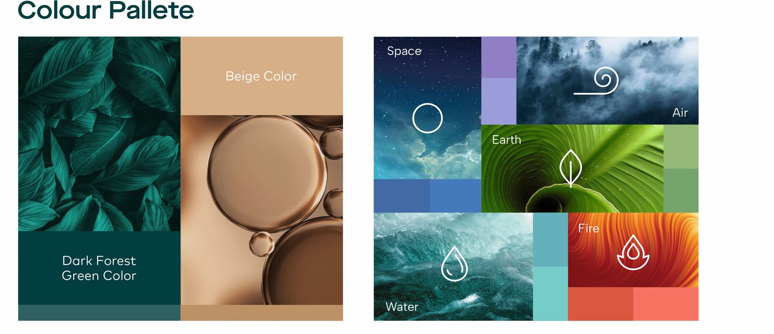
Colors have a powerful psychological impact on human perception and can evoke specific emotions. Designers carefully select colors to convey the desired message and influence user behavior. Key Considerations:- Cultural Associations : Colors can have different meanings across different cultures.
- Emotional Response : Certain colors evoke specific emotions: – Red : Urgency, excitement, danger – Blue : Trust, reliability, calmness – Green : Growth, nature, harmony – Yellow : Happiness, optimism, caution – Orange : Enthusiasm, energy, creativity – Purple : Royalty, luxury, wisdom
- Accessibility : Consider color accessibility for users with color blindness.
Example
A website or portal for a financial institution might use blue for its primary color to convey trust and reliability. A gaming platform might use red and orange to evoke excitement and energy.

3. Cognitive Load: Minimizing Mental Effort
Purpose : Reducing the mental effort required to interact with UI.
Cognitive load refers to the amount of mental energy a user must expend to interact with a UI. By minimizing cognitive load, designers can improve usability and reduce user frustration.. Key Techniques:- Simplicity : Keep the UI uncluttered and avoid overwhelming users with too many options.
- Clear Labeling : Use clear and concise labels for buttons, fields, and other elements.
- Logical Organization : Arrange information in a way that makes sense to the user.
- Progressive Disclosure : Gradually reveal information as needed to avoid overwhelming users.
Example
A well-designed e-commerce website might use a clear navigation menu with well-labeled categories. The product page might have a clean layout with essential information prominently displayed, while less important details can be accessed through expandable sections.
4. Familiarity and Consistency: Building Trust
Purpose : Reducing learning curves and building trust
Users feel more comfortable with familiar interfaces that work consistently across different devices and platforms. By maintaining consistency in psychology and design elements, designers can reduce learning curves and build trust with users. Key Techniques:- Consistent Icons : Use recognizable and consistent icons for common actions..
- Standard Layouts : Adhere to standard UI patterns and conventions.
- Consistent Navigation : Maintain a consistent navigation structure across different pages.
- Cross-Platform Compatibility : Ensure the UI works well on various devices and platforms.
Example
A mobile app should have a similar navigation structure and iconography to its web counterpart. This helps users feel familiar and comfortable as they switch between devices.
Emotion in User Interface: Crafting Engaging Experiences
Emotions play a crucial role in how users perceive and interact with user interfaces (UIs). Well-designed UIs can evoke positive emotions, such as joy, satisfaction, or confidence, leading to more engaging and enjoyable user experiences.Micro-interactions are subtle animations or feedback that respond to user actions. These small details can significantly enhance the user experience by providing visual cues and emotional rewards.
Immediate feedback reassures users that their actions have been registered and understood by the system. Quick response times prevent frustration and maintain user engagement.
Personalized UIs adapt to individual user preferences and habits, making users feel valued and understood. By suggesting relevant content or customizing settings, designers can create more satisfying and engaging experiences.
Conclusion : The Art and Science of User-Centric Design
Behind every intuitive and enjoyable digital experience lies a thoughtful understanding of human psychology. Designers who master the principles of design psychology create interfaces that not only look good but also feel good to use. By considering your emotions, cognitive load, and preferences, they craft experiences that are both functional and satisfying
So, the next time you’re interacting with a well-designed app or website, take a moment to appreciate the artistry and science behind its creation.