


BALCO Medical Centre Launching a Cancer Care Brand in a City That Had Never Had One
BALCO Medical Centre Launching a Cancer Care Brand in a City That Had Never Had One
BALCO Medical Centre Launching a Cancer Care Brand in a City That Had Never Had One
BALCO Medical Centre Launching a Cancer Care Brand in a City That Had Never Had One
Services
Services
Sector
Sector
Branding Strategy | Brand Development | Communication
Branding Strategy | Brand Development | Communication
Healthcare
Healthcare
Over 550,000 Indians die from cancer every year. The vast majority in central India have had to travel hundreds of kilometres for quality oncology care arriving too late, too exhausted, and too financially drained to fight. BALCO Medical Centre was built to change that. Initiated by Vedanta Resources and BALCO through VMRF, it brought ultra-modern, multi-modality cancer treatment to Raipur at an affordable cost. But building a world-class facility is one thing. Making people believe in it in a market that had never had access to this level of care is an entirely different challenge.
Over 550,000 Indians die from cancer every year. The vast majority in central India have had to travel hundreds of kilometres for quality oncology care arriving too late, too exhausted, and too financially drained to fight. BALCO Medical Centre was built to change that. Initiated by Vedanta Resources and BALCO through VMRF, it brought ultra-modern, multi-modality cancer treatment to Raipur at an affordable cost. But building a world-class facility is one thing. Making people believe in it in a market that had never had access to this level of care is an entirely different challenge.

Why Healthcare Communication Is Different
Why Healthcare Communication Is Different
Cancer isn't a category where conventional branding rules apply. The audience is a patient in crisis, a family in fear, a referring doctor weighing trust against outcomes. Every word and image carries weight it wouldn't in any other sector. Get the tone wrong and you're either too clinical to feel human or too emotional to feel credible. This wasn't a brand launch in the traditional sense. It was an introduction of hope to a region underserved for decades and the communication had to carry that responsibility without ever feeling exploitative or hollow.
Cancer isn't a category where conventional branding rules apply. The audience is a patient in crisis, a family in fear, a referring doctor weighing trust against outcomes. Every word and image carries weight it wouldn't in any other sector. Get the tone wrong and you're either too clinical to feel human or too emotional to feel credible. This wasn't a brand launch in the traditional sense. It was an introduction of hope to a region underserved for decades and the communication had to carry that responsibility without ever feeling exploitative or hollow.


Challenge
BALCO faced deep trust barriers. Raipur lacked a benchmark for such advanced care, and corporate backing risked seeming unaffordable. Added to this was the stigma around cancer. The challenge wasn’t just promotion, but reshaping perception and encouraging early action.
Objectives
Position BALCO as the most trusted name in cancer care across Chhattisgarh and central India not by claiming superiority, but by earning belief. Make the brand feel accessible to every economic class while maintaining world-class credibility. And move the audience from fear and avoidance to trust and action.
COMMUNICATION PHILOSOPHY
Care Before Cure
Care Before Cure
Most hospital brands lead with infrastructure machines, technology, and doctor credentials. We chose a different starting point. Before BALCO could talk about what it does, it needed to establish how it feels. The brand attributes care, compassion, cure, and trust weren't just words on a guideline. They were a sequencing strategy. Care and compassion open the door. Cure and trust close it. This order mattered, because the audience families navigating the most frightening diagnosis of their lives needed to feel safe before they could feel convinced.
Most hospital brands lead with infrastructure machines, technology, and doctor credentials. We chose a different starting point. Before BALCO could talk about what it does, it needed to establish how it feels. The brand attributes care, compassion, cure, and trust weren't just words on a guideline. They were a sequencing strategy. Care and compassion open the door. Cure and trust close it. This order mattered, because the audience families navigating the most frightening diagnosis of their lives needed to feel safe before they could feel convinced.

Phased Rollout
Phased Rollout

Pre-launch focused on the problem: the distance, the delay, the cost of seeking treatment outside the region. The intent was to make Raipur feel the absence before BALCO filled it.
Pre-launch focused on the problem: the distance, the delay, the cost of seeking treatment outside the region. The intent was to make Raipur feel the absence before BALCO filled it.
Launch shifted to arrival world-class, accessible, here. This phase carried the heaviest media weight across outdoor, print, and on-ground collaterals, balancing clinical authority with genuine warmth.
Launch shifted to arrival world-class, accessible, here. This phase carried the heaviest media weight across outdoor, print, and on-ground collaterals, balancing clinical authority with genuine warmth.
Post-launch moved into sustained trust-building reinforcing capability, affordability, and patient-centricity well beyond the initial announcement.
authority with genuine warmth.
Post-launch moved into sustained trust-building reinforcing capability, affordability, and patient-centricity well beyond the initial announcement.
authority with genuine warmth.
VISUAL IDENTITY
Trust Across Every Class
Trust Across Every Class
Trust Across Every Class
The visual language had to feel sophisticated enough to signal world-class capability and approachable enough that a farmer's family from a district town wouldn't hesitate to walk through the door. The palette and design elements were chosen to project calm and human connection avoiding the sterile blues and whites that dominate hospital branding. Every collateral was designed not just for visibility but for emotional accessibility. The question at every stage wasn't does this look like a hospital brand? It was: does this make someone in distress feel like they've found the right place?
The visual language had to feel sophisticated enough to signal world-class capability and approachable enough that a farmer's family from a district town wouldn't hesitate to walk through the door. The palette and design elements were chosen to project calm and human connection avoiding the sterile blues and whites that dominate hospital branding. Every collateral was designed not just for visibility but for emotional accessibility. The question at every stage wasn't does this look like a hospital brand? It was: does this make someone in distress feel like they've found the right place?


Explore work
Explore work
Explore work

Healthcare
N. M. Wadia
Designed the 50th anniversary identity, campaign, and print communication for N. M. Wadia Institute of Cardiology, Pune.

Healthcare
XLM
Designed brand identity and UX for a healthcare-focused brand.
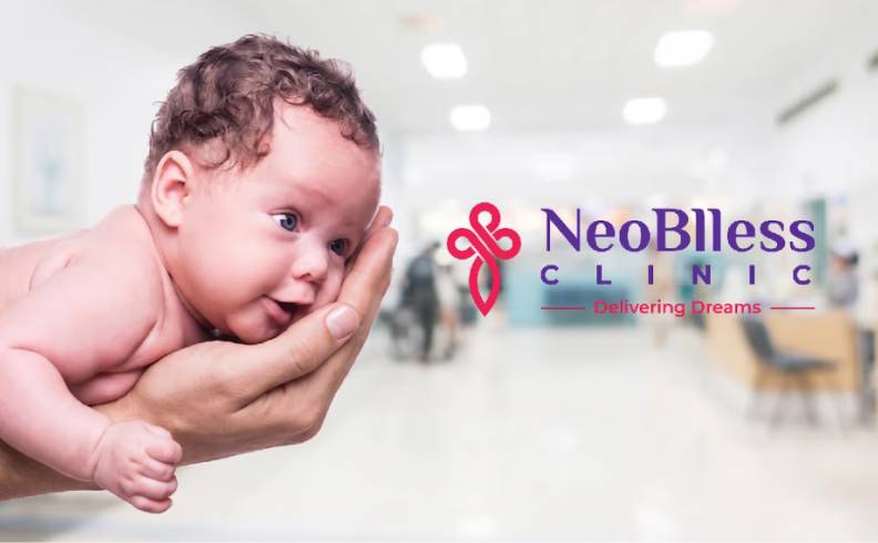
Healthcare
Neoblless Clinic
Building a Brand Identity Around the Most Intimate Hope

Architecture
AVA Architects
Designed a refined brand identity system for an architecture practice.

Corporate
Raco
Designed a clear and professional corporate identity system.
Explore work
Healthcare
N. M. Wadia
Designed the 50th anniversary identity, campaign, and print communication for N. M. Wadia Institute of Cardiology, Pune.
Healthcare
XLM
Designed brand identity and UX for a healthcare-focused brand.
Healthcare
Neoblless Clinic
Building a Brand Identity Around the Most Intimate Hope
Architecture
AVA Architects
Designed a refined brand identity system for an architecture practice.
Explore More Work
