
Hospital Branding, Marketing and Launching in Pune
Hospital Branding, Marketing and Launching in Pune
Hospital Branding, Marketing and Launching in Pune
Hospital Branding, Marketing and Launching in Pune
Services
Services
Sector
Sector
Brand Strategy | Branding & Marketing | Website | Space Design
Brand Strategy | Branding & Marketing | Website | Space Design
Healthcare
Healthcare
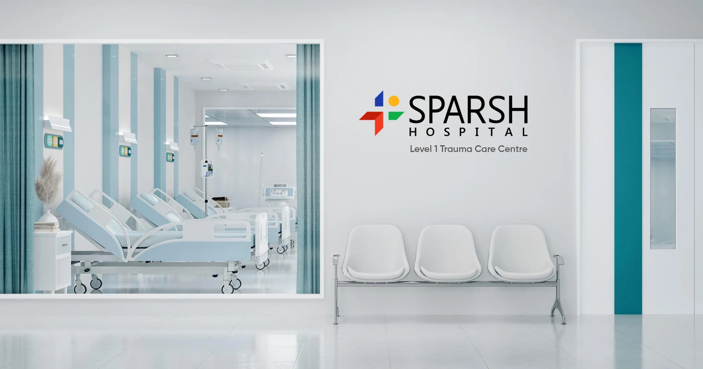
When choosing a healthcare facility, people look for Quality, Expertise, and Care. The preference is given to Prompt and Precise treatment. While the hospital is equipped with infra-tech and expertise in all disciplines, the hospital also carries the tag of LEVEL 1 Trauma Centre.
When choosing a healthcare facility, people look for Quality, Expertise, and Care. The preference is given to Prompt and Precise treatment. While the hospital is equipped with infra-tech and expertise in all disciplines, the hospital also carries the tag of LEVEL 1 Trauma Centre.
THE CHALLENGE
THE CHALLENGE
To create a brand out of Sparsh Hospital that is highly functional in nature and is entirely based on the offerings, tangible as well as intangible
To create a brand out of Sparsh Hospital that is highly functional in nature and is entirely based on the offerings, tangible as well as intangible
To create a brand out of Sparsh Hospital that is highly functional in nature and is entirely based on the offerings, tangible as well as intangible
To create awareness about the brand, with a
focussed approach towards the trauma centre
To create awareness about the brand, with a
focussed approach towards the trauma centre
THE OBJECTIVES
THE OBJECTIVES
To create a focused approach to achieve our goals through customised messaging & positioning. This will be communicated to a specific target audience via various media channels to create an apt brand image & to bring about the desired awareness.
To create a focused approach to achieve our goals through customised messaging & positioning. This will be communicated to a specific target audience via various media channels to create an apt brand image & to bring about the desired awareness.
LOGO CONCEPT
LOGO CONCEPT
Where Care Comes Together
Where Care Comes Together

State of Well-being, not just a person

Intervention that adds life, not just treatment

Continuity of Life & Care Ecosystem

Forward Momentum, not static care

State of Well-being, not just a person
State of Well-being, not just a person
Intervention that adds life, not just treatment
Intervention that adds life, not just treatment
Continuity of Life & Care Ecosystem
Continuity of Life & Care Ecosystem
Forward Momentum, not static care
Forward Momentum, not static care
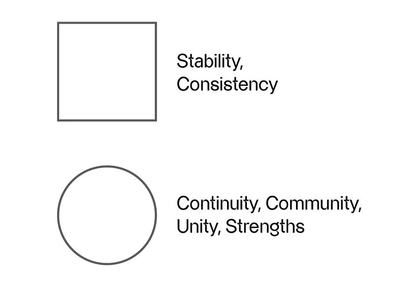
When these elements merge, they form a unified system, not isolated ideas, but interdependent forces. Together, they create a symbol that represents:
A complete healthcare experience: human-first, science-backed, and future-moving.
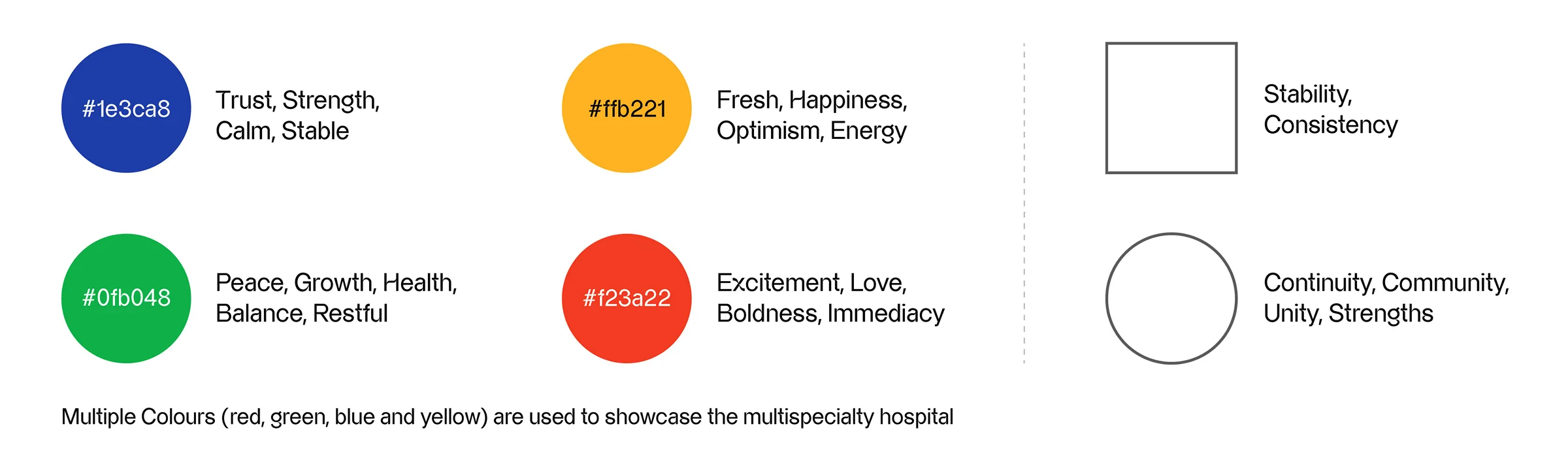
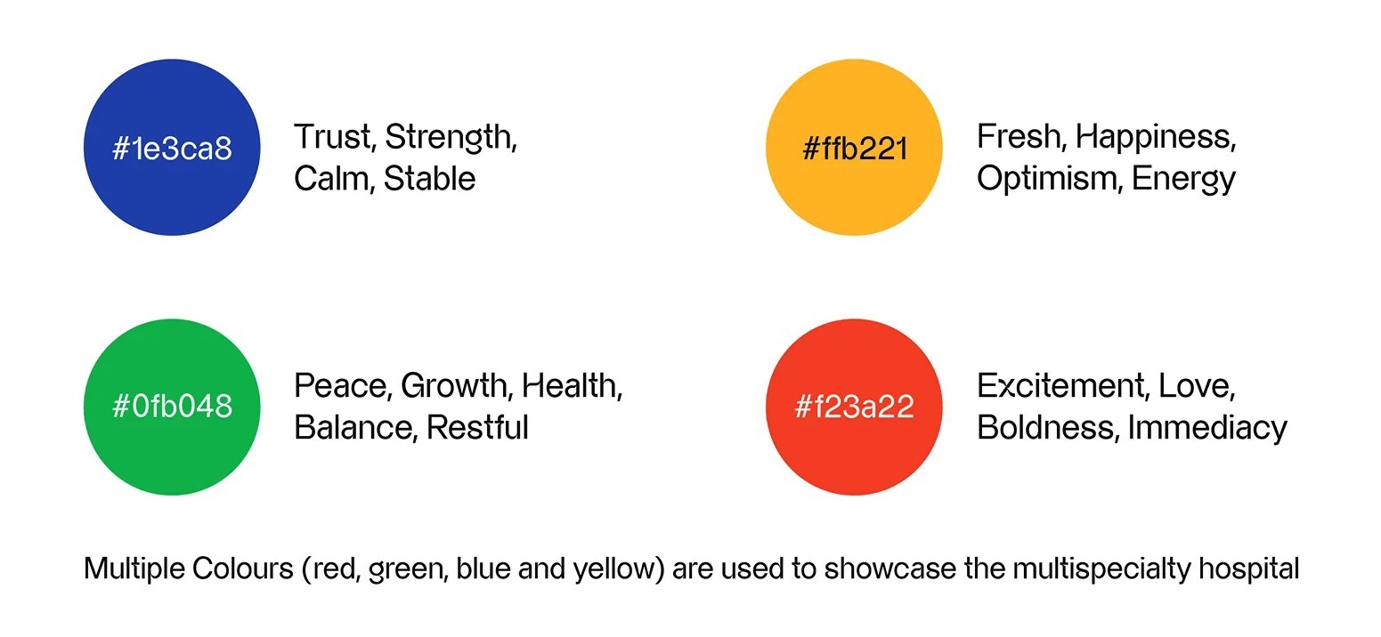
COLOUR PALETTE
COLOUR PALETTE
Branding is about how you relate to the patients you serve. To build a positive reputation, establish credibility, and create a brand that consumers, prospects, and current patients trust. And how things like the logo, design elements, and how the Hospital speaks separate out from other competitors.
Branding is about how you relate to the patients you serve. To build a positive reputation, establish credibility, and create a brand that consumers, prospects, and current patients trust. And how things like the logo, design elements, and how the Hospital speaks separate out from other competitors.
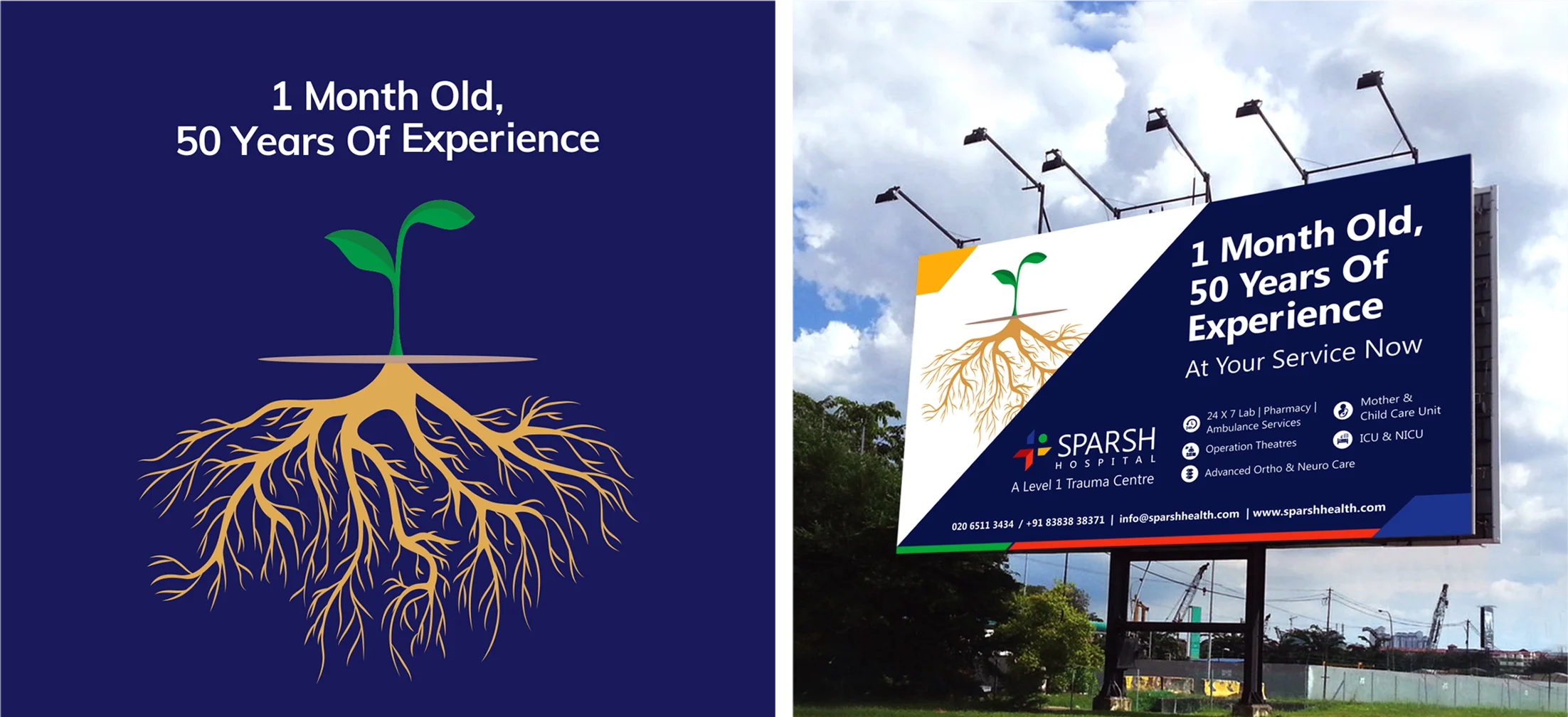
Brand Identity Design Concept:
TRIQUETRA
The rebrand needed a visual identity that could carry the weight of VishwaRaj's philosophy. The Triquetra a Celtic symbol meaning "three-cornered" became the creative foundation. Not for its heritage, but for its inherent structure. The Triquetra represents interconnected trinities, and for VishwaRaj, we mapped it to the three pillars the brand was built on: trust, care, and compassion. Three values, inseparable and continuous exactly as the symbol depicts them. The interlocking form also visually reinforced the Saathidaar promise partnership, togetherness, an unbroken loop between hospital and patient. It gave VishwaRaj an identity that felt meaningful rather than medical, distinctive rather than clinical.
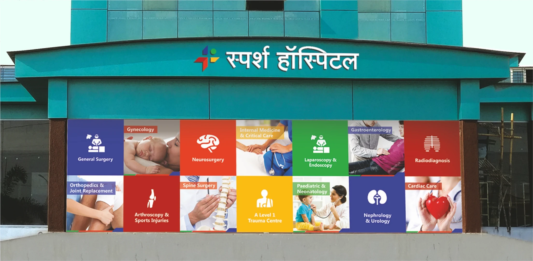
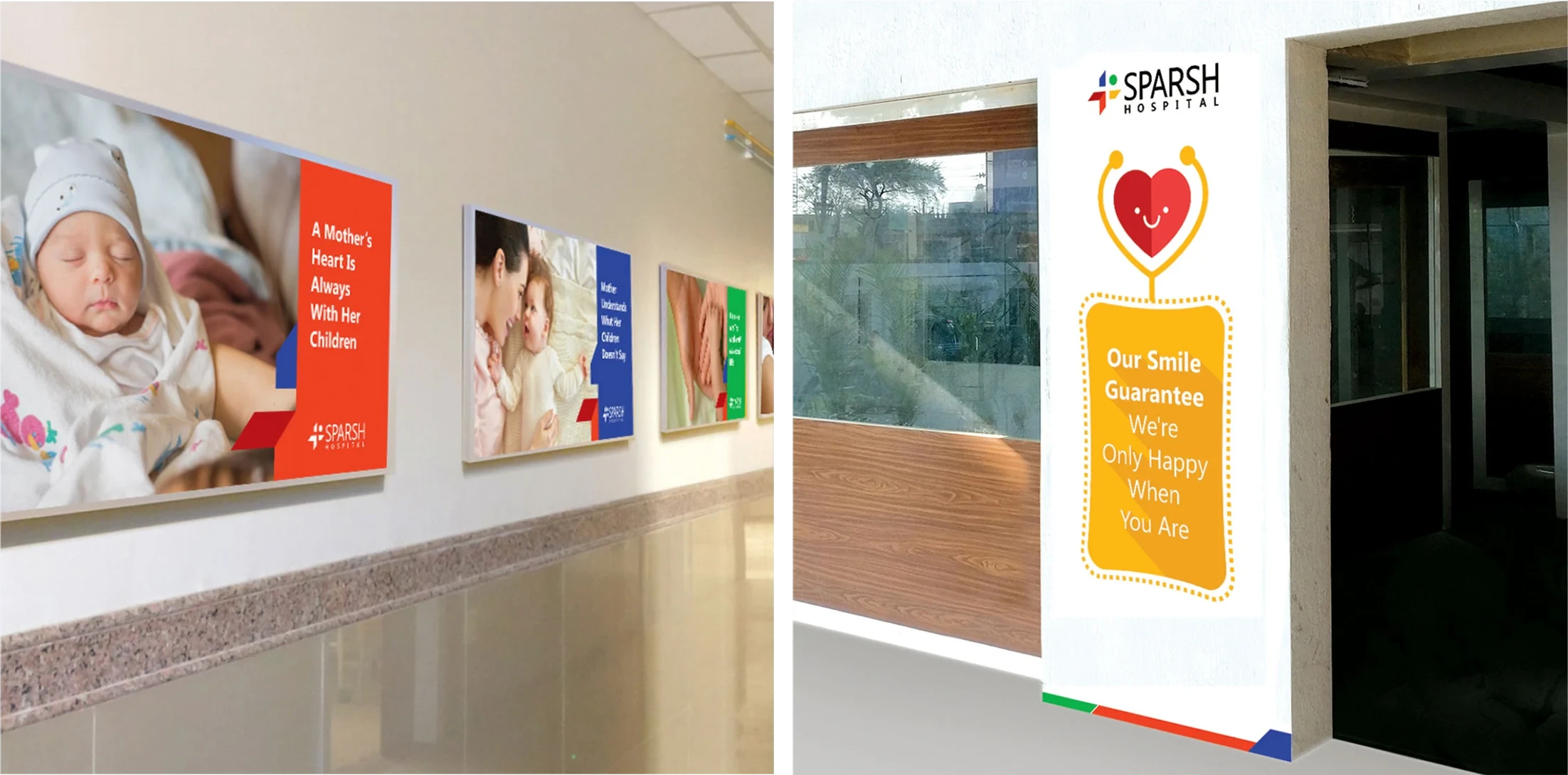
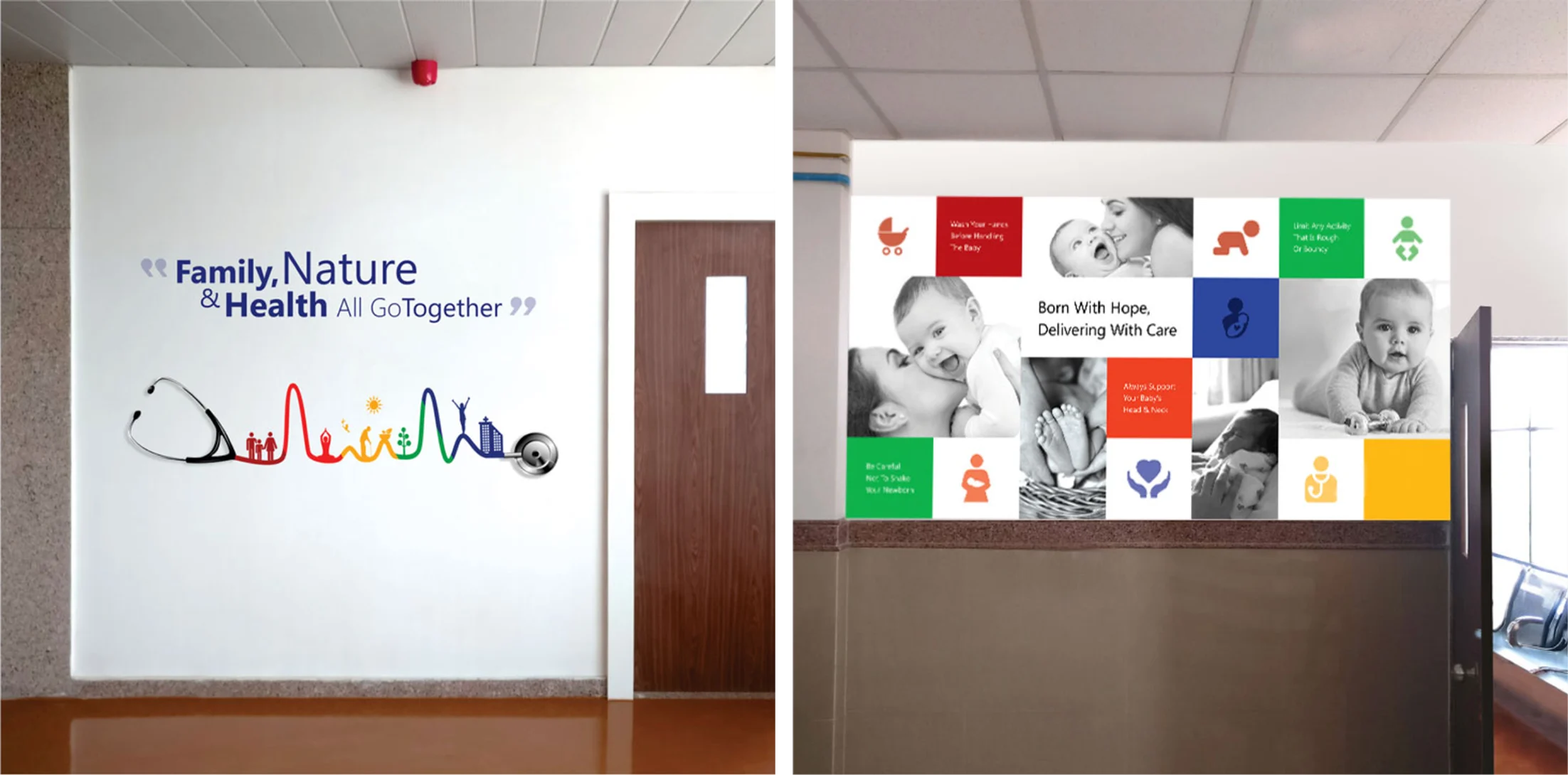
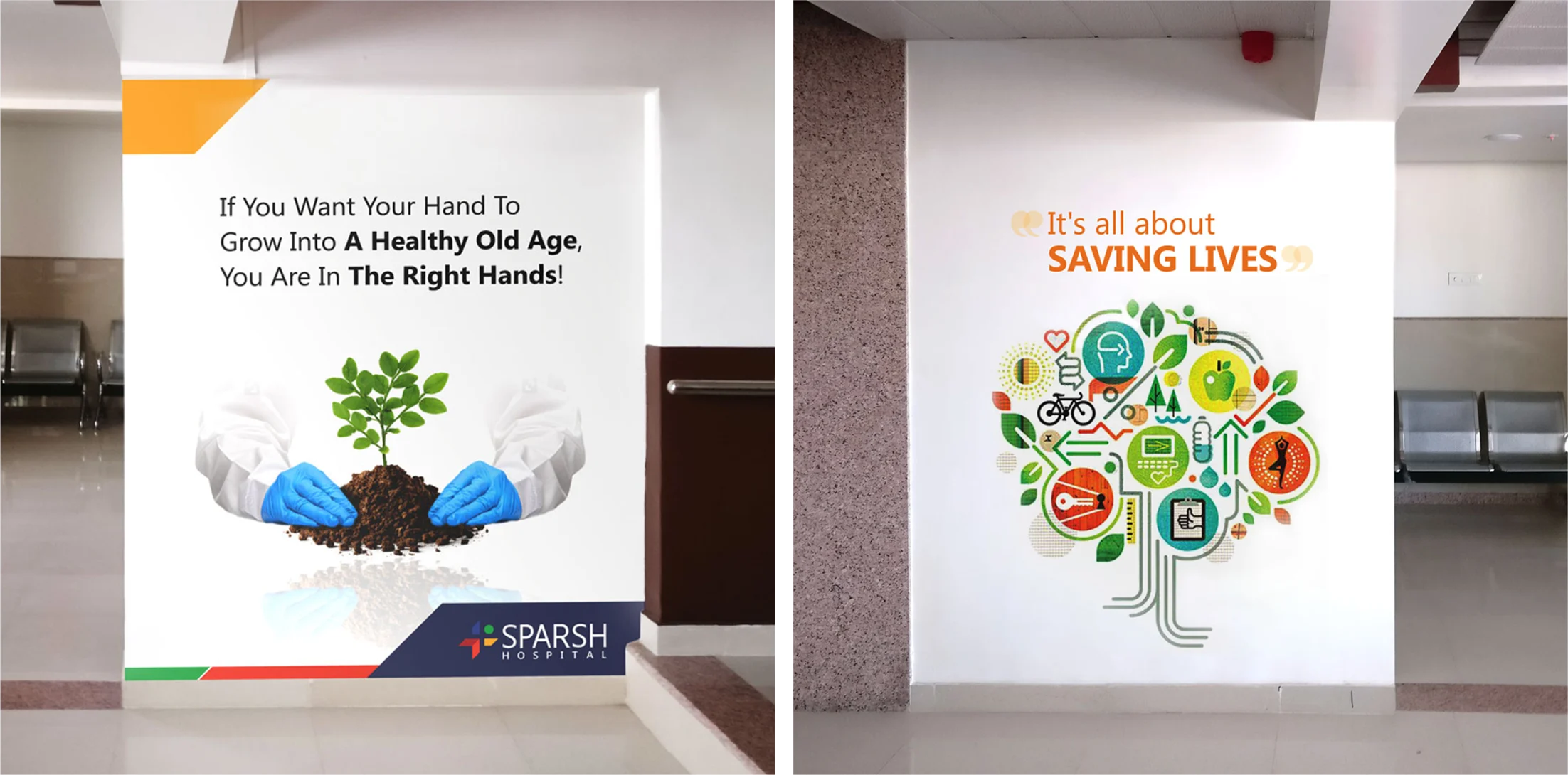
HOSPITAL SPACE DESIGN & BRANDING
Branding is about how you relate to the patients you serve. To build a positive reputation, establish credibility, and create a brand that consumers, prospects, and current patients trust. And how things like the logo, design elements, and how the Hospital speaks separate out from other competitors.
Branding is about how you relate to the patients you serve. To build a positive reputation, establish credibility, and create a brand that consumers, prospects, and current patients trust. And how things like the logo, design elements, and how the Hospital speaks separate out from other competitors.
Brand Identity Design Concept:
TRIQUETRA
The rebrand needed a visual identity that could carry the weight of VishwaRaj's philosophy. The Triquetra a Celtic symbol meaning "three-cornered" became the creative foundation. Not for its heritage, but for its inherent structure. The Triquetra represents interconnected trinities, and for VishwaRaj, we mapped it to the three pillars the brand was built on: trust, care, and compassion. Three values, inseparable and continuous exactly as the symbol depicts them. The interlocking form also visually reinforced the Saathidaar promise partnership, togetherness, an unbroken loop between hospital and patient. It gave VishwaRaj an identity that felt meaningful rather than medical, distinctive rather than clinical.
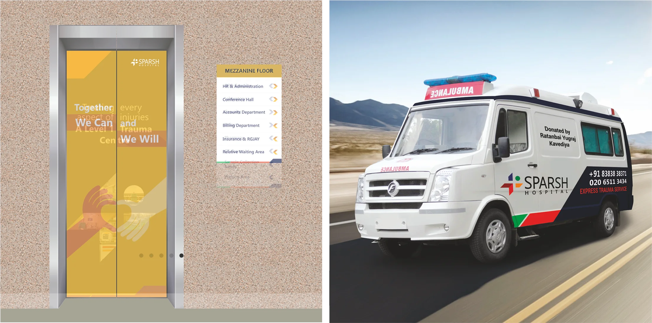
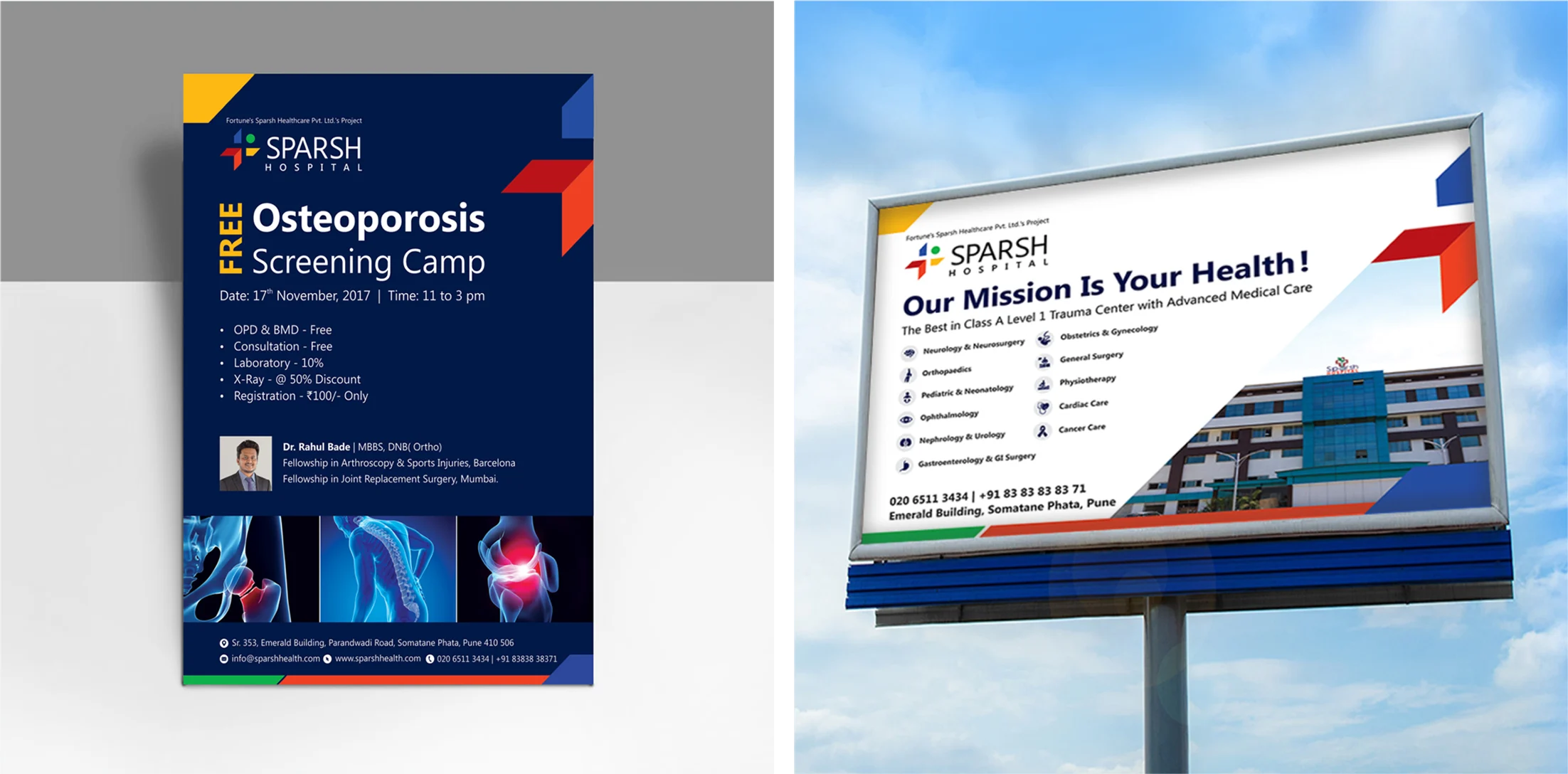
MARKETING COLLATERAL
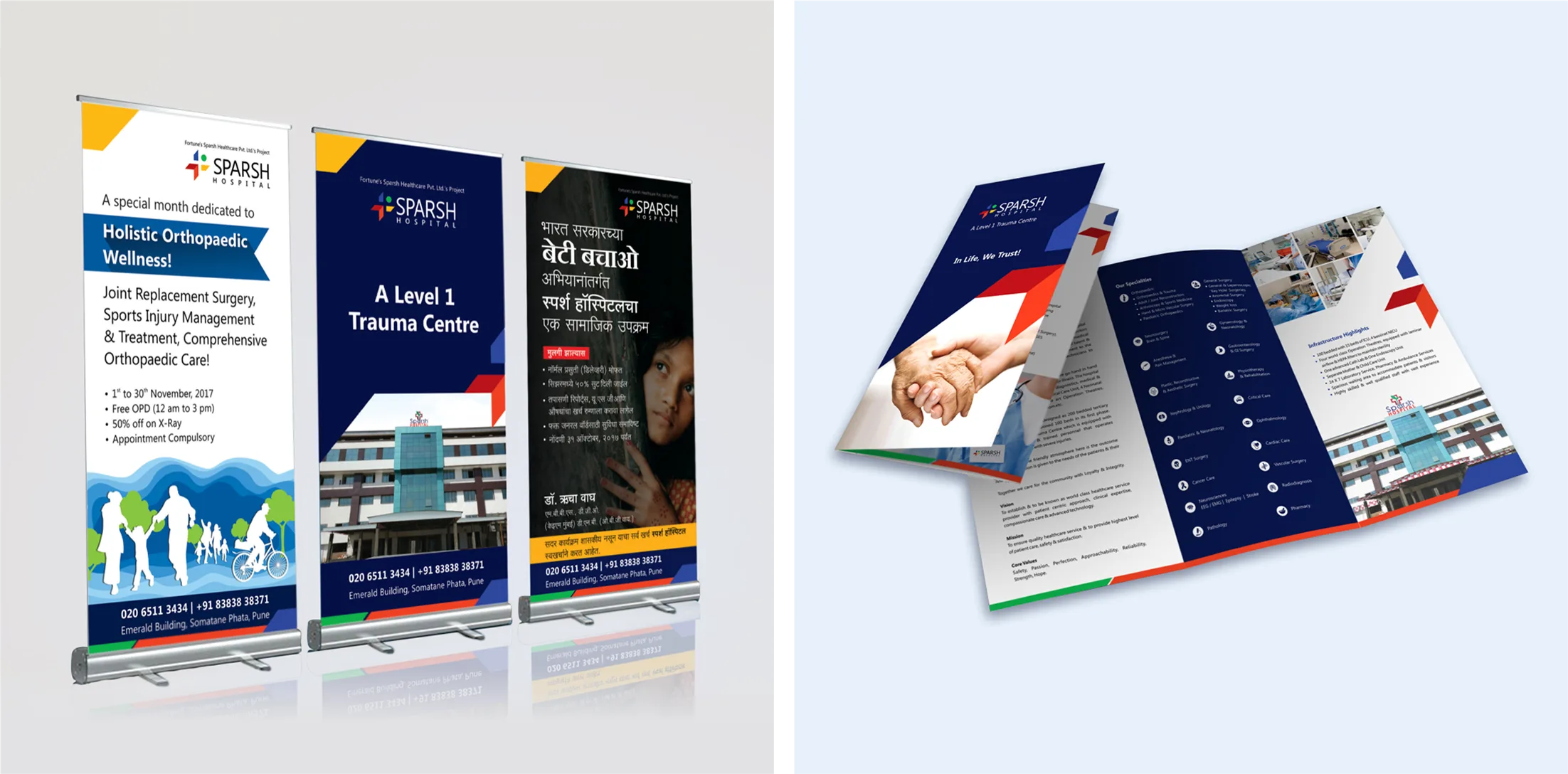
Designing collaterals as and when required by the hospital client like Leaflets, Hoarding, Standee, Brochure, etc. The existing identity, look and feel of the brand were carried forward smartly and incorporated into the new designs.

Brand Identity Design Concept:
TRIQUETRA
The rebrand needed a visual identity that could carry the weight of VishwaRaj's philosophy. The Triquetra a Celtic symbol meaning "three-cornered" became the creative foundation. Not for its heritage, but for its inherent structure. The Triquetra represents interconnected trinities, and for VishwaRaj, we mapped it to the three pillars the brand was built on: trust, care, and compassion. Three values, inseparable and continuous exactly as the symbol depicts them. The interlocking form also visually reinforced the Saathidaar promise partnership, togetherness, an unbroken loop between hospital and patient. It gave VishwaRaj an identity that felt meaningful rather than medical, distinctive rather than clinical.
Not just treating health, but moving life forward.
Not just treating health, but moving life forward.
Not just treating health, but moving life forward.
Explore work
Explore work
Healthcare
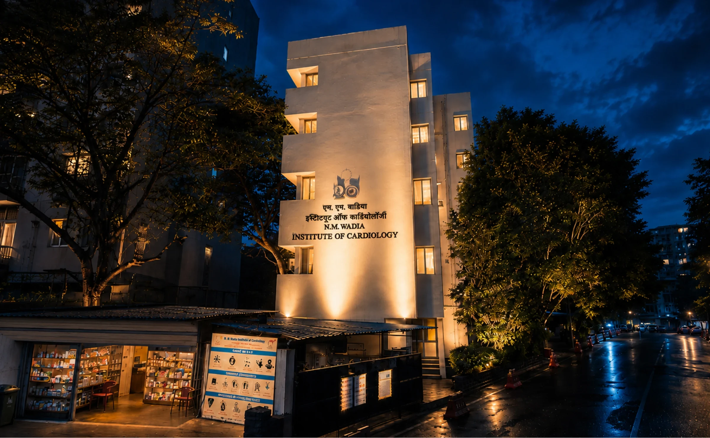
N. M. Wadia
Designed the 50th anniversary identity, campaign, and print communication for N. M. Wadia Institute of Cardiology, Pune.

Healthcare
XLM
Designed brand identity and UX for a healthcare-focused brand.
Healthcare
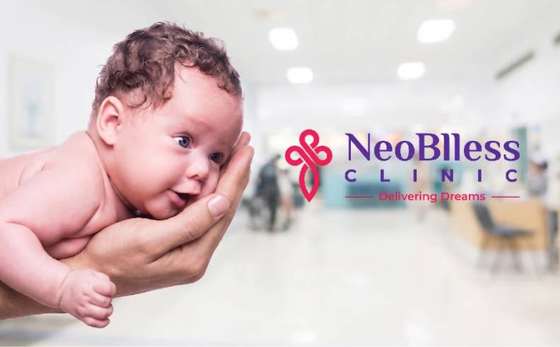
Neoblless Clinic
Building a Brand Identity Around the Most Intimate Hope

Real Estate
AVA Architects
Designed a refined brand identity system for an architecture practice.
Explore work
Explore More Work


We Help You Grow
© OneZeroEight Brandcomm Ltd.
For Business Enquiry
Govind Kabade
+91 98238 71759
govind@onezeroeight.in
For Career
HR
+91 86683 46464
join@onezeroeight.in